

The CSS object-fit property is used to specify how an <img> or <video> should be resized to fit its container.
The CSS object-fit Property
The CSS object-fit property is used to specify how an <img> or <video> should be resized to fit its container.
This property tells the content to fill the container in a variety of ways; such as “preserve that aspect ratio” or “stretch up and take up as much space as possible”.
Look at the following image from Paris. This image is 400 pixels wide and 300 pixels high:
However, if we style the image above to be half its width (200 pixels) and same height (300 pixels), it will look like this:
Example
<!DOCTYPE html>
<html>
<head>
<style>
img {
  width:200px;
  height:300px;
}
</style>
</head>
<body>
<h2>Image</h2>
<img src="paris.jpg" alt="Paris" width="400" height="300">
</body>
</html>
Result:
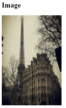
We see that the image is being squished to fit the container of 200×300 pixels (its original aspect ratio is destroyed).
Here is where the object-fit property comes in. The object-fit property can take one of the following values:
fill– This is default. The image is resized to fill the given dimension. If necessary, the image will be stretched or squished to fitcontain– The image keeps its aspect ratio, but is resized to fit within the given dimensioncover– The image keeps its aspect ratio and fills the given dimension. The image will be clipped to fitnone– The image is not resizedscale-down– the image is scaled down to the smallest version ofnoneorcontain
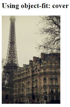
Using object-fit: cover;
If we use object-fit: cover; the image keeps its aspect ratio and fills the given dimension. The image will be clipped to fit:
Example
<!DOCTYPE html>
<html>
<head>
<style>
img {
  width: 200px;
  height: 300px;
  object-fit: cover;
}
</style>
</head>
<body>
<h2>Using object-fit: cover</h2>
<img src="paris.jpg" alt="Paris" width="400" height="300">
</body>
</html>
Result:
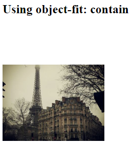
Using object-fit: contain;
If we use object-fit: contain; the image keeps its aspect ratio, but is resized to fit within the given dimension:
Example
<!DOCTYPE html>
<html>
<head>
<style>
img {
  width: 200px;
  height: 300px;
  object-fit: contain;
}
</style>
</head>
<body>
<h2>Using object-fit: contain</h2>
<img src="paris.jpg" alt="Paris" width="400" height="300">
</body>
</html>
Result:
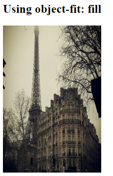
Using object-fit: fill;
If we use object-fit: fill; the image is resized to fill the given dimension. If necessary, the image will be stretched or squished to fit:
Example
<!DOCTYPE html>
<html>
<head>
<style>
img {
  width: 200px;
  height: 300px;
  object-fit: fill;
}
</style>
</head>
<body>
<h2>Using object-fit: fill</h2>
<img src="paris.jpg" alt="Paris" width="400" height="300">
</body>
</html>
Result:
Using object-fit: none;
If we use object-fit: none; the image is not resized:
Example
<!DOCTYPE html>
<html>
<head>
<style>
img {
  width: 200px;
  height: 300px;
  object-fit: none;
}
</style>
</head>
<body>
<h2>Using object-fit: none</h2>
<img src="paris.jpg" alt="Paris" width="400" height="300">
</body>
</html>
Result:

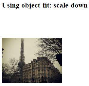
Using object-fit: scale-down;
If we use object-fit: scale-down; the image is scaled down to the smallest version of none or contain:
Example
<!DOCTYPE html>
<html>
<head>
<style>
img {
  width: 200px;
  height: 300px;
  object-fit: scale-down;
}
</style>
</head>
<body>
<h2>Using object-fit: scale-down</h2>
<img src="paris.jpg" alt="Paris" width="400" height="300">
</body>
</html>
Result:
Another Example
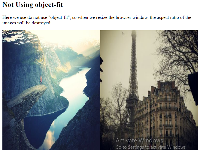
Here we have two images and we want them to fill the width of 50% of the browser window and 100% of the height.
In the following example we do NOT use object-fit, so when we resize the browser window, the aspect ratio of the images will be destroyed:
Example
<!DOCTYPE html>
<html>
<body>
<h2>Not Using object-fit</h2>
<p>Here we use do not use "object-fit", so when we resize the browser window, the aspect ratio of the images will be destroyed:</p>
<div style="width:100%;height:400px;">
  <img src="rock600x400.jpg" alt="Norway" style="float:left;width:50%;height:100%;">
  <img src="paris.jpg" alt="Paris" style="float:left;width:50%;height:100%;">
</div>
</body>
</html>
Result:
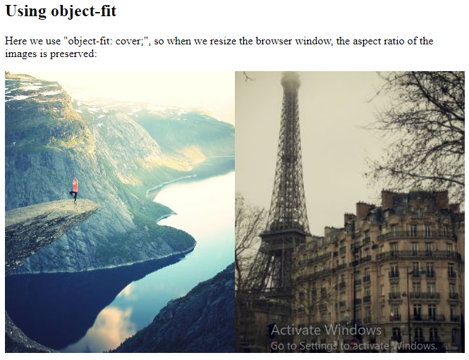
In the next example, we use object-fit: cover;, so when we resize the browser window, the aspect ratio of the images is preserved:
Example
<!DOCTYPE html>
<html>
<body>
<h2>Using object-fit</h2>
<p>Here we use "object-fit: cover;", so when we resize the browser window, the aspect ratio of the images is preserved:</p>
<div style="width:100%;height:400px;">
  <img src="rock600x400.jpg" alt="Norway" style="float:left;width:50%;height:100%;object-fit:cover;">
  <img src="paris.jpg" alt="Paris" style="float:left;width:50%;height:100%;object-fit:cover;"></div>
</body>
</html>
Result:
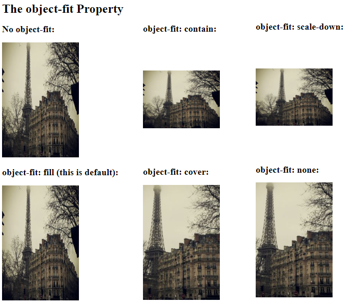
CSS object-fit More Examples
The following example demonstrates all the possible values of the object-fit property in one example:
Example
<!DOCTYPE html>
<html>
<head>
<style>
.fill {object-fit: fill;}
.contain {object-fit: contain;}
.cover {object-fit: cover;}
.scale-down {object-fit: scale-down;}
.none {object-fit: none;}
</style>
</head>
<body>
<h1>The object-fit Property</h1>
<h2>No object-fit:</h2>
<img src="paris.jpg" alt="Paris" style="width:200px;height:300px">
<h2>object-fit: fill (this is default):</h2>
<img class="fill" src="paris.jpg" alt="Paris" style="width:200px;height:300px">
<h2>object-fit: contain:</h2>
<img class="contain" src="paris.jpg" alt="Paris" style="width:200px;height:300px">
<h2>object-fit: cover:</h2>
<img class="cover" src="paris.jpg" alt="Paris" style="width:200px;height:300px">
<h2>object-fit: scale-down:</h2>
<img class="scale-down" src="paris.jpg" alt="Paris" style="width:200px;height:300px">
<h2>object-fit: none:</h2>
<img class="none" src="paris.jpg" alt="Paris" style="width:200px;height:300px">
</body>
</html>
Result: