

Styling Links
Links can be styled with any CSS property (e.g. color, font-family, background, etc.).
Example
<!DOCTYPE html>
<html>
<head>
<style>
a {
  color: hotpink;
}
</style>
</head>
<body>
<h2>Style a link with a color</h2>
<p><b><a href="default.asp" target="_blank">This is a link</a></b></p>
</body>
</html>
Result:
Style a link with a color
In addition, links can be styled differently depending on what state they are in.
The four links states are:
a:link– a normal, unvisited linka:visited– a link the user has visiteda:hover– a link when the user mouses over ita:active– a link the moment it is clicked
Example
<!DOCTYPE html>
<html>
<head>
<style>
/* unvisited link */
a:link {
  color: red;
}
/* visited link */
a:visited {
  color: green;
}
/* mouse over link */
a:hover {
  color: hotpink;
}
/* selected link */
a:active {
  color: blue;
}
</style>
</head>
<body>
<h2>Styling a link depending on state</h2>
<p><b><a href="default.asp" target="_blank">This is a link</a></b></p>
<p><b>Note:</b> a:hover MUST come after a:link and a:visited in the CSS definition in order to be effective.</p>
<p><b>Note:</b> a:active MUST come after a:hover in the CSS definition in order to be effective.</p>
</body>
</html>
Result:
Styling a link depending on state
This is a link – Unvisited Link
This is a link – Visited Link
This is a link – Hover Link
This is a link – Active Link
Note: a:hover MUST come after a:link and a:visited in the CSS definition in order to be effective.
Note: a:active MUST come after a:hover in the CSS definition in order to be effective.
Text Decoration
The text-decoration property is mostly used to remove underlines from links:
Example
Text Decoration
The text-decoration property is mostly used to remove underlines from links:
Example
<!DOCTYPE html>
<html>
<head>
<style>
a:link {
  text-decoration: none;
}
a:visited {
  text-decoration: none;
}
a:hover {
  text-decoration: underline;
}
a:active {
  text-decoration: underline;
}
</style>
</head>
<body>
<h2>Styling a link with text-decoration property</h2>
<p><b><a href="default.asp" target="_blank">This is a link</a></b></p>
<p><b>Note:</b> a:hover MUST come after a:link and a:visited in the CSS definition in order to be effective.</p>
<p><b>Note:</b> a:active MUST come after a:hover in the CSS definition in order to be effective.</p>
</body>
</html>
Result:
Styling a link with text-decoration property
This is a link – Link
This is a link – Link
This is a link – Hover Link
This is a link – Active Link
Note: a:hover MUST come after a:link and a:visited in the CSS definition in order to be effective.
Note: a:active MUST come after a:hover in the CSS definition in order to be effective.
Background Color
The background-color property can be used to specify a background color for links:
Example
<!DOCTYPE html>
<html>
<head>
<style>
a {
color: powderblue;
}
a:link {
background-color: yellow;
}
a:visited {
background-color: blue;
}
a:hover {
background-color: green;
}
a:active {
background-color: hotpink;
}
</style>
</head>
<body>
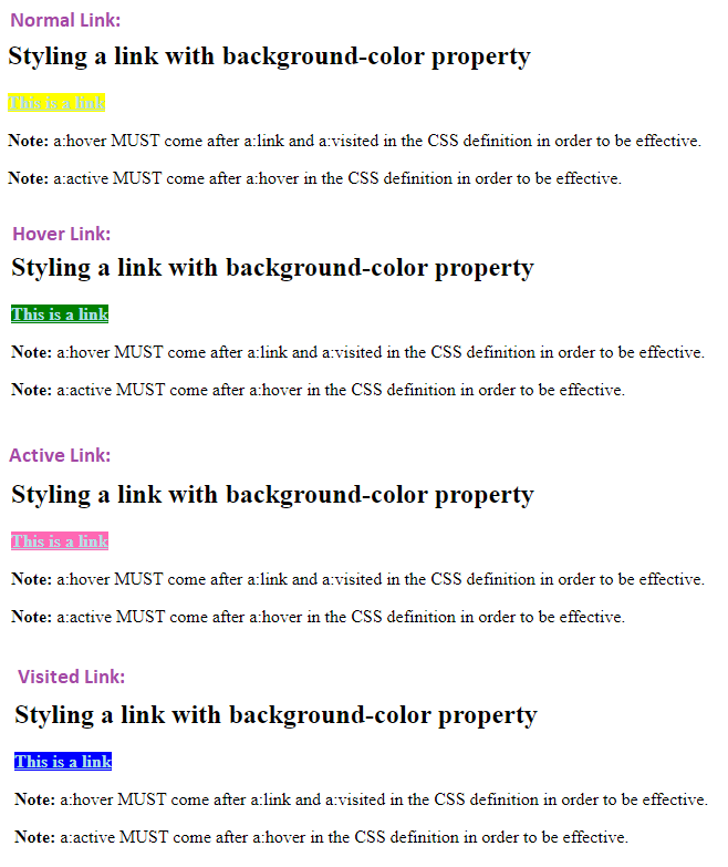
<h2>Styling a link with background-color property</h2>
<p><b><a href="default.asp" target="_blank">This is a link</a></b></p>
<p><b>Note:</b> a:hover MUST come after a:link and a:visited in the CSS definition in order to be effective.</p>
<p><b>Note:</b> a:active MUST come after a:hover in the CSS definition in order to be effective.</p>
</body>
</html>
Result:
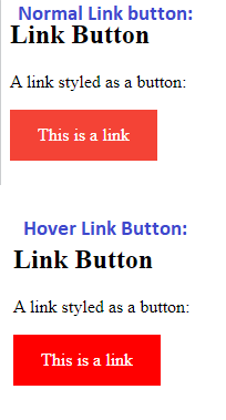
Link Buttons
This example demonstrates a more advanced example where we combine several CSS properties to display links as boxes/buttons:
Example
<!DOCTYPE html>
<html>
<head>
<style>
a:link, a:visited {
  background-color: #f44336;
  color: white;
  padding: 14px 25px;
  text-align: center;
  text-decoration: none;
  display: inline-block;
}
a:hover, a:active {
  background-color: red;
}
</style>
</head>
<body>
<h2>Link Button</h2>
<p>A link styled as a button:</p>
<a href="default.asp" target="_blank">This is a link</a>
</body>
</html>
Result:
More Examples
Example
This example demonstrates how to add other styles to hyperlinks:a.one:link {color: #ff0000;}
a.one:visited {color: #0000ff;}
a.one:hover {color: #ffcc00;}
a.two:link {color: #ff0000;}
a.two:visited {color: #0000ff;}
a.two:hover {font-size: 150%;}
a.three:link {color: #ff0000;}
a.three:visited {color: #0000ff;}
a.three:hover {background: #66ff66;}
a.four:link {color: #ff0000;}
a.four:visited {color: #0000ff;}
a.four:hover {font-family: monospace;}
a.five:link {color: #ff0000; text-decoration: none;}
a.five:visited {color: #0000ff; text-decoration: none;}
a.five:hover {text-decoration: underline;}
Example
Another example of how to create link boxes/buttons:a:link, a:visited {
background-color: white;
color: black;
border: 2px solid green;
padding: 10px 20px;
text-align: center;
text-decoration: none;
display: inline-block;
}
a:hover, a:active {
background-color: green;
color: white;
}
Example
This example demonstrates the different types of cursors (can be useful for links):<span style=”cursor: auto”>auto</span><br>
<span style=”cursor: crosshair”>crosshair</span><br>
<span style=”cursor: default”>default</span><br>
<span style=”cursor: e-resize”>e-resize</span><br>
<span style=”cursor: help”>help</span><br>
<span style=”cursor: move”>move</span><br>
<span style=”cursor: n-resize”>n-resize</span><br>
<span style=”cursor: ne-resize”>ne-resize</span><br>
<span style=”cursor: nw-resize”>nw-resize</span><br>
<span style=”cursor: pointer”>pointer</span><br>
<span style=”cursor: progress”>progress</span><br>
<span style=”cursor: s-resize”>s-resize</span><br>
<span style=”cursor: se-resize”>se-resize</span><br>
<span style=”cursor: sw-resize”>sw-resize</span><br>
<span style=”cursor: text”>text</span><br>
<span style=”cursor: w-resize”>w-resize</span><br>
<span style=”cursor: wait”>wait</span>