

Learn how to style images using CSS.
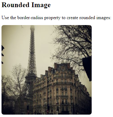
Rounded Images
Use the border-radius property to create rounded images:
Example
Rounded Image:
<!DOCTYPE html>
<html>
<head>
<style>
img {
  border-radius: 8px;
}
</style>
</head>
<body>
<h2>Rounded Image</h2>
<p>Use the border-radius property to create rounded images:</p>
<img src="paris.jpg" alt="Paris" width="300" height="300">
</body>
</html>
Result:
Example
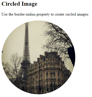
Circled Image:
<!DOCTYPE html>
<html>
<head>
<style>
img {
  border-radius: 50%;
}
</style>
</head>
<body>
<h2>Circled Image</h2>
<p>Use the border-radius property to create circled images:</p>
<img src="paris.jpg" alt="Paris" width="300" height="300">
</body>
</html>
Result:
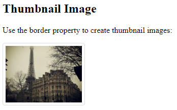
Thumbnail Images
Use the border property to create thumbnail images.
Thumbnail Image:
Example
<!DOCTYPE html>
<html>
<head>
<style>
img {
  border: 1px solid #ddd;
  border-radius: 4px;
  padding: 5px;
  width: 150px;
}
</style>
</head>
<body>
<h2>Thumbnail Image</h2>
<p>Use the border property to create thumbnail images:</p>
<img src="paris.jpg" alt="Paris" style="width:150px">
</body>
</html>
Result:
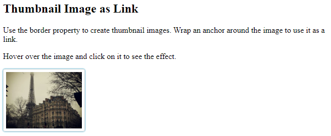
Thumbnail Image as Link:
Example
<!DOCTYPE html>
<html>
<head>
<style>
img {
  border: 1px solid #ddd;
  border-radius: 4px;
  padding: 5px;
  width: 150px;
}
img:hover {
  box-shadow: 0 0 2px 1px rgba(0, 140, 186, 0.5);
}
</style>
</head>
<body>
<h2>Thumbnail Image as Link</h2>
<p>Use the border property to create thumbnail images. Wrap an anchor around the image to use it as a link.</p>
<p>Hover over the image and click on it to see the effect.</p>
<a target="_blank" href="paris.jpg">
  <img src="paris.jpg" alt="Paris" style="width:150px">
</a>
</body>
</html>
Result:
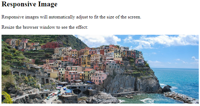
Responsive Images
Responsive images will automatically adjust to fit the size of the screen.
Resize the browser window to see the effect:
If you want an image to scale down if it has to, but never scale up to be larger than its original size, add the following:
Example
<!DOCTYPE html>
<html>
<head>
<style>
img {
  max-width: 100%;
  height: auto;
}
</style>
</head>
<body>
<h2>Responsive Image</h2>
<p>Responsive images will automatically adjust to fit the size of the screen.</p>
<p>Resize the browser window to see the effect:</p>
<img src="img_5terre_wide.jpg" alt="Cinque Terre" width="1000" height="300">
</body>
</html>
Result:
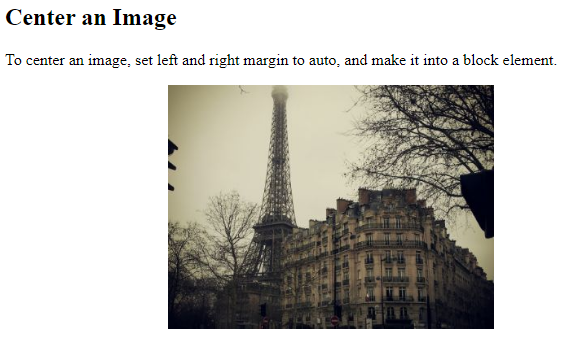
Center an Image
To center an image, set left and right margin to auto and make it into a block element:
Example
<!DOCTYPE html>
<html>
<head>
<style>
img {
  display: block;
  margin-left: auto;
  margin-right: auto;
}
</style>
</head>
<body>
<h2>Center an Image</h2>
<p>To center an image, set left and right margin to auto, and make it into a block element.</p>
<img src="paris.jpg" alt="Paris" style="width:50%">
</body>
</html>
Result:
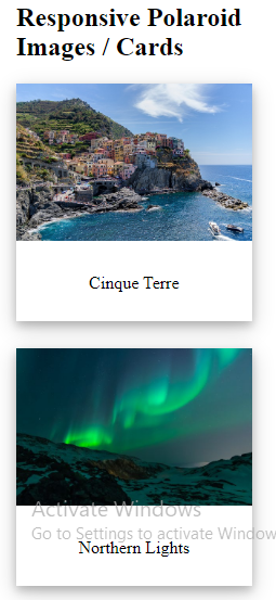
Polaroid Images / Cards
Example
<!DOCTYPE html>
<html>
<head>
<style>
body {margin:25px;}
div.polaroid {
  width: 80%;
  background-color: white;
  box-shadow: 0 4px 8px 0 rgba(0, 0, 0, 0.2), 0 6px 20px 0 rgba(0, 0, 0, 0.19);
  margin-bottom: 25px;
}
div.container {
  text-align: center;
  padding: 10px 20px;
}
</style>
</head>
<body>
<h2>Responsive Polaroid Images / Cards</h2>
<div class="polaroid">
  <img src="img_5terre.jpg" alt="5 Terre" style="width:100%">
  <div class="container">
  <p>Cinque Terre</p>
  </div>
</div>
<div class="polaroid">
  <img src="lights600x400.jpg" alt="Norther Lights" style="width:100%">
  <div class="container">
  <p>Northern Lights</p>
  </div>
</div>
</body>
</html>
Result:
Transparent Image
The opacity property can take a value from 0.0 – 1.0. The lower value, the more transparent:
Example
<!DOCTYPE html>
<html>
<head>
<style>
img {
  opacity: 0.5;
}
</style>
</head>
<body>
<h1>Image Transparency</h1>
<p>The opacity property specifies the transparency of an element. The lower the value, the more transparent:</p>
<p>Image with 50% opacity:</p>
<img src="img_forest.jpg" alt="Forest" width="170" height="100">
</body>
</html>
Result:
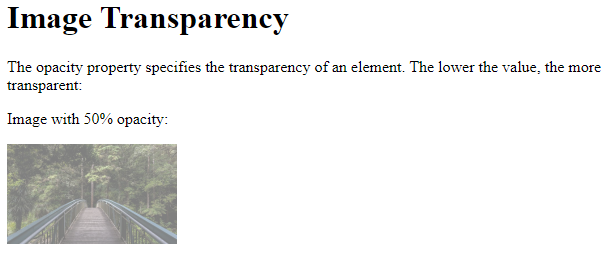
Image Filters
The CSS filter property adds visual effects (like blur and saturation) to an element.
Note: The filter property is not supported in Internet Explorer or Edge 12.
Example
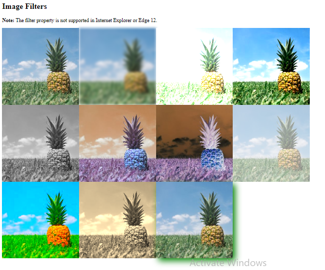
Change the color of all images to black and white (100% gray):
<!DOCTYPE html>
<html>
<head>
<style>
body {
  background-color:white;
}
img {
  width: 33%;
  height: auto;
  float: left;
  max-width: 235px;
}
.blur {filter: blur(4px);}
.brightness {filter: brightness(250%);}
.contrast {filter: contrast(180%);}
.grayscale {filter: grayscale(100%);}
.huerotate {filter: hue-rotate(180deg);}
.invert {filter: invert(100%);}
.opacity {filter: opacity(50%);}
.saturate {filter: saturate(7);}
.sepia {filter: sepia(100%);}
.shadow {filter: drop-shadow(8px 8px 10px green);}
</style>
</head>
<body>
<h2>Image Filters</h2>
<p><strong>Note:</strong> The filter property is not supported in Internet Explorer or Edge 12.</p>
<img src="pineapple.jpg" alt="Pineapple" width="300" height="300">
<img class="blur" src="pineapple.jpg" alt="Pineapple" width="300" height="300">
<img class="brightness" src="pineapple.jpg" alt="Pineapple" width="300" height="300">
<img class="contrast" src="pineapple.jpg" alt="Pineapple" width="300" height="300">
<img class="grayscale" src="pineapple.jpg" alt="Pineapple" width="300" height="300">
<img class="huerotate" src="pineapple.jpg" alt="Pineapple" width="300" height="300">
<img class="invert" src="pineapple.jpg" alt="Pineapple" width="300" height="300">
<img class="opacity" src="pineapple.jpg" alt="Pineapple" width="300" height="300">
<img class="saturate" src="pineapple.jpg" alt="Pineapple" width="300" height="300">
<img class="sepia" src="pineapple.jpg" alt="Pineapple" width="300" height="300">
<img class="shadow" src="pineapple.jpg" alt="Pineapple" width="300" height="300">
</body>
</html>
Result:
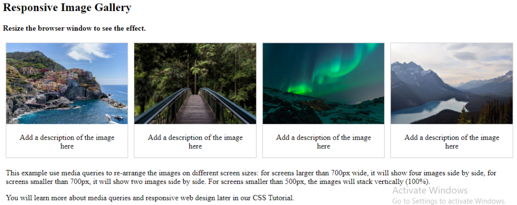
Responsive Image Gallery
CSS can be used to create image galleries. This example use media queries to re-arrange the images on different screen sizes. Resize the browser window to see the effect:
Example
<!DOCTYPE html>
<html>
<head>
<style>
div.gallery {
  border: 1px solid #ccc;
}
div.gallery:hover {
  border: 1px solid #777;
}
div.gallery img {
  width: 100%;
  height: auto;
}
div.desc {
  padding: 15px;
  text-align: center;
}
* {
  box-sizing: border-box;
}
.responsive {
  padding: 0 6px;
  float: left;
  width: 24.99999%;
}
@media only screen and (max-width: 700px) {
  .responsive {
    width: 49.99999%;
    margin: 6px 0;
  }
}
@media only screen and (max-width: 500px) {
  .responsive {
    width: 100%;
  }
}
.clearfix:after {
  content: "";
  display: table;
  clear: both;
}
</style>
</head>
<body>
<h2>Responsive Image Gallery</h2>
<h4>Resize the browser window to see the effect.</h4>
<div class="responsive">
  <div class="gallery">
    <a target="_blank" href="img_5terre.jpg">
      <img src="img_5terre.jpg" alt="Cinque Terre" width="600" height="400">
    </a>
    <div class="desc">Add a description of the image here</div>
  </div>
</div>
<div class="responsive">
  <div class="gallery">
    <a target="_blank" href="img_forest.jpg">
      <img src="img_forest.jpg" alt="Forest" width="600" height="400">
    </a>
    <div class="desc">Add a description of the image here</div>
  </div>
</div>
<div class="responsive">
  <div class="gallery">
    <a target="_blank" href="img_lights.jpg">
      <img src="img_lights.jpg" alt="Northern Lights" width="600" height="400">
    </a>
    <div class="desc">Add a description of the image here</div>
  </div>
</div>
<div class="responsive">
  <div class="gallery">
    <a target="_blank" href="img_mountains.jpg">
      <img src="img_mountains.jpg" alt="Mountains" width="600" height="400">
    </a>
    <div class="desc">Add a description of the image here</div>
  </div>
</div>
<div class="clearfix"></div>
<div style="padding:6px;">
  <p>This example use media queries to re-arrange the images on different screen sizes: for screens larger than 700px wide, it will show four images side by side, for screens smaller than 700px, it will show two images side by side. For screens smaller than 500px, the images will stack vertically (100%).</p>
  <p>You will learn more about media queries and responsive web design later in our CSS Tutorial.</p>
</div>
</body>
</html>
Result: