

Grid Container
To make an HTML element behave as a grid container, you have to set the display property to grid or inline-grid.
Grid containers consist of grid items, placed inside columns and rows.
The grid-template-columns Property
The grid-template-columns property defines the number of columns in your grid layout, and it can define the width of each column.
The value is a space-separated-list, where each value defines the width of the respective column.
If you want your grid layout to contain 4 columns, specify the width of the 4 columns, or “auto” if all columns should have the same width.
Example
Make a grid with 4 columns:
<!DOCTYPE html>
<html>
<head>
<style>
.grid-container {
display: grid;
grid-template-columns: auto auto auto auto;
gap: 10px;
background-color: #2196F3;
padding: 10px;
}
.grid-container > div {
background-color: rgba(255, 255, 255, 0.8);
text-align: center;
padding: 20px 0;
font-size: 30px;
}
</style>
</head>
<body>
<h1>The grid-template-columns Property</h1>
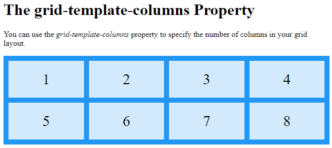
<p>You can use the <em>grid-template-columns</em> property to specify the number of columns in your grid layout.</p>
<div class="grid-container">
<div>1</div>
<div>2</div>
<div>3</div>
<div>4</div>
<div>5</div>
<div>6</div>
<div>7</div>
<div>8</div>
</div>
</body>
</html>
Result:
The grid-template-columns property can also be used to specify the size (width) of the columns.
Example
Set a size for the 4 columns:
<!DOCTYPE html>
<html>
<head>
<style>
.grid-container {
display: grid;
grid-template-columns: 80px 200px auto 30px;
gap: 10px;
background-color: #2196F3;
padding: 10px;
}
.grid-container > div {
background-color: rgba(255, 255, 255, 0.8);
text-align: center;
padding: 20px 0;
font-size: 30px;
}
</style>
</head>
<body>
<h1>The grid-template-columns Property</h1>
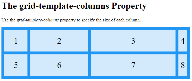
<p>Use the <em>grid-template-columns</em> property to specify the size of each column.</p>
<div class="grid-container">
<div>1</div>
<div>2</div>
<div>3</div>
<div>4</div>
<div>5</div>
<div>6</div>
<div>7</div>
<div>8</div>
</div>
</body>
</html>
Result:
The grid-template-rows Property
The grid-template-rows property defines the height of each row.
The value is a space-separated-list, where each value defines the height of the respective row:
Example
<!DOCTYPE html>
<html>
<head>
<style>
.grid-container {
display: grid;
grid-template-columns: auto auto auto;
grid-template-rows: 80px 200px;
gap: 10px;
background-color: #2196F3;
padding: 10px;
}
grid-container > div {
background-color: rgba(255, 255, 255, 0.8);
text-align: center;
padding: 20px 0;
font-size: 30px;
}
</style>
</head>
<body>
<h1>The grid-template-rows Property</h1>
<div class="grid-container">
<div>1</div>
<div>2</div>
<div>3</div>
<div>4</div>
<div>5</div>
<div>6</div>
</div>
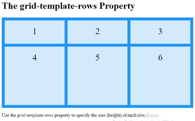
<p>Use the <em>grid-template-rows</em> property to specify the size (height) of each row.</p>
</body>
</html>
Result:
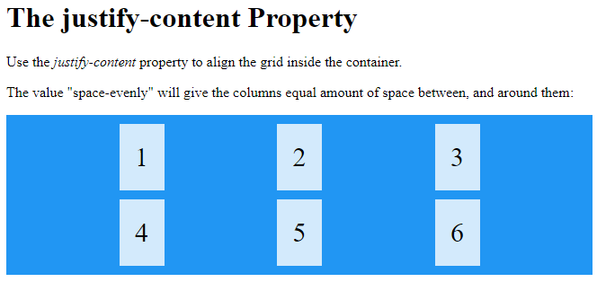
The justify-content Property
The justify-content property is used to align the whole grid inside the container.
Example
<!DOCTYPE html>
<html>
<head>
<style>
.grid-container {
  display: grid;
  justify-content: space-evenly;
  grid-template-columns: 50px 50px 50px; /*Make the grid smaller than the container*/
  gap: 10px;
  background-color: #2196F3;
  padding: 10px;
}
.grid-container > div {
  background-color: rgba(255, 255, 255, 0.8);
  text-align: center;
  padding: 20px 0;
  font-size: 30px;
}
</style>
</head>
<body>
<h1>The justify-content Property</h1>
<p>Use the <em>justify-content</em> property to align the grid inside the container.</p>
<p>The value "space-evenly" will give the columns equal amount of space between, and around them:</p>
<div class="grid-container">
  <div>1</div>
  <div>2</div>
  <div>3</div>
  <div>4</div>
  <div>5</div>
  <div>6</div>
</div>
</body>
</html>
Result:
Example
<!DOCTYPE html>
<html>
<head>
<style>
.grid-container {
display: grid;
height: 400px;
align-content: space-evenly;
grid-template-columns: auto auto auto;
gap: 10px;
background-color: #2196F3;
padding: 10px;
}
.grid-container > div {
background-color: rgba(255, 255, 255, 0.8);
text-align: center;
padding: 20px 0;
font-size: 30px;
}
</style>
</head>
<body>
<h1>The align-content Property</h1>
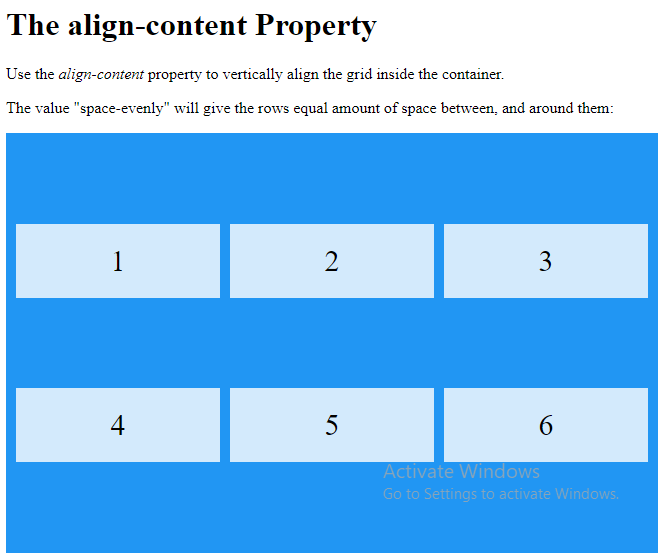
<p>Use the <em>align-content</em> property to vertically align the grid inside the container.</p>
<p>The value "space-evenly" will give the rows equal amount of space between, and around them:</p>
<div class="grid-container">
<div>1</div>
<div>2</div>
<div>3</div>
<div>4</div>
<div>5</div>
<div>6</div>
</div>
</body>
</html>
Result:
Example
<!DOCTYPE html>
<html>
<head>
<style>
.grid-container {
display: grid;
height: 400px;
align-content: space-around;
grid-template-columns: auto auto auto;
gap: 10px;
background-color: #2196F3;
padding: 10px;
}
.grid-container > div {
background-color: rgba(255, 255, 255, 0.8);}
text-align: center;
padding: 20px 0;
font-size: 30px;
}
</style>
</head>
<body>
<h1>The align-content Property</h1>
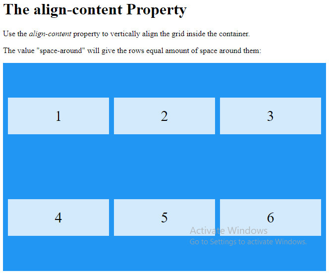
<p>Use the <em>align-content</em> property to vertically align the grid inside the container.</p>
<p>The value "space-around" will give the rows equal amount of space around them:</p>
<div class="grid-container">
<div>1</div>
<div>2</div>
<div>3</div>
<div>4</div>
<div>5</div>
<div>6</div>
</div>
</body>
</html>
Result:
Example
<!DOCTYPE html>
<html>
<head>
<style>
.grid-container {
display: grid;
height: 400px;
align-content: space-between;
grid-template-columns: auto auto auto;
gap: 10px;
background-color: #2196F3;
padding: 10px;
}
.grid-container > div {
background-color: rgba(255, 255, 255, 0.8);
text-align: center;
padding: 20px 0;
font-size: 30px;
}
</style>
</head>
<body>
<h1>The align-content Property</h1>
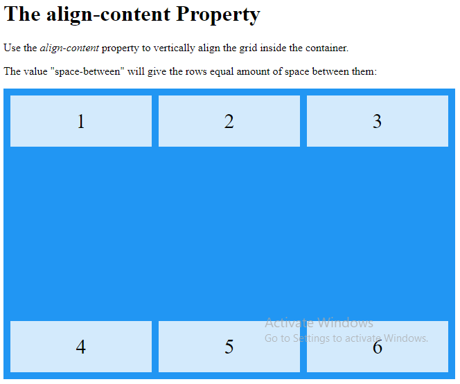
<p>Use the <em>align-content</em> property to vertically align the grid inside the container.</p>
<p>The value "space-between" will give the rows equal amount of space between them:</p>
<div class="grid-container">
<div>1</div>
<div>2</div>
<div>3</div>
<div>4</div>
<div>5</div>
<div>6</div>
</div>
</body>
</html>
Result:
Example
<!DOCTYPE html>
<html>
<head>
<style>
.grid-container {
display: grid;
height: 400px;
align-content: start;
grid-template-columns: auto auto auto;
gap: 10px;
background-color: #2196F3;
padding: 10px;
}
.grid-container > div {
background-color: rgba(255, 255, 255, 0.8);
text-align: center;
padding: 20px 0;
font-size: 30px;
}
</style>
</head>
<body>
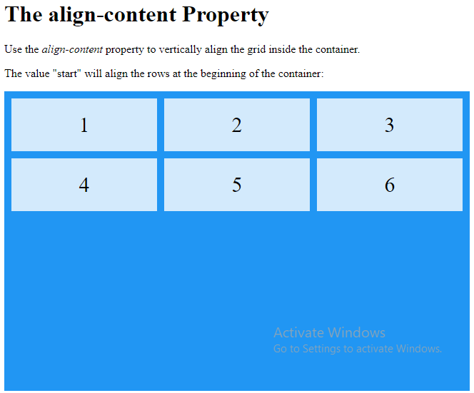
<h1>The align-content Property</h1>
<p>Use the <em>align-content</em> property to vertically align the grid inside the container.</p>
<p>The value "start" will align the rows at the beginning of the container:</p>
<div class="grid-container">
<div>1</div>
<div>2</div>
<div>3</div>
<div>4</div>
<div>5</div>
<div>6</div>
</div>
</body>
</html>
Result:
Example
<!DOCTYPE html>
<html>
<head>
<style>
.grid-container {
display: grid;
height: 400px;
align-content: end;
grid-template-columns: auto auto auto;
gap: 10px;
background-color: #2196F3;
padding: 10px;
}
.grid-container > div {
background-color: rgba(255, 255, 255, 0.8);
text-align: center;
padding: 20px 0;
font-size: 30px;
}
</style>
</head>
<body>
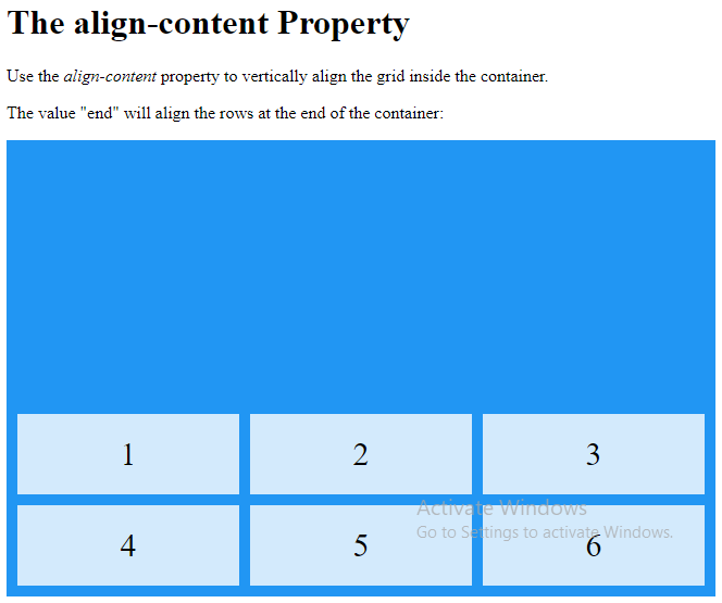
<h1>The align-content Property</h1>
<p>Use the <em>align-content</em> property to vertically align the grid inside the container.</p>
<p>The value "end" will align the rows at the end of the container:</p>
<div class="grid-container">
<div>1</div>
<div>2</div>
<div>3</div>
<div>4</div>
<div>5</div>
<div>6</div>
</div>
</body>
</html>
Result: