

With CSS masking you create a mask layer to place over an element to partially or fully hide portions of the element.
The CSS mask-image Property
The CSS mask-image property specifies a mask layer image.
The mask layer image can be a PNG image, an SVG image, a CSS gradient, or an SVG <mask> element.
Browser Support
Note: Most browsers only have partial support for CSS masking. You will need to use the -webkit- prefix in addition to the standard property in most browsers.
The numbers in the table below specify the first browser version that fully supports the property. Numbers followed by -webkit- specify the first version that worked with a prefix.
| Property | Google Chrome | Internet Explorer | Mozilla Firefox | Safari | Opera |
|---|---|---|---|---|---|
| mask-image | 4.0 -webkit- | 79.0 -webkit- | 53.0 | 4.0 -webkit- | 15.0 -webkit- |
Use an Image as the Mask Layer
To use a PNG or an SVG image as the mask layer, use a url() value to pass in the mask layer image.
The mask image needs to have a transparent or semi-transparent area. Black indicates fully transparent.
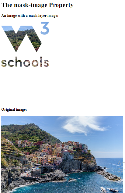
Here is the mask image (a PNG image) we will use:
Here is an image from Cinque Terre, in Italy:
Now, we apply the mask image (the PNG image above) as the mask layer for the image from Cinque Terre, Italy:
Example
Here is the source code:
<!DOCTYPE html>
<html>
<head>
<style>
.mask1 {
 -webkit-mask-image: url(w3logo.png);
  mask-image: url(w3logo.png);
  -webkit-mask-repeat: no-repeat;
  mask-repeat: no-repeat;
}
</style>
</head>
<body>
<h1>The mask-image Property</h1>
<h3>An image with a mask layer image:</h3>
<div class="mask1">
<img src="img_5terre.jpg" alt="Cinque Terre" width="600" height="400">
</div>
<h3>Original image:</h3>
<img src="img_5terre.jpg" alt="Cinque Terre" width="600" height="400">
</body>
</html>
Result:
Example Explained
The mask-image property specifies the image to be used as a mask layer for an element.
The mask-repeat property specifies if or how a mask image will be repeated. The no-repeat value indicates that the mask image will not be repeated (the mask image will only be shown once).
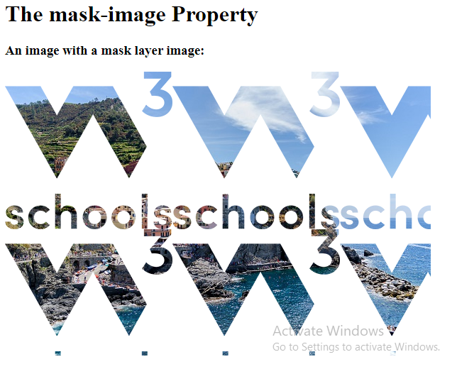
Another Example
If we omit the mask-repeat property, the mask image will be repeated all over the image from Cinque Terre, Italy:
Example
Here is the source code:
<!DOCTYPE html>
<html>
<head>
<style>
.mask1 {
  -webkit-mask-image: url(w3logo.png);
  mask-image: url(w3logo.png);
}
</style>
</head>
<body>
<h1>The mask-image Property</h1>
<h3>An image with a mask layer image:</h3>
<div class="mask1">
<img src="img_5terre.jpg" alt="Cinque Terre" width="600" height="400">
</div>
</body>
</html>
Result:
Use Gradients as the Mask Layer
CSS linear and radial gradients can also be used as mask images.
Linear Gradient Examples
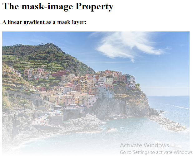
Here, we use a linear-gradient as the mask layer for our image. This linear gradient goes from top (black) to bottom (transparent):
Example
Use a linear gradient as a mask layer:
<!DOCTYPE html>
<html>
<head>
<style>
.mask1 {
  -webkit-mask-image: linear-gradient(black, transparent);
  mask-image: linear-gradient(black, transparent);
}
</style>
</head>
<body>
<h1>The mask-image Property</h1>
<h3>A linear gradient as a mask layer:</h3>
<div class="mask1">
<img src="img_5terre.jpg" alt="Cinque Terre" width="600" height="400">
</div>
</body>
</html>
Result:
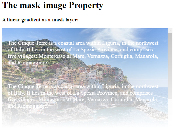
Here, we use a linear-gradient along with text masking as the mask layer for our image:
Example
Use a linear gradient along with text masking as a mask layer:
<!DOCTYPE html>
<html>
<head>
<style>
p {
  font-size: 20px;
  padding: 20px;
  color: white;
}
.mask1 {
  max-width: 600px;
  height: 350px;
  overflow-y: scroll;
  background: url(img_5terre.jpg) no-repeat;
  -webkit-mask-image: linear-gradient(black, transparent);
  mask-image: linear-gradient (black, transparent);
}
</style>
</head>
<body>
<h1>The mask-image Property</h1>
<h3>A linear gradient as a mask layer:</h3>
<div class="mask1">
<p>The Cinque Terre is a coastal area within Liguria, in the northwest of Italy. It lies in the west of La Spezia Province, and comprises five villages: Monterosso al Mare, Vernazza, Corniglia, Manarola, and Riomaggiore.</p>
<p>The Cinque Terre is a coastal area within Liguria, in the northwest of Italy. It lies in the west of La Spezia Province, and comprises five villages: Monterosso al Mare, Vernazza, Corniglia, Manarola, and Riomaggiore.</p>
<p>The Cinque Terre is a coastal area within Liguria, in the northwest of Italy. It lies in the west of La Spezia Province, and comprises five villages: Monterosso al Mare, Vernazza, Corniglia, Manarola, and Riomaggiore.</p>
</div>
</body>
</html>
Result:
Radial Gradient Examples
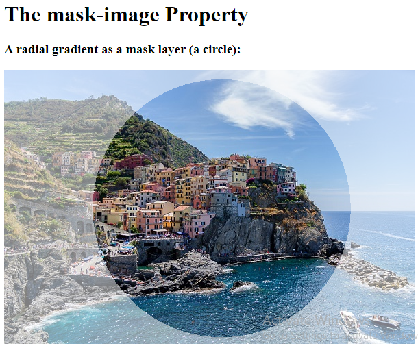
Here, we use a radial-gradient (shaped as a circle) as the mask layer for our image:
Example
Use a radial gradient as a mask layer (a circle):
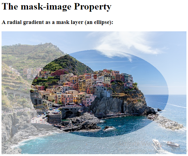
Here, we use a radial-gradient (shaped as an ellipse) as the mask layer for our image:
Example
Use another radial gradient as a mask layer (an ellipse):
<!DOCTYPE html>
<html>
<head>
<style>
.mask3 {
  -webkit-mask-image: radial-gradient(ellipse, black 50%, rgba(0, 0, 0, 0.5) 50%);
  mask-image: radial-gradient(ellipse, black 50%, rgba(0, 0, 0, 0.5));
}
</style>
</head>
<body>
<h1>The mask-image Property</h1>
<h3>A radial gradient as a mask layer (an ellipse):</h3>
<div class="mask3">
<img src="img_5terre.jpg" alt="Cinque Terre" width="600" height="400">
</div>
<h3>Original image:</h3>
<img src="img_5terre.jpg" alt="Cinque Terre" width="600" height="400">
</body>
</html>
Result:
Use SVG as the Mask Layer
The SVG <mask> element can be used inside an SVG graphic to create masking effects.
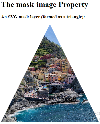
Here, we use the SVG <mask> element to create different mask layers for our image:
Example
An SVG mask layer (formed as a triangle):
<!DOCTYPE html>
<html>
<head>
</head>
<body>
<h1>The mask-image Property</h1>
<h3>An SVG mask layer (formed as a triangle):</h3>
<svg width="600" height="400">
  <mask id="svgmask1">
    <polygon fill="#ffffff" points="200 0, 400 400, 0 400"></polygon>
  </mask>
  <image xmlns:xlink="http://www.w3.org/1999/xlink" xlink:href="img_5terre.jpg" mask="url(#svgmask1)"></image>
</svg>
</body>
</html>
Result:
Example
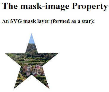
An SVG mask layer (formed as a star):
<!DOCTYPE html>
<html>
<head>
</head>
<body>
<h1>The mask-image Property</h1>
<h3>An SVG mask layer (formed as a star):</h3>
<svg width="600" height="400">
  <mask id="svgmask2">
    <polygon fill="#ffffff" points="100,10 40,198 190,78 10,78 160,198"></polygon>
  </mask>
  <image xmlns:xlink="http://www.w3.org/1999/xlink" xlink:href="img_5terre.jpg" mask="url(#svgmask2)"></image>
</svg>
</body>
</html>
Result:
Example
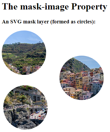
An SVG mask layer (formed as circles):
<!DOCTYPE html>
<html>
<head>
</head>
<body>
<h1>The mask-image Property</h1>
<h3>An SVG mask layer (formed as circles):</h3>
<svg width="600" height="400">
  <mask id="svgmask3">
    <circle fill="#ffffff" cx="75" cy="75" r="75"></circle>
    <circle fill="#ffffff" cx="80" cy="260" r="75"></circle>
    <circle fill="#ffffff" cx="270" cy="160" r="75"></circle>
  </mask>
  <image xmlns:xlink="http://www.w3.org/1999/xlink" xlink:href="img_5terre.jpg" mask="url(#svgmask3)"></image>
</svg>
</body>
</html>
Result: