

CSS Multiple Backgrounds
CSS allows you to add multiple background images for an element, through the background-image property.
The different background images are separated by commas, and the images are stacked on top of each other, where the first image is closest to the viewer.
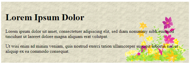
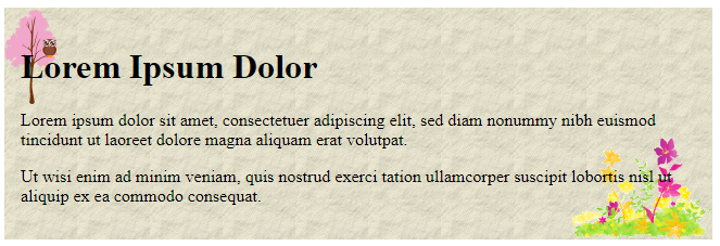
The following example has two background images, the first image is a flower (aligned to the bottom and right) and the second image is a paper background (aligned to the top-left corner):
Example
<!DOCTYPE html>
<html>
<head>
<style>
#example1 {
background-image: url(img_flwr.gif), url(paper.gif);
background-position: right bottom, left top;
background-repeat: no-repeat, repeat;
padding: 15px;
}
</style>
</head>
<body>
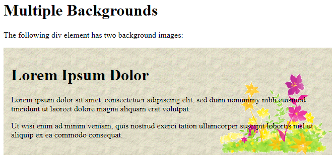
<h1>Multiple Backgrounds</h1>
<p>The following div element has two background images:</p>
<div id="example1">
<h1>Lorem Ipsum Dolor</h1>
<p>Lorem ipsum dolor sit amet, consectetuer adipiscing elit, sed diam nonummy nibh euismod tincidunt ut laoreet dolore magna aliquam erat volutpat.</p>
<p>Ut wisi enim ad minim veniam, quis nostrud exerci tation ullamcorper suscipit lobortis nisl ut aliquip ex ea commodo consequat.</p>
</div>
</body>
</html>
Result:
Multiple background images can be specified using either the individual background properties (as above) or the background shorthand property.
The following example uses the background shorthand property (same result as example above):
Example
<!DOCTYPE html>
<html>
<head>
<style>
#example1 {
  background: url(img_flwr.gif) right bottom no-repeat, url(paper.gif) left top repeat;
  padding: 15px;
}
</style>
</head>
<body>
<div id="example1">
  <h1>Lorem Ipsum Dolor</h1>
  <p>Lorem ipsum dolor sit amet, consectetuer adipiscing elit, sed diam nonummy nibh euismod tincidunt ut laoreet dolore magna aliquam erat volutpat.</p>
  <p>Ut wisi enim ad minim veniam, quis nostrud exerci tation ullamcorper suscipit lobortis nisl ut aliquip ex ea commodo consequat.</p>
</div>
</body>
</html>
Result:
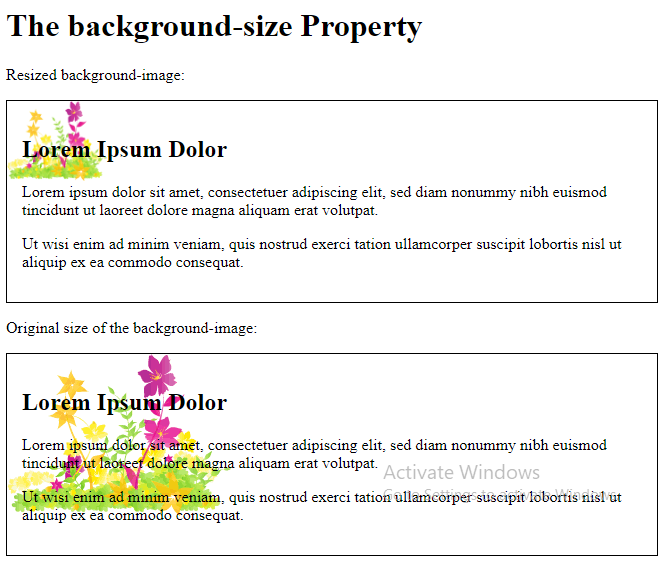
CSS Background Size
The CSS background-size property allows you to specify the size of background images.
The size can be specified in lengths, percentages, or by using one of the two keywords: contain or cover.
The following example resizes a background image to much smaller than the original image (using pixels):
Here is the code:
Example
<!DOCTYPE html>
<html>
<head>
<style>
#example1 {
  border: 1px solid black;
  background: url(img_flwr.gif);
  background-size: 100px 80px;
  background-repeat: no-repeat;
  padding: 15px;
}
#example2 {
  border: 1px solid black;
  background: url(img_flwr.gif);
  background-repeat: no-repeat;
  padding: 15px;
}
</style>
</head>
<body>
<h1>The background-size Property</h1>
<p>Resized background-image:</p>
<div id="example1">
  <h2>Lorem Ipsum Dolor</h2>
  <p>Lorem ipsum dolor sit amet, consectetuer adipiscing elit, sed diam nonummy nibh euismod tincidunt ut laoreet dolore magna aliquam erat volutpat.</p>
  <p>Ut wisi enim ad minim veniam, quis nostrud exerci tation ullamcorper suscipit lobortis nisl ut aliquip ex ea commodo consequat.</p>
</div>
<p>Original size of the background-image:</p>
<div id="example2">
  <h2>Lorem Ipsum Dolor</h2>
  <p>Lorem ipsum dolor sit amet, consectetuer adipiscing elit, sed diam nonummy nibh euismod tincidunt ut laoreet dolore magna aliquam erat volutpat.</p>
  <p>Ut wisi enim ad minim veniam, quis nostrud exerci tation ullamcorper suscipit lobortis nisl ut aliquip ex ea commodo consequat.</p>
</div>
</body>
</html>
Result:
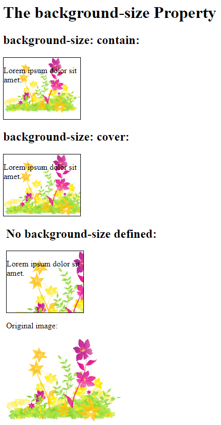
The two other possible values for background-size are contain and cover.
The contain keyword scales the background image to be as large as possible (but both its width and its height must fit inside the content area). As such, depending on the proportions of the background image and the background positioning area, there may be some areas of the background which are not covered by the background image.
The cover keyword scales the background image so that the content area is completely covered by the background image (both its width and height are equal to or exceed the content area). As such, some parts of the background image may not be visible in the background positioning area.
The following example illustrates the use of contain and cover:
Example
<!DOCTYPE html>
<html>
<head>
<style>
.div1 {
   border: 1px solid black;
   height: 120px;
   width: 150px;
   background: url(img_flwr.gif);
   background-repeat: no-repeat;
   background-size: contain;
 }
 .div2 {
   border: 1px solid black;
   height: 120px;
   width: 150px;
   background: url(img_flwr.gif);
   background-repeat: no-repeat;
   background-size: cover;
 }
 .div3 {
   border: 1px solid black;
   height: 120px;
   width: 150px;
   background: url(img_flwr.gif);
   background-repeat: no-repeat;
 }
</style>
</head>
<body>
<h1>The background-size Property</h1>
<h2>background-size: contain:</h2>
<div class="div1">
<p>Lorem ipsum dolor sit amet.</p>
</div>
<h2>background-size: cover:</h2>
<div class="div2">
<p>Lorem ipsum dolor sit amet.</p>
</div>
<h2>No background-size defined:</h2>
<div class="div3">
<p>Lorem ipsum dolor sit amet.</p>
</div>
<p>Original image:</p>
<img src="img_flwr.gif" alt="Flowers" width="224" height="162">
</body>
</html>
Result:
Define Sizes of Multiple Background Images
The background-size property also accepts multiple values for background size (using a comma-separated list), when working with multiple backgrounds.
The following example has three background images specified, with different background-size value for each image:
Example
<!DOCTYPE html>
<html>
<head>
<style>
#example1 {
  background: url(img_tree.gif) left top no-repeat, url(img_flwr.gif) right bottom no-repeat, url(paper.gif) left top repeat;
  padding: 15px;
  background-size: 50px, 130px, auto;
}
</style>
</head>
<body>
<div id="example1">
  <h1>Lorem Ipsum Dolor</h1>
  <p>Lorem ipsum dolor sit amet, consectetuer adipiscing elit, sed diam nonummy nibh euismod tincidunt ut laoreet dolore magna aliquam erat volutpat.</p>
  <p>Ut wisi enim ad minim veniam, quis nostrud exerci tation ullamcorper suscipit lobortis nisl ut aliquip ex ea commodo consequat.</p>
</div>
</body>
</html>
Result:
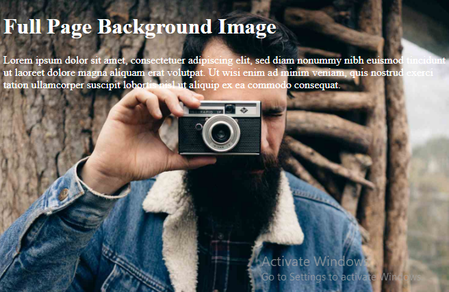
Full Size Background Image
Now we want to have a background image on a website that covers the entire browser window at all times.
The requirements are as follows:
- Fill the entire page with the image (no white space)
- Scale image as needed
- Center image on page
- Do not cause scrollbars
The following example shows how to do it; Use the <html> element (the <html> element is always at least the height of the browser window). Then set a fixed and centered background on it. Then adjust its size with the background-size property:
Example
<!DOCTYPE html>
<html>
<head>
<style>
html {
  background: url(img_man.jpg) no-repeat center fixed;
  background-size: cover;
}
body {
  color: white;
}
</style>
</head>
<body>
<h1>Full Page Background Image</h1>
<p>Lorem ipsum dolor sit amet, consectetuer adipiscing elit, sed diam nonummy nibh euismod tincidunt ut laoreet dolore magna aliquam erat volutpat. Ut wisi enim ad minim veniam, quis nostrud exerci tation ullamcorper suscipit lobortis nisl ut aliquip ex ea commodo consequat.</p>
</body>
</html>
Result:
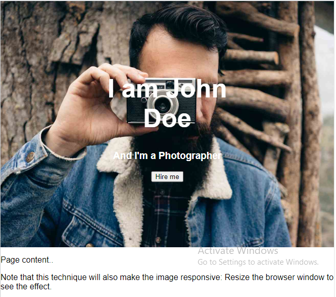
Hero Image
You could also use different background properties on a <div> to create a hero image (a large image with text), and place it where you want.
Example
<!DOCTYPE html>
<html>
<head>
<meta name="viewport" content="width=device-width, initial-scale=1">
<style>
body {
  margin: 0;
  font-family: Arial, Helvetica, sans-serif;
}
.hero-image {
  background: url(img_man.jpg) no-repeat center;
  background-size: cover;
  height: 500px;
  position: relative;
}
.hero-text {
  text-align: center;
  position: absolute;
  top: 50%;
  left: 50%;
  transform: translate(-50%, -50%);
  color: white;
}
</style>
</head>
<body>
<div class="hero-image">
  <div class="hero-text">
    <h1 style="font-size:50px">I am John Doe</h1>
    <h3>And I'm a Photographer</h3>
    <button>Hire me</button>
  </div>
</div>
<p>Page content..</p>
<p>Note that this technique will also make the image responsive: Resize the browser window to see the effect.</p>
</body>
</html>
Result:
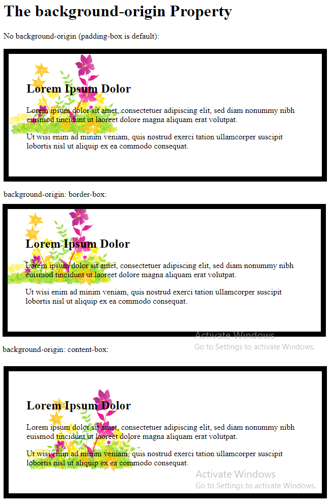
CSS background-origin Property
The CSS background-origin property specifies where the background image is positioned.
The property takes three different values:
- border-box – the background image starts from the upper left corner of the border
- padding-box – (default) the background image starts from the upper left corner of the padding edge
- content-box – the background image starts from the upper left corner of the content
The following example illustrates the background-origin property:
Example
<!DOCTYPE html>
<html>
<head>
<style>
#example1 {
border: 10px solid black;
padding: 35px;
background: url(img_flwr.gif);
background-repeat: no-repeat;
}
#example2 {
border: 10px solid black;
padding: 35px;
background: url(img_flwr.gif);
background-repeat: no-repeat;
background-origin: border-box;
}
#example3 {
border: 10px solid black;
padding: 35px;
background: url(img_flwr.gif);
background-repeat: no-repeat;
background-origin: content-box;
}
</style>
</head>
<body>
<h1>The background-origin Property</h1>
<p>No background-origin (padding-box is default):</p>
<div id="example1">
<h2>Lorem Ipsum Dolor</h2>
<p>Lorem ipsum dolor sit amet, consectetuer adipiscing elit, sed diam nonummy nibh euismod tincidunt ut laoreet dolore magna aliquam erat volutpat.</p>
<p>Ut wisi enim ad minim veniam, quis nostrud exerci tation ullamcorper suscipit lobortis nisl ut aliquip ex ea commodo consequat.</p>
</div>
<p>background-origin: border-box:</p>
<div id="example2">
<h2>Lorem Ipsum Dolor</h2>
<p>Lorem ipsum dolor sit amet, consectetuer adipiscing elit, sed diam nonummy nibh euismod tincidunt ut laoreet dolore magna aliquam erat volutpat.</p>
<p>Ut wisi enim ad minim veniam, quis nostrud exerci tation ullamcorper suscipit lobortis nisl ut aliquip ex ea commodo consequat.</p>
</div>
<p>background-origin: content-box:</p>
<div id="example3">
<h2>Lorem Ipsum Dolor</h2>
<p>Lorem ipsum dolor sit amet, consectetuer adipiscing elit, sed diam nonummy nibh euismod tincidunt ut laoreet dolore magna aliquam erat volutpat.</p>
<p>Ut wisi enim ad minim veniam, quis nostrud exerci tation ullamcorper suscipit lobortis nisl ut aliquip ex ea commodo consequat.</p>
</div>
</body>
</html>
Result:
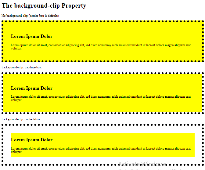
CSS background-clip Property
The CSS background-clip property specifies the painting area of the background.
The property takes three different values:
- border-box – (default) the background is painted to the outside edge of the border
- padding-box – the background is painted to the outside edge of the padding
- content-box – the background is painted within the content box
The following example illustrates the background-clip property:
Example
<!DOCTYPE html>
<html>
<head>
<style>
#example1 {
  border: 10px dotted black;
  padding: 35px;
  background: yellow;
}
#example2 {
  border: 10px dotted black;
  padding: 35px;
  background: yellow;
  background-clip: padding-box;
}
#example3 {
  border: 10px dotted black;
  padding: 35px;
  background: yellow;
  background-clip: content-box;
}
</style>
</head>
<body>
<h1>The background-clip Property</h1>
<p>No background-clip (border-box is default):</p>
<div id="example1">
  <h2>Lorem Ipsum Dolor</h2>
  <p>Lorem ipsum dolor sit amet, consectetuer adipiscing elit, sed diam nonummy nibh euismod tincidunt ut laoreet dolore magna aliquam erat volutpat.</p>
</div>
<p>background-clip: padding-box:</p>
<div id="example2">
  <h2>Lorem Ipsum Dolor</h2>
  <p>Lorem ipsum dolor sit amet, consectetuer adipiscing elit, sed diam nonummy nibh euismod tincidunt ut laoreet dolore magna aliquam erat volutpat.</p>
</div>
<p>background-clip: content-box:</p>
<div id="example3">
  <h2>Lorem Ipsum Dolor</h2>
  <p>Lorem ipsum dolor sit amet, consectetuer adipiscing elit, sed diam nonummy nibh euismod tincidunt ut laoreet dolore magna aliquam erat volutpat.</p>
</div>
</body>
</html>
Result: