

Website Layout
A website is often divided into headers, menus, content and a footer:
There are tons of different layout designs to choose from. However, the structure above, is one of the most common, and we will take a closer look at it in this tutorial.
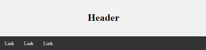
Header
A header is usually located at the top of the website (or right below a top navigation menu). It often contains a logo or the website name:
Example
<!DOCTYPE html>
<html lang="en">
<head>
<title>CSS Website Layout</title>
<meta charset="utf-8">
<meta name="viewport" content="width=device-width, initial-scale=1">
<style>
body {
  margin: 0;
}
/* Style the header */
.header {
  background-color: #f1f1f1;
  padding: 20px;
  text-align: center;
}
</style>
</head>
<body>
<div class="header">
  <h1>Header</h1>
</div>
</body>
</html>
Result:

Navigation Bar
A navigation bar contains a list of links to help visitors navigating through your website:
Example
<!DOCTYPE html>
<html lang="en">
<head>
<title>CSS Website Layout</title>
<meta charset="utf-8">
<meta name="viewport" content="width=device-width, initial-scale=1">
<style>
* {
box-sizing: border-box;
}
body {
margin: 0;
}
/* Style the header */
.header {
background-color: #f1f1f1;
padding: 20px;
text-align: center;
}
/* Style the top navigation bar */
.topnav {
overflow: hidden;
background-color: #333;
}
/* Style the topnav links */
.topnav a {
float: left;
display: block;
color: #f2f2f2;
text-align: center;
padding: 14px 16px;
text-decoration: none;
}
/* Change color on hover */
.topnav a:hover {
background-color: #ddd;
color: black;
}
</style>
</head>
<body>
<div class="header">
<h1>Header</h1>
</div>
<div class="topnav">
<a href="#">Link</a>
<a href="#">Link</a>
<a href="#">Link</a>
</div>
</body>
</html>
Content
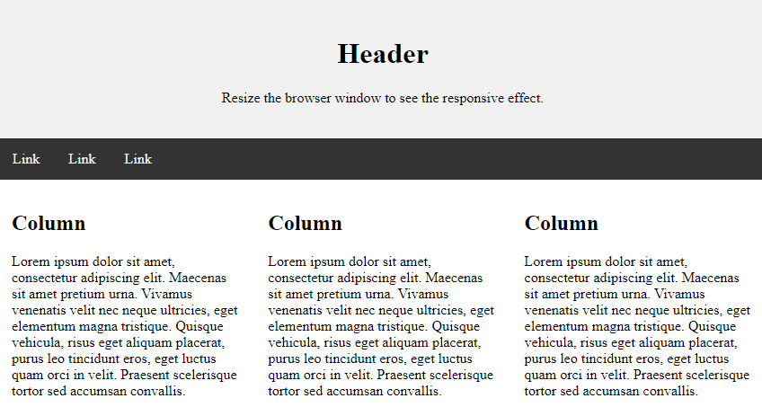
The layout in this section, often depends on the target users. The most common layout is one (or combining them) of the following:
- 1-column (often used for mobile browsers)
- 2-column (often used for tablets and laptops)
- 3-column layout (only used for desktops)
We will create a 3-column layout, and change it to a 1-column layout on smaller screens:
Example
<!DOCTYPE html>
<html lang="en">
<head>
<title>CSS Website Layout</title>
<meta charset="utf-8">
<meta name="viewport" content="width=device-width, initial-scale=1">
<style>
 {
 box-sizing: border-box;
 }
 body {
   margin: 0;
 }
 /* Style the header */
 .header {
   background-color: #f1f1f1;
   padding: 20px;
   text-align: center;
 }
 /* Style the top navigation bar */
 .topnav {
   overflow: hidden;
   background-color: #333;
 }
 /* Style the topnav links */
 .topnav a {
   float: left;
   display: block;
   color: #f2f2f2;
   text-align: center;
   padding: 14px 16px;
   text-decoration: none;
 }
 /* Change color on hover */
 .topnav a:hover {
   background-color: #ddd;
   color: black;
 }
 /* Create three equal columns that floats next to each other */
 .column {
   float: left;
   width: 33.33%;
   padding: 15px;
 }
 /* Clear floats after the columns */
 .row:after {
   content: "";
   display: table;
   clear: both;
 }
 /* Responsive layout - makes the three columns stack on top of each other instead of next to each other */
 @media screen and (max-width:600px) {
   .column {
     width: 100%;
   }
 }
</style>
</head>
<body>
<div class="header">
<h1>Header</h1>
<p>Resize the browser window to see the responsive effect.</p>
</div>
<div class="topnav">
  <a href="#">Link</a>
  <a href="#">Link</a>
  <a href="#">Link</a>
</div>
<div class="row">
  <div class="column">
    <h2>Column</h2>
    <p>Lorem ipsum dolor sit amet, consectetur adipiscing elit. Maecenas sit amet pretium urna. Vivamus venenatis velit nec neque ultricies, eget elementum magna tristique. Quisque vehicula, risus eget aliquam placerat, purus leo tincidunt eros, eget luctus quam orci in velit. Praesent scelerisque tortor sed accumsan convallis.</p>
  </div>
 <div class="column">
    <h2>Column</h2>
    <p>Lorem ipsum dolor sit amet, consectetur adipiscing elit. Maecenas sit amet pretium urna. Vivamus venenatis velit nec neque ultricies, eget elementum magna tristique. Quisque vehicula, risus eget aliquam placerat, purus leo tincidunt eros, eget luctus quam orci in velit. Praesent scelerisque tortor sed accumsan convallis.</p>
  </div>
</div>
</body>
</html>
Result:
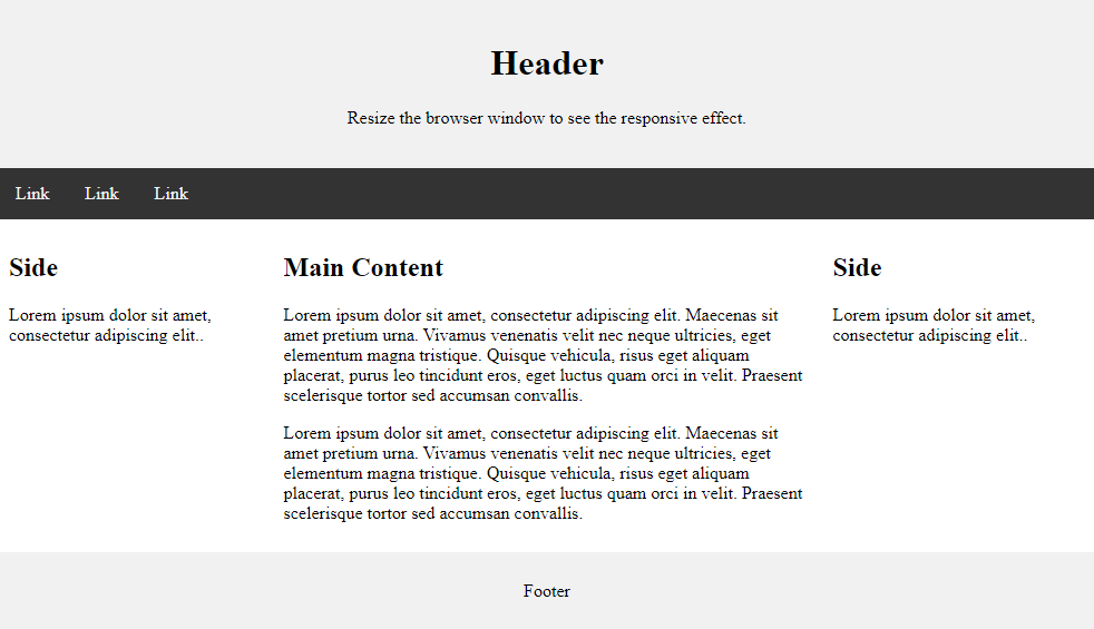
Unequal Columns
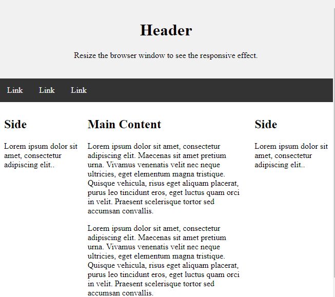
The main content is the biggest and the most important part of your site.
It is common with unequal column widths, so that most of the space is reserved for the main content. The side content (if any) is often used as an alternative navigation or to specify information relevant to the main content. Change the widths as you like, only remember that it should add up to 100% in total:
Example
<!DOCTYPE html>
<html lang="en">
<head>
<title>CSS Website Layout</title>
<meta charset="utf-8">
<meta name="viewport" content="width=device-width, initial-scale=1">
<style>
 {
 box-sizing: border-box;
 }
 body {
   margin: 0;
 }
 /* Style the header */
 .header {
   background-color: #f1f1f1;
   padding: 20px;
   text-align: center;
 }
 /* Style the top navigation bar */
 .topnav {
   overflow: hidden;
   background-color: #333;
 }
 /* Style the topnav links */
 .topnav a {
   float: left;
   display: block;
   color: #f2f2f2;
   text-align: center;
   padding: 14px 16px;
   text-decoration: none;
 }
 /* Change color on hover */
 .topnav a:hover {
   background-color: #ddd;
   color: black;
 }
 /* Create three unequal columns that floats next to each other */
 .column {
   float: left;
   padding: 10px;
 }
 /* Left and right column */
 .column.side {
   width: 25%;
 }
 /* Middle column */
 .column.middle {
   width: 50%;
 }
 /* Clear floats after the columns */
 .row:after {
   content: "";
   display: table;
   clear: both;
 }
 /* Responsive layout - makes the three columns stack on top of each other instead of next to each other */
 @media screen and (max-width: 600px) {
   .column.side, .column.middle {
     width: 100%;
   }
 }
</style>
</head>
<body>
<div class="header">
<h1>Header</h1>
<p>Resize the browser window to see the responsive effect.</p>
</div>
<div class="topnav">
  <a href="#">Link</a>
  <a href="#">Link</a>
  <a href="#">Link</a>
</div>
<div class="row">
  <div class="column side">
    <h2>Side</h2>
    <p>Lorem ipsum dolor sit amet, consectetur adipiscing elit..</p>
  </div>
  <div class="column middle">
    <h2>Main Content</h2>
    <p>Lorem ipsum dolor sit amet, consectetur adipiscing elit. Maecenas sit amet pretium urna. Vivamus venenatis velit nec neque ultricies, eget elementum magna tristique. Quisque vehicula, risus eget aliquam placerat, purus leo tincidunt eros, eget luctus quam orci in velit. Praesent scelerisque tortor sed accumsan convallis.</p>
    <p>Lorem ipsum dolor sit amet, consectetur adipiscing elit. Maecenas sit amet pretium urna. Vivamus venenatis velit nec neque ultricies, eget elementum magna tristique. Quisque vehicula, risus eget aliquam placerat, purus leo tincidunt eros, eget luctus quam orci in velit. Praesent scelerisque tortor sed accumsan convallis.</p>
  </div>
  <div class="column side">
    <h2>Side</h2>
    <p>Lorem ipsum dolor sit amet, consectetur adipiscing elit..</p>
  </div>
</div>
</body>
</html>
Result:
Footer
The footer is placed at the bottom of your page. It often contains information like copyright and contact info:
Example
<!DOCTYPE html>
<html lang="en">
<head>
<title>CSS Website Layout</title>
<meta charset="utf-8">
<meta name="viewport" content="width=device-width, initial-scale=1">
<style>
 {
 box-sizing: border-box;
 }
 body {
   margin: 0;
 }
 /* Style the header */
 .header {
   background-color: #f1f1f1;
   padding: 20px;
   text-align: center;
 }
 /* Style the top navigation bar */
 .topnav {
   overflow: hidden;
   background-color: #333;
 }
 /* Style the topnav links */
 .topnav a {
   float: left;
   display: block;
   color: #f2f2f2;
   text-align: center;
   padding: 14px 16px;
   text-decoration: none;
 }
 /* Change color on hover */
 .topnav a:hover {
   background-color: #ddd;
   color: black;
 }
 /* Create three unequal columns that floats next to each other */
 .column {
   float: left;
   padding: 10px;
 }
 /* Left and right column */
 .column.side {
   width: 25%;
 }
 /* Middle column */
 .column.middle {
   width: 50%;
 }
 /* Clear floats after the columns */
 .row:after {
   content: "";
   display: table;
   clear: both;
 }
 /* Responsive layout - makes the three columns stack on top of each other instead of next to each other */
 @media screen and (max-width: 600px) {
   .column.side, .column.middle {
     width: 100%;
   }
 }
</style>
</head>
<body>
<div class="header">
<h1>Header</h1>
<p>Resize the browser window to see the responsive effect.</p>
</div>
<div class="topnav">
  <a href="#">Link</a>
  <a href="#">Link</a>
  <a href="#">Link</a>
</div>
<div class="row">
  <div class="column side">
    <h2>Side</h2>
    <p>Lorem ipsum dolor sit amet, consectetur adipiscing elit..</p>
  </div>
  <div class="column middle">
    <h2>Main Content</h2>
    <p>Lorem ipsum dolor sit amet, consectetur adipiscing elit. Maecenas sit amet pretium urna. Vivamus venenatis velit nec neque ultricies, eget elementum magna tristique. Quisque vehicula, risus eget aliquam placerat, purus leo tincidunt eros, eget luctus quam orci in velit. Praesent scelerisque tortor sed accumsan convallis.</p>
    <p>Lorem ipsum dolor sit amet, consectetur adipiscing elit. Maecenas sit amet pretium urna. Vivamus venenatis velit nec neque ultricies, eget elementum magna tristique. Quisque vehicula, risus eget aliquam placerat, purus leo tincidunt eros, eget luctus quam orci in velit. Praesent scelerisque tortor sed accumsan convallis.</p>
  </div>
  <div class="column side">
    <h2>Side</h2>
    <p>Lorem ipsum dolor sit amet, consectetur adipiscing elit..</p>
  </div>
</div>
<class="footer">
   <p>Footer</p>
 </div>
</body>
</html>
Result:
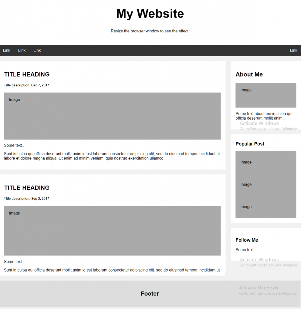
Responsive Website Layout
By using some of the CSS code above, we have created a responsive website layout, which varies between two columns and full-width columns depending on screen width:
Example:
<!DOCTYPE html>
<html>
<head>
<style>
* {
box-sizing: border-box;
}
body {
font-family: Arial;
padding: 10px;
background: #f1f1f1;
}
/* Header/Blog Title */
.header {
padding: 30px;
text-align: center;
background: white;
}
.header h1 {
font-size: 50px;
}
/* Style the top navigation bar */
.topnav {
overflow: hidden;
background-color: #333;
}
/* Style the topnav links */
.topnav a {
float: left;
display: block;
color: #f2f2f2;
text-align: center;
padding: 14px 16px;
text-decoration: none;
}
/* Change color on hover */
.topnav a:hover {
background-color: #ddd;
color: black;
}
/* Create two unequal columns that floats next to each other / / Left column */
.leftcolumn {
float: left;
width: 75%;
}
/* Right column */
.rightcolumn {
float: left;
width: 25%;
background-color: #f1f1f1;
padding-left: 20px;
}
/* Fake image */
.fakeimg {
background-color: #aaa;
width: 100%;
padding: 20px;
}
/* Add a card effect for articles */
.card {
background-color: white;
padding: 20px;
margin-top: 20px;
}
/* Clear floats after the columns */
.row:after {
content: "";
display: table;
clear: both;
}
/* Footer */
.footer {
padding: 20px;
text-align: center;
background: #ddd;
margin-top: 20px;
}
/* Responsive layout - when the screen is less than 800px wide, make the two columns stack on top of each other instead of next to each other */
@media screen and (max-width: 800px) {
.leftcolumn, .rightcolumn {
width: 100%;
padding: 0;
}
}
/* Responsive layout - when the screen is less than 400px wide, make the navigation links stack on top of each other instead of next to each other */
@media screen and (max-width: 400px) {
.topnav a {
float: none;
width: 100%;
}
}
</style>
</head>
<html>
<div class="header">
<h1>My Website</h1>
<p>Resize the browser window to see the effect.</p>
</div>
<div class="topnav">
<a href="#">Link</a>
<a href="#">Link</a>
<a href="#">Link</a>
<a href="#" style="float:right">Link</a>
</div>
<div class="row">
<div class="leftcolumn">
<div class="card">
<h2>TITLE HEADING</h2>
<h5>Title description, Sep 2, 2017</h5>
<div class="fakeimg" style="height:200px;">Image</div>
<p>Some text..</p>
<p>Sunt in culpa qui officia deserunt mollit anim id est laborum consectetur adipiscing elit, sed do eiusmod tempor incididunt ut labore et dolore magna aliqua. Ut enim ad minim veniam, quis nostrud exercitation ullamco.</p>
</div>
</div>
<div class="rightcolumn">
<div class="card">
<h2>About Me</h2>
<div class="fakeimg" style="height:100px;">Image</div>
<p>Some text about me in culpa qui officia deserunt mollit anim..</p>
</div>
<div class="card">
<h3>Popular Post</h3>
<div class="fakeimg"><p>Image</p></div>
<div class="fakeimg"><p>Image</p></div>
<div class="fakeimg"><p>Image</p></div>
</div>
<div class="card">
<h3>Follow Me</h3>
<p>Some text..</p>
</div>
</div>
</div>
<div class="footer">
<h2>Footer</h2>
</div>
</body>
</html>
Result: