

The opacity property specifies the opacity/transparency of an element.
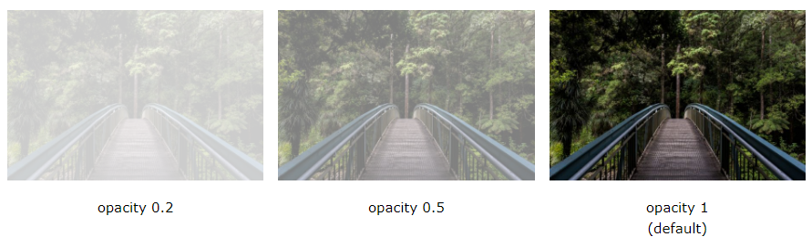
Transparent Image
The opacity property can take a value from 0.0 – 1.0. The lower value, the more transparent:
Example
<!DOCTYPE html>
<html>
<head>
<style>
img {
opacity: 0.5;
}
</style>
</head>
<body>
<h1>Image Transparency</h1>
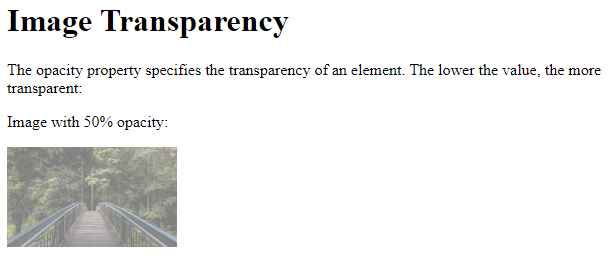
<p>The opacity property specifies the transparency of an element. The lower the value, the more transparent:</p>
<p>Image with 50% opacity:</p>
<img src="img_forest.jpg" alt="Forest" width="170" height="100">
</body>
</html>
Result:
Transparent Hover Effect
The opacity property is often used together with the :hover selector to change the opacity on mouse-over:
Example
<!DOCTYPE html>
<html>
<head>
<style>
img {
opacity: 0.5;
}
img:hover {
opacity: 1.0;
}
</style>
</head>
<body>
<h1>Image Transparency</h1>
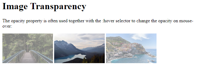
<p>The opacity property is often used together with the :hover selector to change the opacity on mouse-over:</p>
<img src="img_forest.jpg" alt="Forest" width="170" height="100">
<img src="img_mountains.jpg" alt="Mountains" width="170" height="100">
<img src="img_5terre.jpg" alt="Italy" width="170" height="100">
</body>
</html>
Result:
Example explained
The first CSS block is similar to the code in Example 1. In addition, we have added what should happen when a user hovers over one of the images. In this case we want the image to NOT be transparent when the user hovers over it. The CSS for this is opacity:1;.
When the mouse pointer moves away from the image, the image will be transparent again.
An example of reversed hover effect:
Example
<!DOCTYPE html>
<html>
<head>
<style>
img:hover {
opacity: 0.5;
}
</style>
</head>
<body>
<h1>Image Transparency</h1>
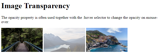
<p>The opacity property is often used together with the :hover selector to change the opacity on mouse-over:</p>
<img src="img_forest.jpg" alt="Forest" width="170" height="100">
<img src="img_mountains.jpg" alt="Mountains" width="170" height="100">
<img src="img_5terre.jpg" alt="Italy" width="170" height="100">
</body>
</html>
Result:
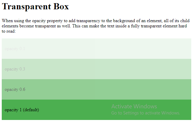
Transparent Box
When using the opacity property to add transparency to the background of an element, all of its child elements inherit the same transparency. This can make the text inside a fully transparent element hard to read:
Example
<!DOCTYPE html>
<html>
<head>
<style>
div {
  background-color: #4CAF50;
  padding: 10px;
}
div.first {
  opacity: 0.1;
}
div.second {
  opacity: 0.3;
}
div.third {
  opacity: 0.6;
}
</style>
</head>
<body>
<h1>Transparent Box</h1>
<p>When using the opacity property to add transparency to the background of an element, all of its child elements become transparent as well. This can make the text inside a fully transparent element hard to read:</p>
<div class="first"><p>opacity 0.1</p></div>
<div class="second"><p>opacity 0.3</p></div>
<div class="third"><p>opacity 0.6</p></div>
<div><p>opacity 1 (default)</p></div>
</body>
</html>
Result:
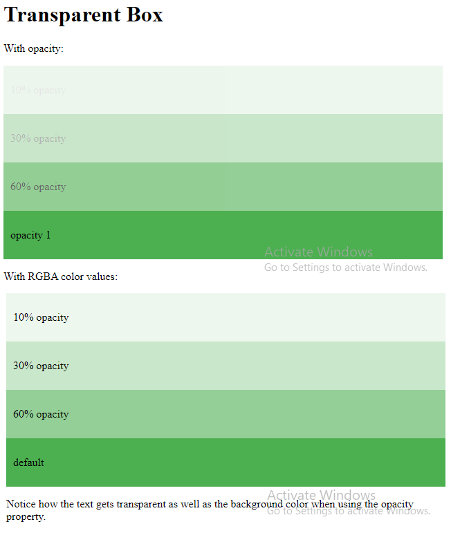
Transparency using RGBA
If you do not want to apply opacity to child elements, like in our example above, use RGBA color values. The following example sets the opacity for the background color and not the text:
100% opacity
60% opacity
30% opacity
10% opacity
You learned from our CSS Colors Chapter, that you can use RGB as a color value. In addition to RGB, you can use an RGB color value with an alpha channel (RGBA) – which specifies the opacity for a color.
An RGBA color value is specified with: rgba(red, green, blue, alpha). The alpha parameter is a number between 0.0 (fully transparent) and 1.0 (fully opaque).
Tip: You will learn more about RGBA Colors in our CSS Colors Chapter.
Example
<!DOCTYPE html>
<html>
<head>
<style>
div {
  background: rgb(76, 175, 80);
  padding: 10px;
}
div.first {
  background: rgba(76, 175, 80, 0.1);
}
div.second {
  background: rgba(76, 175, 80, 0.3);
}
div.third {
  background: rgba(76, 175, 80, 0.6);
}
</style>
</head>
<body>
<h1>Transparent Box</h1>
<p>With opacity:</p>
<div style="opacity:0.1;"><p>10% opacity</p></div>
<div style="opacity:0.3;"><p>30% opacity</p></div>
<div style="opacity:0.6;"><p>60% opacity</p></div>
<div><p>opacity 1</p></div>
<p>With RGBA color values:</p>
<div class="first"><p>10% opacity</p></div>
<div class="second"><p>30% opacity</p></div>
<div class="third"><p>60% opacity</p></div>
<div><p>default</p></div>
<p>Notice how the text gets transparent as well as the background color when using the opacity property.</p>
</body>
</html>
Result:
Text in Transparent Box
This is some text that is placed in the transparent box.
Example
<html>
<head>
<style>
div.background {
background: url(klematis.jpg) repeat;
border: 2px solid black;
}
div.transbox {
margin: 30px;
background-color: #ffffff;
border: 1px solid black;
opacity: 0.6;
}
div.transbox p {
margin: 5%;
font-weight: bold;
color: #000000;
}
</style>
</head>
<body>
<div class=”background”>
<div class=”transbox”>
<p>This is some text that is placed in the transparent box.</p>
</div>
</div>
</body>
</html>
Result:

Example explained
First, we create a <div> element (class=”background”) with a background image, and a border.
Then we create another <div> (class=”transbox”) inside the first <div>.
The <div class=”transbox”> have a background color, and a border – the div is transparent.
Inside the transparent <div>, we add some text inside a <p> element.