

he CSS border properties allow you to specify the style, width, and color of an element’s border.
CSS Border Style
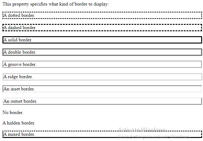
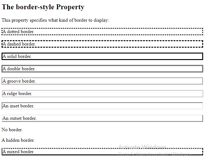
The border-style property specifies what kind of border to display.
The following values are allowed:
dotted– Defines a dotted borderdashed– Defines a dashed bordersolid– Defines a solid borderdouble– Defines a double bordergroove– Defines a 3D grooved border. The effect depends on the border-color valueridge– Defines a 3D ridged border. The effect depends on the border-color valueinset– Defines a 3D inset border. The effect depends on the border-color valueoutset– Defines a 3D outset border. The effect depends on the border-color valuenone– Defines no borderhidden– Defines a hidden border
The border-style property can have from one to four values (for the top border, right border, bottom border, and the left border).
Example
Demonstration of the different border styles:
<!DOCTYPE html>
<html>
<head>
<style>
p.dotted {border-style: dotted;}
p.dashed {border-style: dashed;}
p.solid {border-style: solid;}
p.double {border-style: double;}
p.groove {border-style: groove;}
p.ridge {border-style: ridge;}
p.inset {border-style: inset;}
p.outset {border-style: outset;}
p.none {border-style: none;}
p.hidden {border-style: hidden;}
p.mix {border-style: dotted dashed solid double;}
</style>
</head>
<body>
<h2>The border-style Property</h2>
<p>This property specifies what kind of border to display:</p>
<p class="dotted">A dotted border.</p>
<p class="dashed">A dashed border.</p>
<p class="solid">A solid border.</p>
<p class="double">A double border.</p>
<p class="groove">A groove border.</p>
<p class="ridge">A ridge border.</p>
<p class="inset">An inset border.</p>
<p class="outset">An outset border.</p>
<p class="none">No border.</p>
<p class="hidden">A hidden border.</p>
<p class="mix">A mixed border.</p>
</body>
</html>
Result:
CSS Border Width
The border-width property specifies the width of the four borders.
The width can be set as a specific size (in px, pt, cm, em, etc) or by using one of the three pre-defined values: thin, medium, or thick:
Example
Demonstration of the different border widths:
<!DOCTYPE html>
<html>
<head>
<style>
p.one {
  border-style: solid;
  border-width: 5px;
}
p.two {
  border-style: solid;
  border-width: medium;
}
p.three {
  border-style: dotted;
  border-width: 2px;
}
p.four {
  border-style: dotted;
  border-width: thick;
}
p.five {
  border-style: double;
  border-width: 15px;
}
p.six {
  border-style: double;
  border-width: thick;
}
</style>
</head>
<body>
<h2>The border-width Property</h2>
<p>This property specifies the width of the four borders:</p>
<p class="one">Some text.</p>
<p class="two">Some text.</p>
<p class="three">Some text.</p>
<p class="four">Some text.</p>
<p class="five">Some text.</p>
<p class="six">Some text.</p>
<p><b>Note:</b> The "border-width" property does not work if it is used alone.
Always specify the "border-style" property to set the borders first.</p>
</body>
</html>
Result:
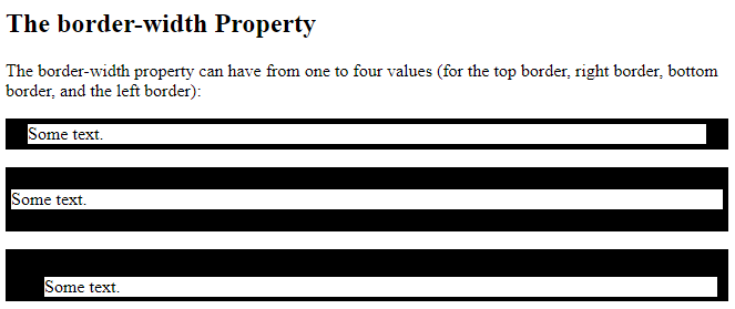
Specific Side Widths
The border-width property can have from one to four values (for the top border, right border, bottom border, and the left border):
Example
<!DOCTYPE html>
<html>
<head>
<style>
p.one {
  border-style: solid;
  border-width: 5px 20px; /* 5px top and bottom, 20px on the sides */
}
p.two {
  border-style: solid;
  border-width: 20px 5px; /* 20px top and bottom, 5px on the sides */
}
p.three {
  border-style: solid;
  border-width: 25px 10px 4px 35px; /* 25px top, 10px right, 4px bottom and 35px left */
}
</style>
</head>
<body>
<h2>The border-width Property</h2>
<p>The border-width property can have from one to four values (for the top border, right border, bottom border, and the left border):</p>
<p class="one">Some text.</p>
<p class="two">Some text.</p>
<p class="three">Some text.</p>
</body>
</html>
Result:
CSS Border Color
The border-color property is used to set the color of the four borders.
The color can be set by:
- name – specify a color name, like “red”
- HEX – specify a HEX value, like “#ff0000”
- RGB – specify a RGB value, like “rgb(255,0,0)”
- HSL – specify a HSL value, like “hsl(0, 100%, 50%)”
- transparent
Note: If border-color is not set, it inherits the color of the element.
Example
<!DOCTYPE html>
<html>
<head>
<style>
p.one {
border-style: solid;
border-color: red;
}
p.two {
border-style: solid;
border-color: green;
}
p.three {
border-style: dotted;
border-color: blue;
}
</style>
</head>
<body>
<h2>The border-color Property</h2>
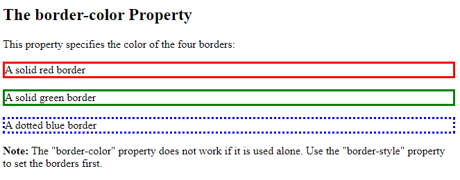
<p>This property specifies the color of the four borders:</p>
<p class="one">A solid red border</p>
<p class="two">A solid green border</p>
<p class="three">A dotted blue border</p>
<p><b>Note:</b> The "border-color" property does not work if it is used alone. Use the "border-style" property to set the borders first.</p>
</body>
</html>
Result:
Specific Side Colors
The border-color property can have from one to four values (for the top border, right border, bottom border, and the left border).
Example
<!DOCTYPE html>
<html>
<head>
<style>
p.one {
border-style: solid;
border-color: red green blue yellow; /* red top, green right, blue bottom and yellow left */
}
</style>
</head>
<body>
<h2>The border-color Property</h2>
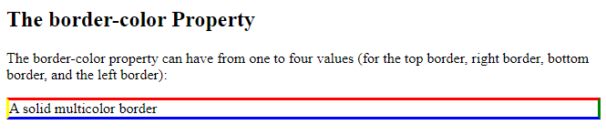
<p>The border-color property can have from one to four values (for the top border, right border, bottom border, and the left border):</p>
<p class="one">A solid multicolor border</p>
</body>
</html>
Result:
HEX Values
The color of the border can also be specified using a hexadecimal value (HEX):
Example
<!DOCTYPE html>
<html>
<head>
<style>
p.one {
border-style: solid;
border-color: #ff0000; /* red */
}
p.two {
border-style: solid;
border-color: #0000ff; /* blue */
}
p.three {
border-style: solid;
border-color: #bbbbbb; /* grey */
}
</style>
</head>
<body>
<h2>The border-color Property</h2>
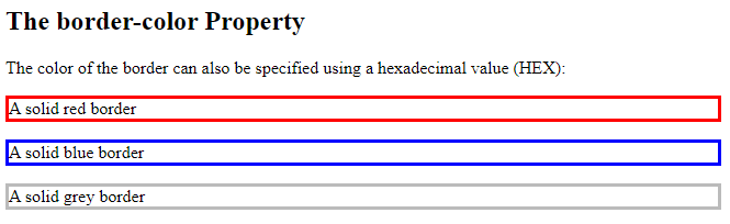
<p>The color of the border can also be specified using a hexadecimal value (HEX):</p>
<p class="one">A solid red border</p>
<p class="two">A solid blue border</p>
<p class="three">A solid grey border</p>
</body>
</html>
Result:
RGB Values
Or by using RGB values:
Example
<!DOCTYPE html>
<html>
<head>
<style>
p.one {
border-style: solid;
border-color: rgb(255, 0, 0); /* red */
}
p.two {
border-style: solid;
border-color: rgb(0, 0, 255); /* blue */
}
p.three {
border-style: solid;
border-color: rgb(187, 187, 187); /* grey */
}
</style>
</head>
<body>
<h2>The border-color Property</h2>
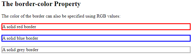
<p>The color of the border can also be specified using RGB values:</p>
<p class="one">A solid red border</p>
<p class="two">A solid blue border</p>
<p class="three">A solid grey border</p>
</body>
</html>
Result:
HSL Values
You can also use HSL values:
Example
<!DOCTYPE html>
<html>
<head>
<style>
p.one {
border-style: solid;
border-color: hsl(0, 100%, 50%); /* red */
}
p.two {
border-style: solid;
border-color: hsl(240, 100%, 50%); /* blue */
}
p.three {
border-style: solid;
border-color: hsl(0, 0%, 73%); /* grey */
}
</style>
</head>
<body>
<h2>The border-color Property</h2>
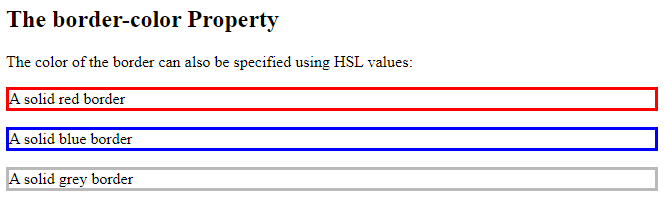
<p>The color of the border can also be specified using HSL values:</p>
<p class="one">A solid red border</p>
<p class="two">A solid blue border</p>
<p class="three">A solid grey border</p>
</body>
</html>
Result:
CSS Border – Individual Sides
From the examples on the previous pages, you have seen that it is possible to specify a different border for each side.
In CSS, there are also properties for specifying each of the borders (top, right, bottom, and left):
Example
<!DOCTYPE html>
<html>
<head>
<style>
p {
border-top-style: dotted;
border-right-style: solid;
border-bottom-style: dotted;
border-left-style: solid;
}
</style>
</head>
<body>
<h2>Individual Border Sides</h2>
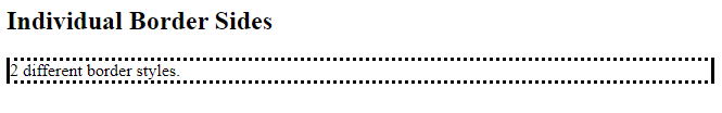
<p>2 different border styles.</p>
</body>
</html>
Result:

The example above gives the same result as this:
Example
<!DOCTYPE html>
<html>
<head>
<style>
p {
  border-style: dotted solid;
}
</style>
</head>
<body>
<h2>Individual Border Sides</h2>
<p>2 different border styles.</p>
</body>
</html>
Result:
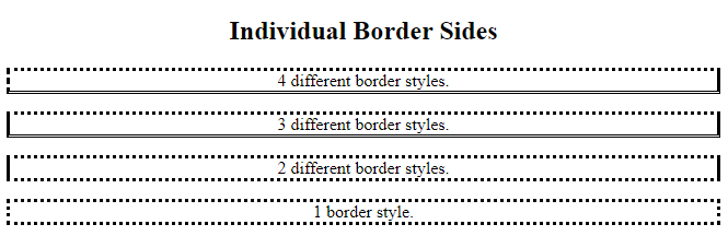
So, here is how it works:
If the border-style property has four values:
- border-style: dotted solid double dashed;
- top border is dotted
- right border is solid
- bottom border is double
- left border is dashed
If the border-style property has three values:
- border-style: dotted solid double;
- top border is dotted
- right and left borders are solid
- bottom border is double
If the border-style property has two values:
- border-style: dotted solid;
- top and bottom borders are dotted
- right and left borders are solid
If the border-style property has one value:
- border-style: dotted;
- all four borders are dotted
Example
<!DOCTYPE html>
<html>
<head>
<style>
body {
  text-align: center;
}
/* Four values */
p.four {
  border-style: dotted solid double dashed;
}
/* Three values */
p.three {
  border-style: dotted solid double;
}
/* Two values */
p.two {
  border-style: dotted solid;
}
/* One value */
p.one {
  border-style: dotted;
}
</style>
</head>
<body>
<h2>Individual Border Sides</h2>
<p class="four">4 different border styles.</p>
<p class="three">3 different border styles.</p>
<p class="two">2 different border styles.</p>
<p class="one">1 border style.</p>
</body>
</html>
Result:
CSS Border – Shorthand Property
Like you saw in the previous page, there are many properties to consider when dealing with borders.
To shorten the code, it is also possible to specify all the individual border properties in one property.
The border property is a shorthand property for the following individual border properties:
border-widthborder-style(required)border-color
Example
<!DOCTYPE html>
<html>
<head>
<style>
p {
border: 5px solid red;
}
</style>
</head>
<body>
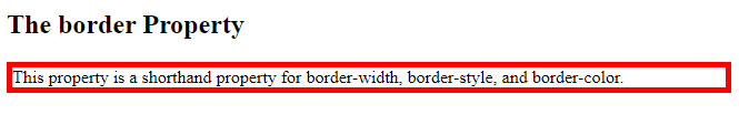
<h2>The border Property</h2>
<p>This property is a shorthand property for border-width, border-style, and border-color.</p>
</body>
</html>
Result:
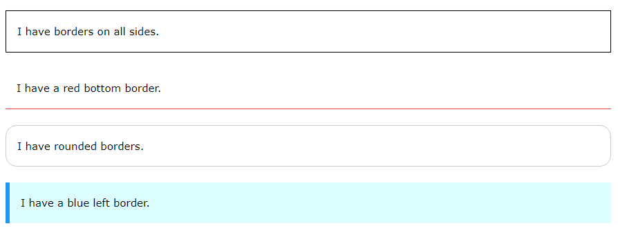
You can also specify all the individual border properties for just one side:
Left Border
<!DOCTYPE html>
<html>
<head>
<style>
p {
border-left: 6px solid red;
background-color: lightgrey;
}
</style>
</head>
<body>
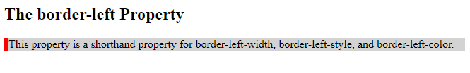
<h2>The border-left Property</h2>
<p>This property is a shorthand property for border-left-width, border-left-style, and border-left-color.</p>
</body>
</html>
Result:
Bottom Border
<!DOCTYPE html>
<html>
<head>
<style>
p {
border-bottom: 6px solid red;
background-color: lightgrey;
}
</style>
</head>
<body>
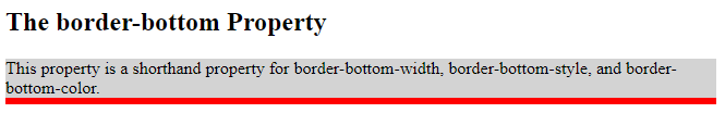
<h2>The border-bottom Property</h2>
<p>This property is a shorthand property for border-bottom-width, border-bottom-style, and border-bottom-color.</p>
</body>
</html>
Result:
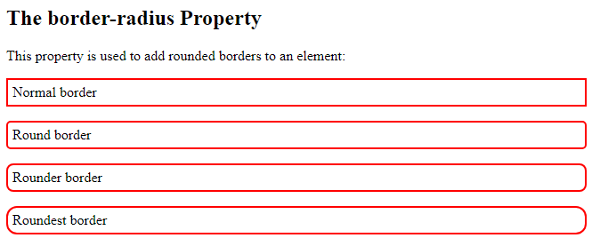
CSS Rounded Borders
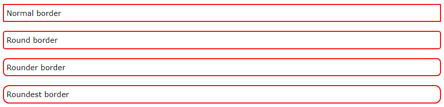
The border-radius property is used to add rounded borders to an element:
<!DOCTYPE html>
<html>
<head>
<style>
p.normal {
  border: 2px solid red;
  padding: 5px;
}
p.round1 {
  border: 2px solid red;
  border-radius: 5px;
  padding: 5px;
}
p.round2 {
  border: 2px solid red;
  border-radius: 8px;
  padding: 5px;
}
p.round3 {
  border: 2px solid red;
  border-radius: 12px;
  padding: 5px;
}
</style>
</head>
<body>
<h2>The border-radius Property</h2>
<p>This property is used to add rounded borders to an element:</p>
<p class="normal">Normal border</p>
<p class="round1">Round border</p>
<p class="round2">Rounder border</p>
<p class="round3">Roundest border</p>
</body>
</html>
Result: