

Learn how to style buttons using CSS.
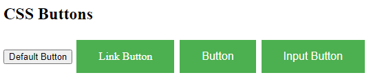
Basic Button Styling
Example
<!DOCTYPE html>
<html>
<head>
<style>
.button {
background-color: #4CAF50;
border: none;
color: white;
padding: 15px 32px;
text-align: center;
text-decoration: none;
display: inline-block;
font-size: 16px;
margin: 4px 2px;
cursor: pointer;
}
</style>
</head>
<body>
<h2>CSS Buttons</h2>
<button>Default Button</button>
<a href="#" class="button">Link Button</a>
<button class="button">Button</button>
<input type="button" class="button" value="Input Button">
</body>
</html>
Result:
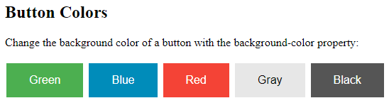
Button Colors
Use the background-color property to change the background color of a button:
Example
<!DOCTYPE html>
<html>
<head>
<style>
.button {
  background-color: #4CAF50; /* Green */
  border: none;
  color: white;
  padding: 15px 32px;
  text-align: center;
  text-decoration: none;
  display: inline-block;
  font-size: 16px;
  margin: 4px 2px;
  cursor: pointer;
}
.button2 {background-color: #008CBA;} /* Blue */
.button3 {background-color: #f44336;} /* Red */
.button4 {background-color: #e7e7e7; color: black;} /* Gray */
.button5 {background-color: #555555;} /* Black */
</style>
</head>
<body>
<h2>Button Colors</h2>
<p>Change the background color of a button with the background-color property:</p>
<button class="button">Green</button>
<button class="button button2">Blue</button>
<button class="button button3">Red</button>
<button class="button button4">Gray</button>
<button class="button button5">Black</button>
</body>
</html>
Result:
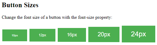
Button Sizes
Use the font-size property to change the font size of a button:
Example
<!DOCTYPE html>
<html>
<head>
<style>
.button {
  background-color: #4CAF50; /* Green */
  border: none;
  color: white;
  padding: 15px 32px;
  text-align: center;
  text-decoration: none;
  display: inline-block;
  margin: 4px 2px;
  cursor: pointer;
}
.button1 {font-size: 10px;}
.button2 {font-size: 12px;}
.button3 {font-size: 16px;}
.button4 {font-size: 20px;}
.button5 {font-size: 24px;}
</style>
</head>
<body>
<h2>Button Sizes</h2>
<p>Change the font size of a button with the font-size property:</p>
<button class="button button1">10px</button>
<button class="button button2">12px</button>
<button class="button button3">16px</button>
<button class="button button4">20px</button>
<button class="button button5">24px</button>
</body>
</html>
Result:
Use the padding property to change the padding of a button:
Example
<!DOCTYPE html>
<html>
<head>
<style>
.button {
background-color: #4CAF50; /* Green */
border: none;
color: white;
text-align: center;
text-decoration: none;
display: inline-block;
font-size: 16px;
margin: 4px 2px;
cursor: pointer;
}
.button1 {padding: 10px 24px;}
.button2 {padding: 12px 28px;}
.button3 {padding: 14px 40px;}
.button4 {padding: 32px 16px;}
.button5 {padding: 16px;}
</style>
</head>
<body>
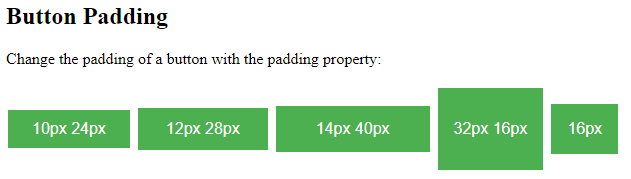
<h2>Button Padding</h2>
<p>Change the padding of a button with the padding property:</p>
<button class="button button1">10px 24px</button>
<button class="button button2">12px 28px</button>
<button class="button button3">14px 40px</button>
<button class="button button4">32px 16px</button>
<button class="button button5">16px</button>
</body>
</html>
Result:
Rounded Buttons
Use the border-radius property to add rounded corners to a button:
Example
<!DOCTYPE html>
<html>
<head>
<style>
.button {
background-color: #4CAF50; /* Green */
border: none;
color: white;
padding: 20px;
text-align: center;
text-decoration: none;
display: inline-block;
font-size: 16px;
margin: 4px 2px;
cursor: pointer;
}
.button1 {border-radius: 2px;}
.button2 {border-radius: 4px;}
.button3 {border-radius: 8px;}
.button4 {border-radius: 12px;}
.button5 {border-radius: 50%;}
</style>
</head>
<body>
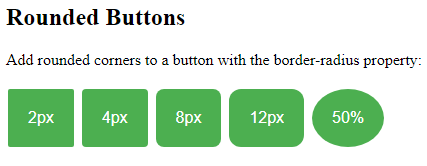
<h2>Rounded Buttons</h2>
<p>Add rounded corners to a button with the border-radius property:</p>
<button class="button button1">2px</button>
<button class="button button2">4px</button>
<button class="button button3">8px</button>
<button class="button button4">12px</button>
<button class="button button5">50%</button>
</body>
</html>
Result:
Colored Button Borders
Use the border property to add a colored border to a button:
Example
<!DOCTYPE html>
<html>
<head>
<style>
.button {
background-color: #4CAF50; /* Green */
border: none;
color: white;
padding: 15px 32px;
text-align: center;
text-decoration: none;
display: inline-block;
font-size: 16px;
margin: 4px 2px;
cursor: pointer;
}
.button1 {
background-color: white;
color: black;
border: 2px solid #4CAF50;
}
.button2 {
background-color: white;
color: black;
border: 2px solid #008CBA;
}
.button3 {
background-color: white;
color: black;
border: 2px solid #f44336;
}
.button4 {
background-color: white;
color: black;
border: 2px solid #e7e7e7;
}
.button5 {
background-color: white;
color: black;
border: 2px solid #555555;
}
</style>
</head>
<body>
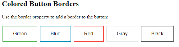
<h2>Colored Button Borders</h2>
<p>Use the border property to add a border to the button:</p>
<button class="button button1">Green</button>
<button class="button button2">Blue</button>
<button class="button button3">Red</button>
<button class="button button4">Gray</button>
<button class="button button5">Black</button>
</body>
</html>
Result:
Hoverable Buttons
Use the :hover selector to change the style of a button when you move the mouse over it.
Tip: Use the transition-duration property to determine the speed of the “hover” effect:
Example
<!DOCTYPE html>
<html>
<head>
<style>
.button {
background-color: #4CAF50; /* Green */
border: none;
color: white;
padding: 16px 32px;
text-align: center;
text-decoration: none;
display: inline-block;
font-size: 16px;
margin: 4px 2px;
transition-duration: 0.4s;
cursor: pointer;
}
.button1 {
background-color: white;
color: black;
border: 2px solid #4CAF50;
}
.button1:hover {
background-color: #4CAF50;
color: white;
}
.button2 {
background-color: white;
color: black;
border: 2px solid #008CBA;
}
.button2:hover {
background-color: #008CBA;
color: white;
}
.button3 {
background-color: white;
color: black;
border: 2px solid #f44336;
}
.button3:hover {
background-color: #f44336;
color: white;
}
.button4 {
background-color: white;
color: black;
border: 2px solid #e7e7e7;
}
.button4:hover {background-color: #e7e7e7;}
.button5 {
background-color: white;
color: black;
border: 2px solid #555555;
}
.button5:hover {
background-color: #555555;
color: white;
}
</style>
</head>
<body>
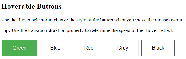
<h2>Hoverable Buttons</h2>
<p>Use the :hover selector to change the style of the button when you move the mouse over it.</p>
<p><strong>Tip:</strong> Use the transition-duration property to determine the speed of the "hover" effect:</p>
<button class="button button1">Green</button>
<button class="button button2">Blue</button>
<button class="button button3">Red</button>
<button class="button button4">Gray</button>
<button class="button button5">Black</button>
</body>
</html>
Result:
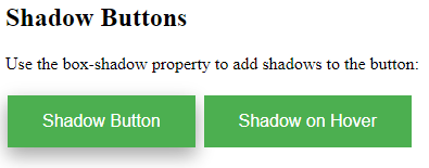
Shadow Buttons
Use the box-shadow property to add shadows to a button:
Example
<!DOCTYPE html>
<html>
<head>
<style>
.button {
  background-color: #4CAF50; /* Green */
  border: none;
  color: white;
  padding: 15px 32px;
  text-align: center;
  text-decoration: none;
  display: inline-block;
  font-size: 16px;
  margin: 4px 2px;
  cursor: pointer;
  -webkit-transition-duration: 0.4s; /* Safari */
  transition-duration: 0.4s;
}
.button1 {
  box-shadow: 0 8px 16px 0 rgba(0,0,0,0.2), 0 6px 20px 0 rgba(0,0,0,0.19);
}
.button2:hover {
  box-shadow: 0 12px 16px 0 rgba(0,0,0,0.24),0 17px 50px 0 rgba(0,0,0,0.19);
}
</style>
</head>
<body>
<h2>Shadow Buttons</h2>
<p>Use the box-shadow property to add shadows to the button:</p>
<button class="button button1">Shadow Button</button>
<button class="button button2">Shadow on Hover</button>
</body>
</html>
Result:
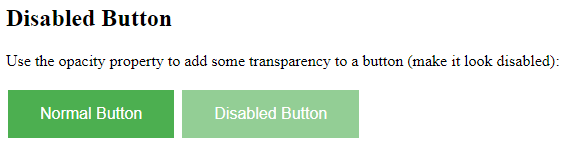
Disabled Buttons
Use the opacity property to add transparency to a button (creates a “disabled” look).
Tip: You can also add the cursor property with a value of “not-allowed”, which will display a “no parking sign” when you mouse over the button:
Example
<!DOCTYPE html>
<html>
<head>
<style>
.button {
  background-color: #4CAF50; /* Green */
  border: none;
  color: white;
  padding: 15px 32px;
  text-align: center;
  text-decoration: none;
  display: inline-block;
  font-size: 16px;
  margin: 4px 2px;
  cursor: pointer;
}
.disabled {
  opacity: 0.6;
  cursor: not-allowed;
}
</style>
</head>
<body>
<h2>Disabled Button</h2>
<p>Use the opacity property to add some transparency to a button (make it look disabled):</p><button class="button">Normal Button</button>
<button class="button disabled">Disabled Button</button>
</body>
</html>
Result:
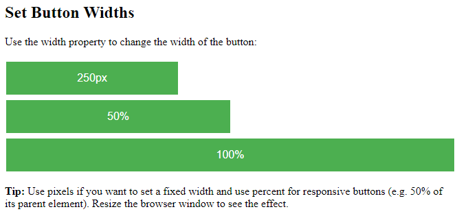
Button Width
By default, the size of the button is determined by its text content (as wide as its content). Use the width property to change the width of a button:
Example
<!DOCTYPE html>
<html>
<head>
<style>
.button {
  background-color: #4CAF50; /* Green */
  border: none;
  color: white;
  padding: 15px 32px;
  text-align: center;
  text-decoration: none;
  display: inline-block;
  font-size: 16px;
  margin: 4px 2px;
  cursor: pointer;
}
.button1 {width: 250px;}
.button2 {width: 50%;}
.button3 {width: 100%;}
</style>
</head>
<body>
<h2>Set Button Widths</h2>
<p>Use the width property to change the width of the button:</p>
<button class="button button1">250px</button><br>
<button class="button button2">50%</button><br>
<button class="button button3">100%</button>
<p><strong>Tip:</strong> Use pixels if you want to set a fixed width and use percent for responsive buttons (e.g. 50% of its parent element). Resize the browser window to see the effect.</p>
</body>
</html>
Result:
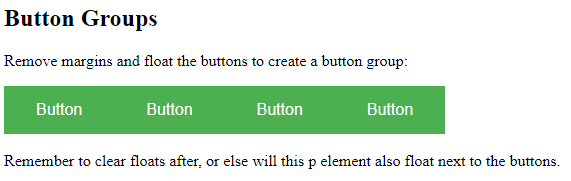
Button Groups
Remove margins and add float:left to each button to create a button group:
Example
<!DOCTYPE html>
<html>
<head>
<style>
.btn-group .button {
  background-color: #4CAF50; /* Green */
  border: none;
  color: white;
  padding: 15px 32px;
  text-align: center;
  text-decoration: none;
  display: inline-block;
  font-size: 16px;
  cursor: pointer;
  float: left;
}
.btn-group .button:hover {
  background-color: #3e8e41;
}
</style>
</head>
<body>
<h2>Button Groups</h2>
<p>Remove margins and float the buttons to create a button group:</p>
<div class="btn-group">
  <button class="button">Button</button>
  <button class="button">Button</button>
  <button class="button">Button</button>
  <button class="button">Button</button>
</div>
<p style="clear:both"><br>Remember to clear floats after, or else will this p element also float next to the buttons.</p>
</body>
</html>
Result:
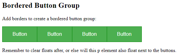
Bordered Button Group
Use the border property to create a bordered button group:
Example
<!DOCTYPE html>
<html>
<head>
<style>
.btn-group .button {
  background-color: #4CAF50; /* Green */
  border: 1px solid green;
  color: white;
  padding: 15px 32px;
  text-align: center;
  text-decoration: none;
  display: inline-block;
  font-size: 16px;
  cursor: pointer;
  float: left;
}
.btn-group .button:not(:last-child) {
  border-right: none; /* Prevent double borders */
}
.btn-group .button:hover {
  background-color: #3e8e41;
}
</style>
</head>
<body>
<h2>Bordered Button Group</h2>
<p>Add borders to create a bordered button group:</p>
<div class="btn-group">
  <button class="button">Button</button>
  <button class="button">Button</button>
  <button class="button">Button</button>
  <button class="button">Button</button>
</div>
<p style="clear:both"><br>Remember to clear floats after, or else will this p element also float next to the buttons.</p>
</body>
</html>
Result:
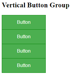
Vertical Button Group
Use display:block instead of float:left to group the buttons below each other, instead of side by side:
Example
<!DOCTYPE html>
<html>
<head>
<style>
.btn-group .button {
  background-color: #4CAF50; /* Green */
  border: 1px solid green;
  color: white;
  padding: 15px 32px;
  text-align: center;
  text-decoration: none;
  font-size: 16px;
  cursor: pointer;
  width: 150px;
  display: block;
}
.btn-group .button:not(:last-child) {
  border-bottom: none; /* Prevent double borders */
}
.btn-group .button:hover {
  background-color: #3e8e41;
}
</style>
</head>
<body>
<h2>Vertical Button Group</h2>
<div class="btn-group">
  <button class="button">Button</button>
  <button class="button">Button</button>
  <button class="button">Button</button>
  <button class="button">Button</button>
</div>
</body>
</html>
Result:
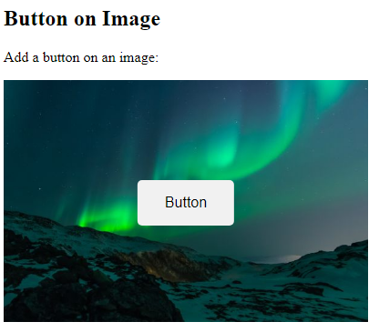
Button on Image
<!DOCTYPE html>
<html>
<head>
<style>
.container {
position: relative;
width: 100%;
max-width: 400px;
}
.container img {
width: 100%;
height: auto;
}
.container .btn {
position: absolute;
top: 50%;
left: 50%;
transform: translate(-50%, -50%);
-ms-transform: translate(-50%, -50%);
background-color: #f1f1f1;
color: black;
font-size: 16px;
padding: 16px 30px;
border: none;
cursor: pointer;
border-radius: 5px;
text-align: center;
}
.container .btn:hover {
background-color: black;
color: white;
}
</style>
</head>
<body>
<h2>Button on Image</h2>
<p>Add a button on an image:</p>
<div class="container">
<img src="img_lights.jpg" alt="Snow" style="width:100%">
<button class="btn">Button</button>
</div>
</body>
</html>
Result:
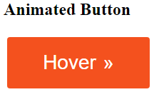
Animated Buttons
Example
Add an arrow on hover:
<!DOCTYPE html>
<html>
<head>
<style>
.button {
  display: inline-block;
  border-radius: 4px;
  background-color: #f4511e;
  border: none;
  color: #FFFFFF;
  text-align: center;
  font-size: 28px;
  padding: 20px;
  width: 200px;
  transition: all 0.5s;
  cursor: pointer;
  margin: 5px;
}
.button span {
  cursor: pointer;
  display: inline-block;
  position: relative;
  transition: 0.5s;
}
.button span:after {
  content: '\00bb';
  position: absolute;
  opacity: 0;
  top: 0;
  right: -20px;
  transition: 0.5s;
}
.button:hover span {
  padding-right: 25px;
}
.button:hover span:after {
  opacity: 1;
  right: 0;
}
</style>
</head>
<body>
<h2>Animated Button</h2>
<button class="button" style="vertical-align:middle"><span>Hover </span></button>
</body>
</html>
Result:
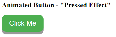
Example
Add a “pressed” effect on click:
<!DOCTYPE html>
<html>
<head>
<style>
.button {
  display: inline-block;
  padding: 15px 25px;
  font-size: 24px;
  cursor: pointer;
  text-align: center;
  text-decoration: none;
  outline: none;
  color: #fff;
  background-color: #4CAF50;
  border: none;
  border-radius: 15px;
  box-shadow: 0 9px #999;
}
.button:hover {background-color: #3e8e41}
.button:active {
  background-color: #3e8e41;
  box-shadow: 0 5px #666;
  transform: translateY(4px);
}
</style>
</head>
<body>
<h2>Animated Button - "Pressed Effect"</h2>
<button class="button">Click Me</button>
</body>
</html>
Result: