

Create tooltips with CSS.
Demo: Tooltip Examples
A tooltip is often used to specify extra information about something when the user moves the mouse pointer over an element:
Basic Tooltip
Create a tooltip that appears when the user moves the mouse over an element:
Example
<!DOCTYPE html>
<html>
<style>
.tooltip {
position: relative;
display: inline-block;
border-bottom: 1px dotted black;
}
.tooltip .tooltiptext {
visibility: hidden;
width: 120px;
background-color: black;
color: #fff;
text-align: center;
border-radius: 6px;
padding: 5px 0;
/* Position the tooltip */
position: absolute;
z-index: 1;
}
.tooltip:hover .tooltiptext {
visibility: visible;
}
</style>
<body style="text-align:center;">
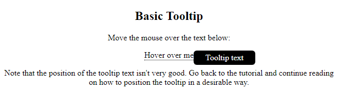
<h2>Basic Tooltip</h2>
<p>Move the mouse over the text below:</p>
<div class="tooltip">Hover over me
<span class="tooltiptext">Tooltip text</span>
</div>
<p>Note that the position of the tooltip text isn't very good. Go back to the tutorial and continue reading on how to position the tooltip in a desirable way.</p>
</body>
</html>
Result:
Example Explained
HTML: Use a container element (like <div>) and add the "tooltip" class to it. When the user mouse over this <div>, it will show the tooltip text.
The tooltip text is placed inside an inline element (like <span>) with class="tooltiptext".
CSS: The tooltip class use position:relative, which is needed to position the tooltip text (position:absolute). Note: See examples below on how to position the tooltip.
The tooltiptext class holds the actual tooltip text. It is hidden by default, and will be visible on hover (see below). We have also added some basic styles to it: 120px width, black background color, white text color, centered text, and 5px top and bottom padding.
The CSS border-radius property is used to add rounded corners to the tooltip text.
The :hover selector is used to show the tooltip text when the user moves the mouse over the <div> with class="tooltip".
Positioning Tooltips
In this example, the tooltip is placed to the right (left:105%) of the “hoverable” text (<div>). Also note that top:-5px is used to place it in the middle of its container element. We use the number 5 because the tooltip text has a top and bottom padding of 5px. If you increase its padding, also increase the value of the top property to ensure that it stays in the middle (if this is something you want). The same applies if you want the tooltip placed to the left.
Right Tooltip
<!DOCTYPE html>
<html>
<style>
.tooltip {
position: relative;
display: inline-block;
border-bottom: 1px dotted black;
}
.tooltip .tooltiptext {
visibility: hidden;
width: 120px;
background-color: black;
color: #fff;
text-align: center;
border-radius: 6px;
padding: 5px 0;
/* Position the tooltip */
position: absolute;
z-index: 1;
top: -5px;
left: 105%;
}
.tooltip:hover .tooltiptext {
visibility: visible;
}
</style>
<body style="text-align:center;">
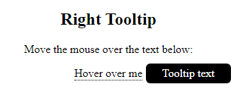
<h2>Right Tooltip</h2>
<p>Move the mouse over the text below:</p>
<div class="tooltip">Hover over me
<span class="tooltiptext">Tooltip text</span>
</div>
</body>
</html>
Result:
Left Tooltip
<!DOCTYPE html>
<html>
<style>
.tooltip {
position: relative;
display: inline-block;
border-bottom: 1px dotted black;
}
.tooltip .tooltiptext {
visibility: hidden;
width: 120px;
background-color: black;
color: #fff;
text-align: center;
border-radius: 6px;
padding: 5px 0;
/* Position the tooltip */
position: absolute;
z-index: 1;
top: -5px;
right: 105%;
}
.tooltip:hover .tooltiptext {
visibility: visible;
}
</style>
<body style="text-align:center;">
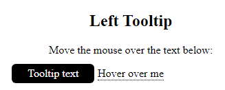
<h2>Left Tooltip</h2>
<p>Move the mouse over the text below:</p>
<div class="tooltip">Hover over me
<span class="tooltiptext">Tooltip text</span>
</div>
</body>
</html>
Result:
If you want the tooltip to appear on top or on the bottom, see examples below. Note that we use the margin-left property with a value of minus 60 pixels. This is to center the tooltip above/below the hoverable text. It is set to the half of the tooltip’s width (120/2 = 60).
Top Tooltip
<!DOCTYPE html>
<html>
<style>
.tooltip {
position: relative;
display: inline-block;
border-bottom: 1px dotted black;
}
.tooltip .tooltiptext {
visibility: hidden;
width: 120px;
background-color: black;
color: #fff;
text-align: center;
border-radius: 6px;
padding: 5px 0;
/* Position the tooltip */
position: absolute;
z-index: 1;
bottom: 100%;
left: 50%;
margin-left: -60px;
}
.tooltip:hover .tooltiptext {
visibility: visible;
}
</style>
<body style="text-align:center;">
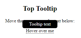
<h2>Top Tooltip</h2>
<p>Move the mouse over the text below:</p>
<div class="tooltip">Hover over me
<span class="tooltiptext">Tooltip text</span>
</div>
</body>
</html>
Result:
Bottom Tooltip
<!DOCTYPE html>
<html>
<style>
.tooltip {
position: relative;
display: inline-block;
border-bottom: 1px dotted black;
}
.tooltip .tooltiptext {
visibility: hidden;
width: 120px;
background-color: black;
color: #fff;
text-align: center;
border-radius: 6px;
padding: 5px 0;
/* Position the tooltip */
position: absolute;
z-index: 1;
top: 100%;
left: 50%;
margin-left: -60px;
}
.tooltip:hover .tooltiptext {
visibility: visible;
}
</style>
<body style="text-align:center;">
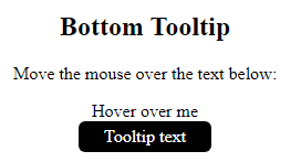
<h2>Bottom Tooltip</h2>
<p>Move the mouse over the text below:</p>
<div class="tooltip">Hover over me
<span class="tooltiptext">Tooltip text</span>
</div>
</body>
</html>
Result:
Tooltip Arrows
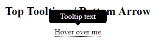
To create an arrow that should appear from a specific side of the tooltip, add “empty” content after tooltip, with the pseudo-element class ::after together with the content property. The arrow itself is created using borders. This will make the tooltip look like a speech bubble.
This example demonstrates how to add an arrow to the bottom of the tooltip:
Bottom Arrow
<!DOCTYPE html>
<html>
<style>
.tooltip {
position: relative;
display: inline-block;
border-bottom: 1px dotted black;
}
.tooltip .tooltiptext {
visibility: hidden;
width: 120px;
background-color: black;
color: #fff;
text-align: center;
border-radius: 6px;
padding: 5px 0;
position: absolute;
z-index: 1;
bottom: 150%;
left: 50%;
margin-left: -60px;
}
.tooltip .tooltiptext::after {
content: "";
position: absolute;
top: 100%;
left: 50%;
margin-left: -5px;
border-width: 5px;
border-style: solid;
border-color: black transparent transparent transparent;
}
.tooltip:hover .tooltiptext {
visibility: visible;
}
</style>
<body style="text-align:center;">
<h2>Top Tooltip w/ Bottom Arrow</h2>
<div class="tooltip">Hover over me
<span class="tooltiptext">Tooltip text</span>
</div>
</body>
</html>
Result:
Example Explained
Position the arrow inside the tooltip: top: 100% will place the arrow at the bottom of the tooltip. left: 50% will center the arrow.
Note: The border-width property specifies the size of the arrow. If you change this, also change the margin-left value to the same. This will keep the arrow centered.
The border-color is used to transform the content into an arrow. We set the top border to black, and the rest to transparent. If all sides were black, you would end up with a black square box.
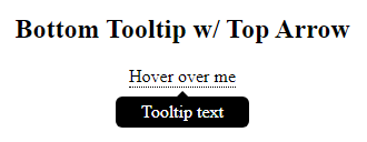
This example demonstrates how to add an arrow to the top of the tooltip. Notice that we set the bottom border color this time:
Top Arrow
<!DOCTYPE html>
<html>
<style>
.tooltip {
  position: relative;
  display: inline-block;
  border-bottom: 1px dotted black;
}
.tooltip .tooltiptext {
  visibility: hidden;
  width: 120px;
  background-color: black;
  color: #fff;
  text-align: center;
  border-radius: 6px;
  padding: 5px 0;
  position: absolute;
  z-index: 1;
  top: 150%;
  left: 50%;
  margin-left: -60px;
}
.tooltip .tooltiptext::after {
  content: "";
  position: absolute;
  bottom: 100%;
  left: 50%;
  margin-left: -5px;
  border-width: 5px;
  border-style: solid;
  border-color: transparent transparent black transparent;
}
.tooltip:hover .tooltiptext {
  visibility: visible;
}
</style>
<body style="text-align:center;">
<h2>Bottom Tooltip w/ Top Arrow</h2>
<div class="tooltip">Hover over me
  <span class="tooltiptext">Tooltip text</span>
</div>
</body>
</html>
Result:
This example demonstrates how to add an arrow to the left of the tooltip:
Left Arrow
<!DOCTYPE html>
<html>
<style>
.tooltip {
position: relative;
display: inline-block;
border-bottom: 1px dotted black;
}
.tooltip .tooltiptext {
visibility: hidden;
width: 120px;
background-color: black;
color: #fff;
text-align: center;
border-radius: 6px;
padding: 5px 0;
position: absolute;
z-index: 1;
top: -5px;
left: 110%;
}
.tooltip .tooltiptext::after {
content: "";
position: absolute;
top: 50%;
right: 100%;
margin-top: -5px;
border-width: 5px;
border-style: solid;
border-color: transparent black transparent transparent;
}
.tooltip:hover .tooltiptext {
visibility: visible;
}
</style>
<body style="text-align:center;">
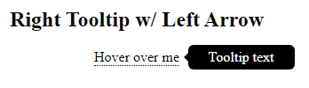
<h2>Right Tooltip w/ Left Arrow</h2>
<div class="tooltip">Hover over me
<span class="tooltiptext">Tooltip text</span>
</div>
</body>
</html>
Result:
This example demonstrates how to add an arrow to the right of the tooltip:
Right Arrow
<!DOCTYPE html>
<html>
<style>
.tooltip {
  position: relative;
  display: inline-block;
  border-bottom: 1px dotted black;
}
.tooltip .tooltiptext {
  visibility: hidden;
  width: 120px;
  background-color: black;
  color: #fff;
  text-align: center;
  border-radius: 6px;
  padding: 5px 0;
  position: absolute;
  z-index: 1;
  top: -5px;
  right: 110%;
}
.tooltip .tooltiptext::after {
  content: "";
  position: absolute;
  top: 50%;
  left: 100%;
  margin-top: -5px;
  border-width: 5px;
  border-style: solid;
  border-color: transparent transparent transparent black;
}
.tooltip:hover .tooltiptext {
  visibility: visible;
}
</style>
<body style="text-align:center;">
<h2>Left Tooltip w/ Right Arrow</h2>
<div class="tooltip">Hover over me
  <span class="tooltiptext">Tooltip text</span>
</div>
</body>
</html>
Result:

Fade In Tooltips (Animation)
If you want to fade in the tooltip text when it is about to be visible, you can use the CSS transition property together with the opacity property, and go from being completely invisible to 100% visible, in a number of specified seconds (1 second in our example):
Example
<!DOCTYPE html>
<html>
<style>
.tooltip {
position: relative;
display: inline-block;
border-bottom: 1px dotted black;
}
.tooltip .tooltiptext {
visibility: hidden;
width: 120px;
background-color: black;
color: #fff;
text-align: center;
border-radius: 6px;
padding: 5px 0;
position: absolute;
z-index: 1;
bottom: 100%;
left: 50%;
margin-left: -60px;
/* Fade in tooltip - takes 1 second to go from 0% to 100% opac: */
opacity: 0;
transition: opacity 1s;
}
.tooltip:hover .tooltiptext {
visibility: visible;
opacity: 1;
}
</style>
<body style="text-align:center;">
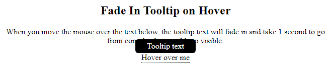
<h2>Fade In Tooltip on Hover</h2>
<p>When you move the mouse over the text below, the tooltip text will fade in and take 1 second to go from completely invisible to visible.</p>
<div class="tooltip">Hover over me
<span class="tooltiptext">Tooltip text</span>
</div>
</body>
</html>
Result: