

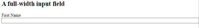
Styling Input Fields
Use the width property to determine the width of the input field:
Example
<!DOCTYPE html>
<html>
<head>
<style>
input {
width: 100%;
}
</style>
</head>
<body>
<h2>A full-width input field</h2>
<form>
<label for="fname">First Name</label>
<input type="text" id="fname" name="fname">
</form>
<body>
</html>
Result:
The example above applies to all <input> elements. If you only want to style a specific input type, you can use attribute selectors:
input[type=text]– will only select text fieldsinput[type=password]– will only select password fieldsinput[type=number]– will only select number fields- etc..
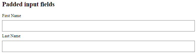
Padded Inputs
Use the padding property to add space inside the text field.
Tip: When you have many inputs after each other, you might also want to add some margin, to add more space outside of them:
Example
<!DOCTYPE html>
<html>
<head>
<style>
input[type=text] {
  width: 100%;
  padding: 12px 20px;
  margin: 8px 0;
  box-sizing: border-box;
}
</style>
</head>
<body>
<h2>Padded input fields</h2>
<form>
  <label for="fname">First Name</label>
  <input type="text" id="fname" name="fname">
  <label for="lname">Last Name</label>
  <input type="text" id="lname" name="lname">
</form>
</body>
</html>
Result:
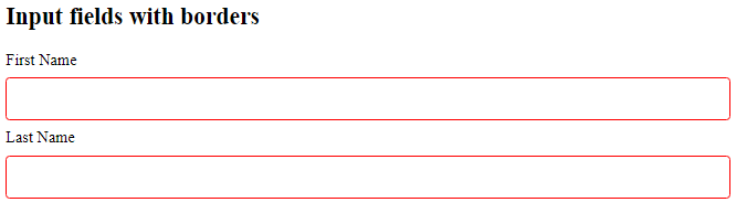
Bordered Inputs
Use the border property to change the border size and color, and use the border-radius property to add rounded corners:
Example
<!DOCTYPE html>
<html>
<head>
<style>
input[type=text] {
  width: 100%;
  padding: 12px 20px;
  margin: 8px 0;
  box-sizing: border-box;
  border: 2px solid red;
  border-radius: 4px;
}
</style>
</head>
<body>
<h2>Input fields with borders</h2>
<form>
  <label for="fname">First Name</label>
  <input type="text" id="fname" name="fname">
  <label for="lname">Last Name</label>
  <input type="text" id="lname" name="lname">
</form>
</body>
</html>
Result:
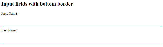
If you only want a bottom border, use the border-bottom property:
Example
<!DOCTYPE html>
<html>
<head>
<style>
input[type=text] {
  width: 100%;
  padding: 12px 20px;
  margin: 8px 0;
  box-sizing: border-box;
  border: none;
  border-bottom: 2px solid red;
}
</style>
</head>
<body>
<h2>Input fields with bottom border</h2>
<form>
  <label for="fname">First Name</label>
  <input type="text" id="fname" name="fname">
  <label for="lname">Last Name</label>
  <input type="text" id="lname" name="lname">
</form>
</body>
</html>
Result:
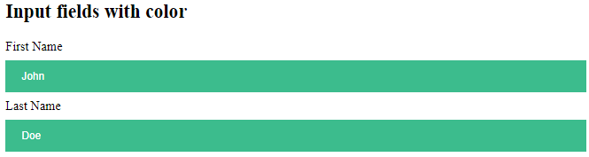
Colored Inputs
Use the background-color property to add a background color to the input, and the color property to change the text color:
Example
<!DOCTYPE html>
<html>
<head>
<style>
input[type=text] {
  width: 100%;
  padding: 12px 20px;
  margin: 8px 0;
  box-sizing: border-box;
  border: none;
  background-color: #3CBC8D;
  color: white;
}
</style>
</head>
<body>
<h2>Input fields with color</h2>
<form>
  <label for="fname">First Name</label>
  <input type="text" id="fname" name="fname" value="John">
  <label for="lname">Last Name</label>
  <input type="text" id="lname" name="lname" value="Doe">
</form>
</body>
</html>
Result:
Focused Inputs
By default, some browsers will add a blue outline around the input when it gets focus (clicked on). You can remove this behavior by adding outline: none; to the input.
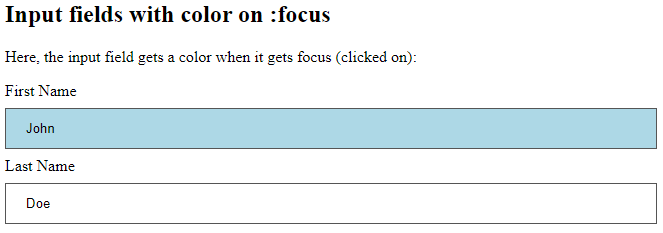
Use the :focus selector to do something with the input field when it gets focus:
Example:
<!DOCTYPE html>
<html>
<head>
<style>
input[type=text] {
  width: 100%;
  padding: 12px 20px;
  margin: 8px 0;
  box-sizing: border-box;
  border: 1px solid #555;
  outline: none;
}
input[type=text]:focus {
  background-color: lightblue;
}
</style>
</head>
<body>
<h2>Input fields with color on :focus</h2>
<p>Here, the input field gets a color when it gets focus (clicked on):</p>
<form>
  <label for="fname">First Name</label>
  <input type="text" id="fname" name="fname" value="John">
  <label for="lname">Last Name</label>
  <input type="text" id="lname" name="lname" value="Doe">
</form>
</body>
</html>
Result:
Example:
<!DOCTYPE html>
<html>
<head>
<style>
input[type=text] {
width: 100%;
padding: 12px 20px;
margin: 8px 0;
box-sizing: border-box;
border: 3px solid #ccc;
-webkit-transition: 0.5s;
transition: 0.5s;
outline: none;
}
input[type=text]:focus {
border: 3px solid #555;
}
</style>
</head>
<body>
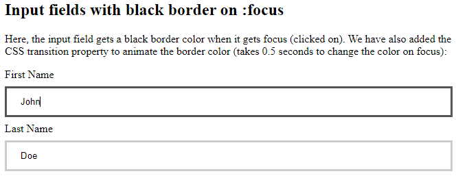
<h2>Input fields with black border on :focus</h2>
<p>Here, the input field gets a black border color when it gets focus (clicked on). We have also added the CSS transition property to animate the border color (takes 0.5 seconds to change the color on focus):</p>
<form>
<label for="fname">First Name</label>
<input type="text" id="fname" name="fname" value="John">
<label for="lname">Last Name</label>
<input type="text" id="lname" name="lname" value="Doe">
</form>
</body>
</html>
Result:
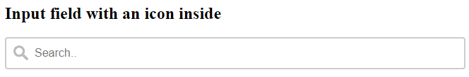
Input with icon/image
If you want an icon inside the input, use the background-image property and position it with the background-position property. Also notice that we add a large left padding to reserve the space of the icon:
Example
<!DOCTYPE html>
<html>
<head>
<style>
input[type=text] {
  width: 100%;
  box-sizing: border-box;
  border: 2px solid #ccc;
  border-radius: 4px;
  font-size: 16px;
  background-color: white;
  background-image: url('searchicon.png');
  background-position: 10px 10px;
  background-repeat: no-repeat;
  padding: 12px 20px 12px 40px;
}
</style>
</head>
<body>
<h2>Input field with an icon inside</h2>
<form>
  <input type="text" name="search" placeholder="Search..">
</form>
</body>
</html>
Result:
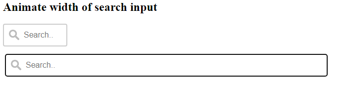
Animated Search Input
In this example we use the CSS transition property to animate the width of the search input when it gets focus. You will learn more about the transition property later, in our CSS Transitions chapter.
Example
<!DOCTYPE html>
<html>
<head>
<style>
input[type=text] {
  width: 130px;
  box-sizing: border-box;
  border: 2px solid #ccc;
  border-radius: 4px;
  font-size: 16px;
  background-color: white;
  background-image: url('searchicon.png');
  background-position: 10px 10px;
  background-repeat: no-repeat;
  padding: 12px 20px 12px 40px;
  transition: width 0.4s ease-in-out;
}
input[type=text]:focus {
  width: 100%;
}
</style>
</head>
<body>
<h2>Animate width of search input</h2>
<form>
  <input type="text" name="search" placeholder="Search..">
</form>
</body>
</html>
Result:
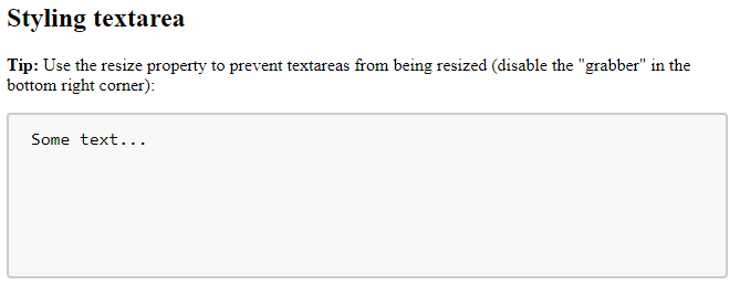
Styling Textareas
Tip: Use the resize property to prevent textareas from being resized (disable the “grabber” in the bottom right corner):
Example
<!DOCTYPE html>
<html>
<head>
<style>
textarea {
  width: 100%;
  height: 150px;
  padding: 12px 20px;
  box-sizing: border-box;
  border: 2px solid #ccc;
  border-radius: 4px;
  background-color: #f8f8f8;
  font-size: 16px;
  resize: none;
}
</style>
</head>
<body>
<h2>Styling textarea</h2>
<p><strong>Tip:</strong> Use the resize property to prevent textareas from being resized (disable the "grabber" in the bottom right corner):</p>
<form>
  <textarea>Some text...</textarea>
</form>
</body>
</html>
Result:
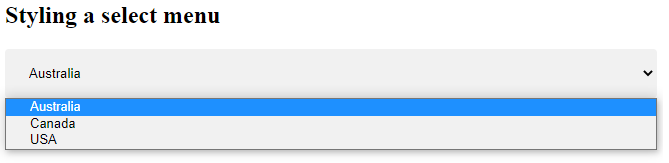
Styling Select Menus
Example
<!DOCTYPE html>
<html>
<head>
<style>
select {
  width: 100%;
  padding: 16px 20px;
  border: none;
  border-radius: 4px;
  background-color: #f1f1f1;
}
</style>
</head>
<body>
<h2>Styling a select menu</h2>
<form>
  <select id="country" name="country">
  <option value="au">Australia</option>
  <option value="ca">Canada</option>
  <option value="usa">USA</option>
  </select>
</form>
</body>
</html>
Result:
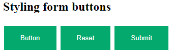
Styling Input Buttons
Example
<!DOCTYPE html>
<html>
<head>
<style>
input[type=button], input[type=submit], input[type=reset] {
  background-color: #04AA6D;
  border: none;
  color: white;
  padding: 16px 32px;
  text-decoration: none;
  margin: 4px 2px;
  cursor: pointer;
}
</style>
</head>
<body>
<h2>Styling form buttons</h2>
<input type="button" value="Button">
<input type="reset" value="Reset">
<input type="submit" value="Submit">
</body>
</html>
Result: