

Text Color
The color property is used to set the color of the text. The color is specified by:
- a color name – like “red”
- a HEX value – like “#ff0000”
- an RGB value – like “rgb(255,0,0)”
Look at CSS Color Values for a complete list of possible color values.
The default text color for a page is defined in the body selector.
Example
<!DOCTYPE html>
<html>
<head>
<style>
body {
  color: blue;
}
h1 {
  color: green;
}
</style>
</head>
<body>
<h1>This is heading 1</h1>
<p>This is an ordinary paragraph. Notice that this text is blue. The default text color for a page is defined in the body selector.</p>
<p>Another paragraph.</p>
</body>
</html>
Result:
This is heading 1
This is an ordinary paragraph. Notice that this text is blue. The default text color for a page is defined in the body selector.
Another paragraph.
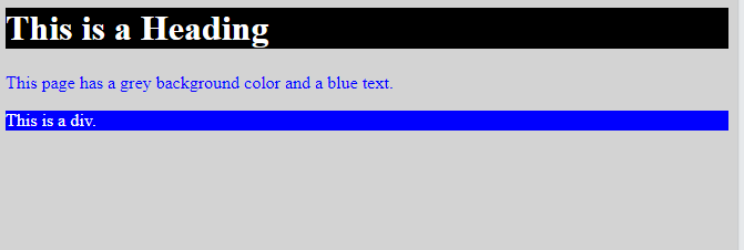
Text Color and Background Color
In this example, we define both the background-color property and the color property:
Example
<!DOCTYPE html>
<html>
<head>
<style>
body {
  background-color: lightgrey;
  color: blue;
}
h1 {
  background-color: black;
  color: white;
}
div {
  background-color: blue;
  color: white;
}
</style>
</head>
<body>
<h1>This is a Heading</h1>
<p>This page has a grey background color and a blue text.</p>
<div>This is a div.</div>
</body>
</html>
Result:
CSS Text Alignment and Text Direction
In this chapter you will learn about the following properties:
text-aligntext-align-lastdirectionunicode-bidivertical-align
Text Alignment
The text-align property is used to set the horizontal alignment of a text.
A text can be left or right aligned, centered, or justified.
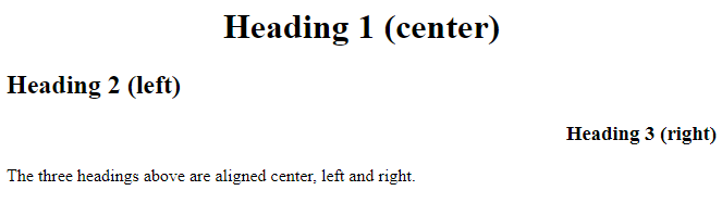
The following example shows center aligned, and left and right aligned text (left alignment is default if text direction is left-to-right, and right alignment is default if text direction is right-to-left):
Example
<!DOCTYPE html>
<html>
<head>
<style>
h1 {
  text-align: center;
}
h2 {
  text-align: left;
}
h3 {
  text-align: right;
}
</style>
</head>
<body>
<h1>Heading 1 (center)</h1>
<h2>Heading 2 (left)</h2>
<h3>Heading 3 (right)</h3>
<p>The three headings above are aligned center, left and right.</p>
</body>
</html>
Result:
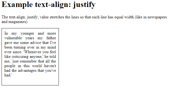
When the text-align property is set to “justify”, each line is stretched so that every line has equal width, and the left and right margins are straight (like in magazines and newspapers):
Example
<!DOCTYPE html>
<html>
<head>
<style>
div {
  border: 1px solid black;
  padding: 10px;
  width: 200px;
  height: 200px;
  text-align: justify;
}
</style>
</head>
<body>
<h1>Example text-align: justify</h1>
<p>The text-align: justify; value stretches the lines so that each line has equal width (like in newspapers and magazines).</p>
<div>
In my younger and more vulnerable years my father gave me some advice that I've been turning over in my mind ever since. 'Whenever you feel like criticizing anyone,' he told me, 'just remember that all the people in this world haven't had the advantages that you've had.'
</div>
</body>
</html>
Result:
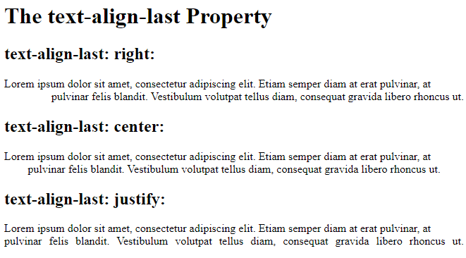
Text Align Last
The text-align-last property specifies how to align the last line of a text.
Example
Align the last line of text in three <p> elements:
<!DOCTYPE html>
<html>
<head>
<style>
p.a {
  text-align-last: right;
}
p.b {
  text-align-last: center;
}
p.c {
  text-align-last: justify;
}
</style>
</head>
<body>
<h1>The text-align-last Property</h1>
<h2>text-align-last: right:</h2>
<p class="a">Lorem ipsum dolor sit amet, consectetur adipiscing elit. Etiam semper diam at erat pulvinar, at pulvinar felis blandit. Vestibulum volutpat tellus diam, consequat gravida libero rhoncus ut.</p>
<h2>text-align-last: center:</h2>
<p class="b">Lorem ipsum dolor sit amet, consectetur adipiscing elit. Etiam semper diam at erat pulvinar, at pulvinar felis blandit. Vestibulum volutpat tellus diam, consequat gravida libero rhoncus ut.</p>
<h2>text-align-last: justify:</h2>
<p class="c">Lorem ipsum dolor sit amet, consectetur adipiscing elit. Etiam semper diam at erat pulvinar, at pulvinar felis blandit. Vestibulum volutpat tellus diam, consequat gravida libero rhoncus ut.</p>
</body>
</html>
Result:
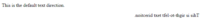
Text Direction
The direction and unicode-bidi properties can be used to change the text direction of an element:
Example
<!DOCTYPE html>
<html>
<head>
<style>
p.ex1 {
  direction: rtl;
  unicode-bidi: bidi-override;
}
</style>
</head>
<body>
<p>This is the default text direction.</p>
<p class="ex1">This is right-to-left text direction.</p>
</body>
</html>
Result:
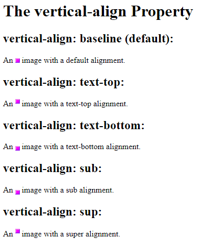
Vertical Alignment
The vertical-align property sets the vertical alignment of an element.
Example
Set the vertical alignment of an image in a text:
<!DOCTYPE html>
<html>
<head>
<style>
img.a {
  vertical-align: baseline;
}
img.b {
  vertical-align: text-top;
}
img.c {
  vertical-align: text-bottom;
}
img.d {
  vertical-align: sub;
}
img.e {
  vertical-align: super;
}
</style>
</head>
<body>
<h1>The vertical-align Property</h1>
<h2>vertical-align: baseline (default):</h2>
<p>An <img class="a" src="sqpurple.gif" width="9" height="9"> image with a default alignment.</p>
<h2>vertical-align: text-top:</h2>
<p>An <img class="b" src="sqpurple.gif" width="9" height="9"> image with a text-top alignment.</p>
<h2>vertical-align: text-bottom:</h2>
<p>An <img class="c" src="sqpurple.gif" width="9" height="9"> image with a text-bottom alignment.</p>
<h2>vertical-align: sub:</h2>
<p>An <img class="d" src="sqpurple.gif" width="9" height="9"> image with a sub alignment.</p> <h2>vertical-align: sup:</h2>
<p>An <img class="e" src="sqpurple.gif" width="9" height="9"> image with a super alignment.</p>
</body>
</html>
Result:
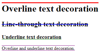
CSS Text Decoration
In this chapter you will learn about the following properties:
text-decoration-linetext-decoration-colortext-decoration-styletext-decoration-thicknesstext-decoration
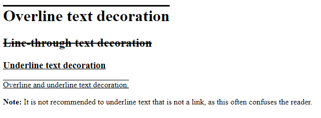
Add a Decoration Line to Text
The text-decoration-line property is used to add a decoration line to text.
Tip: You can combine more than one value, like overline and underline to display lines both over and under a text.
Example
<!DOCTYPE html>
<html>
<head>
<style>
h1 {
  text-decoration: overline;
}
h2 {
  text-decoration: line-through;
}
h3 {
  text-decoration: underline;
}
p.ex {
  text-decoration: overline underline;
}
</style>
</head>
<body>
<h1>Overline text decoration</h1>
<h2>Line-through text decoration</h2>
<h3>Underline text decoration</h3>
<p class="ex">Overline and underline text decoration.</p>
<p><strong>Note:</strong> It is not recommended to underline text that is not a link, as this often confuses the reader.</p>
</body>
</html>
Result:
Specify a Color for the Decoration Line
The text-decoration-color property is used to set the color of the decoration line.
Example
<!DOCTYPE html>
<html>
<head>
<style>
h1 {
  text-decoration-line: overline;
  text-decoration-color: red;
}
h2 {
  text-decoration-line: line-through;
  text-decoration-color: blue;
}
h3 {
  text-decoration-line: underline;
  text-decoration-color: green;
}
p {
  text-decoration-line: overline underline;
  text-decoration-color: purple;
}
</style>
</head>
<body>
<h1>Overline text decoration</h1>
<h2>Line-through text decoration</h2>
<h3>Underline text decoration</h3>
<p>Overline and underline text decoration.</p>
</body>
</html>
Result:
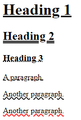
Specify a Style for the Decoration Line
The text-decoration-style property is used to set the style of the decoration line.
Example
<!DOCTYPE html>
<html>
<head>
<style>
h1 {
  text-decoration-line: underline;
  text-decoration-style: solid; /* this is default */
}
h2 {
  text-decoration-line: underline;
  text-decoration-style: double;
}
h3 {
  text-decoration-line: underline;
  text-decoration-style: dotted;
}
p.ex1 {
  text-decoration-line: underline;
  text-decoration-style: dashed;
}
p.ex2 {
  text-decoration-line: underline;
  text-decoration-style: wavy;
}
p.ex3 {
  text-decoration-line: underline;
  text-decoration-color: red;
  text-decoration-style: wavy;
}
</style>
</head>
<body>
<h1>Heading 1</h1>
<h2>Heading 2</h2>
<h3>Heading 3</h3>
<p class="ex1">A paragraph.</p>
<p class="ex2">Another paragraph.</p>
<p class="ex3">Another paragraph.</p>
</body>
</html>
Result:
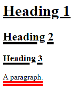
Specify the Thickness for the Decoration Line
The text-decoration-thickness property is used to set the thickness of the decoration line.
Example
<!DOCTYPE html>
<html>
<head>
<style>
h1 {
text-decoration-line: underline;
text-decoration-thickness: auto; /* this is default */
}
h2 {
text-decoration-line: underline;
text-decoration-thickness: 5px;
}
h3 {
text-decoration-line: underline;
text-decoration-thickness: 25%;
}
p {
text-decoration-line: underline;
text-decoration-color: red;
text-decoration-style: double;
text-decoration-thickness: 5px;
}
</style>
</head>
<body>
<h1>Heading 1</h1>
<h2>Heading 2</h2>
<h3>Heading 3</h3>
<p>A paragraph.</p>
</body>
</html>
Result:
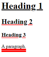
The Shorthand Property
The text-decoration property is a shorthand property for:
text-decoration-line(required)text-decoration-color(optional)text-decoration-style(optional)text-decoration-thickness(optional)
Example
<!DOCTYPE html>
<html>
<head>
<style>
h1 {
text-decoration: underline;
}
h2 {
text-decoration: underline red;
}
h3 {
text-decoration: underline red double;
}
p {
text-decoration: underline red double 5px;
}
</style>
</head>
<body>
<h1>Heading 1</h1>
<h2>Heading 2</h2>
<h3>Heading 3</h3>
<p>A paragraph.</p>
</body>
</html>
Result:
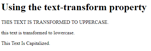
Text Transformation
The text-transform property is used to specify uppercase and lowercase letters in a text.
It can be used to turn everything into uppercase or lowercase letters, or capitalize the first letter of each word:
Example
<!DOCTYPE html>
<html>
<head>
<style>
p.uppercase {
text-transform: uppercase;
}
p.lowercase {
text-transform: lowercase;
}
p.capitalize {
text-transform: capitalize;
}
</style>
</head>
<body>
<h1>Using the text-transform property</h1>
<p class="uppercase">This text is transformed to uppercase.</p>
<p class="lowercase">This text is transformed to lowercase.</p>
<p class="capitalize">This text is capitalized.</p>
</body>
</html>
Result:
CSS Text Indentation, Letter Spacing, Line Height, Word Spacing, and White Space
In this chapter you will learn about the following properties:
text-indentletter-spacingline-heightword-spacingwhite-space
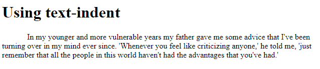
Text Indentation
The text-indent property is used to specify the indentation of the first line of a text:
Example
<!DOCTYPE html> <html> <head>
<style>
p {
text-indent: 50px;
}
</style>
</head>
<body>
<h1>Using text-indent</h1>
<p>In my younger and more vulnerable years my father gave me some advice that I've been turning over in my mind ever since. 'Whenever you feel like criticizing anyone,' he told me, 'just remember that all the people in this world haven't had the advantages that you've had.'</p>
</body>
</html>
Result:
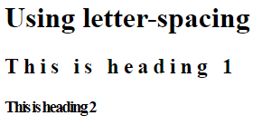
Letter Spacing
The letter-spacing property is used to specify the space between the characters in a text.
The following example demonstrates how to increase or decrease the space between characters:
Example
<!DOCTYPE html>
<html>
<head>
<style>
h2 {
  letter-spacing: 5px;
}
h3 {
  letter-spacing: -2px;
}
</style>
</head>
<body>
<h1>Using letter-spacing</h1>
<h2>This is heading 1</h2>
<h3>This is heading 2</h3>
</body>
</html>
Result:
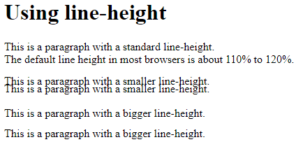
Line Height
The line-height property is used to specify the space between lines:
Example
<!DOCTYPE html>
<html>
<head>
<style>
p.small {
  line-height: 0.7;
}
p.big {
  line-height: 1.8;
}
</style>
</head>
<body>
<h1>Using line-height</h1>
<p>This is a paragraph with a standard line-height.<br>
The default line height in most browsers is about 110% to 120%.<br>
</p>
<p class="small">
This is a paragraph with a smaller line-height.<br>
This is a paragraph with a smaller line-height.<br>
</p>
<p class="big">
This is a paragraph with a bigger line-height.<br>
This is a paragraph with a bigger line-height.<br>
</p>
</body>
</html>
Result:
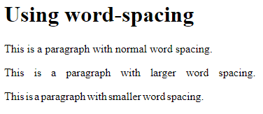
Word Spacing
The word-spacing property is used to specify the space between the words in a text.
The following example demonstrates how to increase or decrease the space between words:
Example
<!DOCTYPE html>
<html>
<head>
<style>
p.one {
  word-spacing: 10px;
}
p.two {
  word-spacing: -2px;
}
</style>
</head>
<body>
<h1>Using word-spacing</h1>
<p>This is a paragraph with normal word spacing.</p>
<p class="one">This is a paragraph with larger word spacing.</p>
<p class="two">This is a paragraph with smaller word spacing.</p>
</body>
</html>
Result:
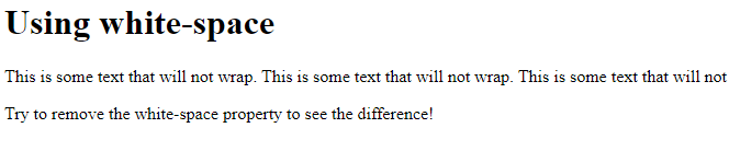
White Space
The white-space property specifies how white-space inside an element is handled.
This example demonstrates how to disable text wrapping inside an element:
Example
<!DOCTYPE html>
<html>
<head>
<style>
p {
  white-space: nowrap;
}
</style>
</head>
<body>
<h1>Using white-space</h1>
<p>
This is some text that will not wrap.
This is some text that will not wrap.
This is some text that will not wrap.
This is some text that will not wrap.
This is some text that will not wrap.
This is some text that will not wrap.
This is some text that will not wrap.
This is some text that will not wrap.
This is some text that will not wrap.
</p>
<p>Try to remove the white-space property to see the difference!</p>
</body>
</html>
Result:
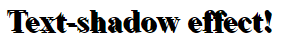
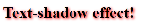
Text Shadow
The text-shadow property adds shadow to text.
In its simplest use, you only specify the horizontal shadow (2px) and the vertical shadow (2px):
Text shadow effect!
Example
<!DOCTYPE html>
<html>
<head>
<style>
h1 {
  text-shadow: 2px 2px;
}
</style>
</head>
<body>
<h1>Text-shadow effect!</h1>
</body>
</html>
Result:
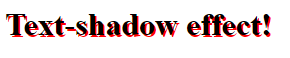
Next, add a color (red) to the shadow:
Example
<!DOCTYPE html>
<html>
<head>
<style>
h1 {
  text-shadow: 2px 2px red;
}
</style>
</head>
<body>
<h1>Text-shadow effect!</h1>
</body>
</html>
Result:
Then, add a blur effect (5px) to the shadow:
Example
<!DOCTYPE html>
<html>
<head>
<style>
h1 {
text-shadow: 2px 2px 5px red;
}
</style>
</head>
<body>
<h1>Text-shadow effect!</h1>
</body>
</html>
Result:
More Text Shadow Examples
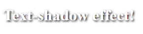
Example 1
Text-shadow on a white text:
<!DOCTYPE html>
<html>
<head>
<style>
h1 {
  color: white;
  text-shadow: 2px 2px 4px #000000;
}
</style>
</head>
<body>
<h1>Text-shadow effect!</h1>
</body>
</html>
Result:
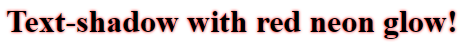
Example 2
Text-shadow with red neon glow:h1 {
text-shadow: 0 0 3px #ff0000;
}
Result:
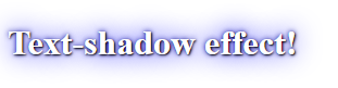
Example 3
Text-shadow with red and blue neon glow:h1 {
text-shadow: 0 0 3px #ff0000, 0 0 5px #0000ff;
}
Result:

Example 4
h1 {
color: white;
text-shadow: 1px 1px 2px black, 0 0 25px blue, 0 0 5px darkblue;
}
Result: