

CSS Flexbox Layout Module
Before the Flexbox Layout module, there were four layout modes:
- Block, for sections in a webpage
- Inline, for text
- Table, for two-dimensional table data
- Positioned, for explicit position of an element
The Flexible Box Layout Module, makes it easier to design flexible responsive layout structure without using float or positioning.
Browser Support
The flexbox properties are supported in all modern browsers.
| Google Chrome | Internet Explorer | Mozilla Firefox | Safari | Opera |
|---|---|---|---|---|
| 29.0 | 11.0 | 22.0 | 10 | 48 |
Flexbox Elements
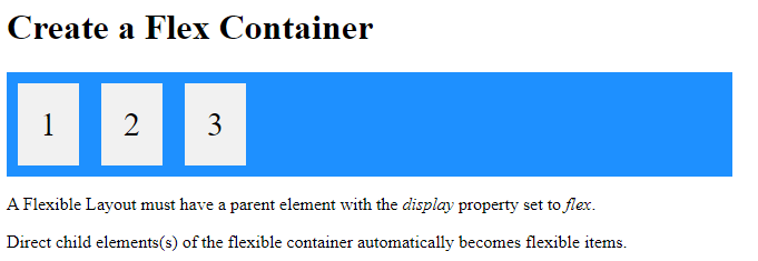
To start using the Flexbox model, you need to first define a flex container.
The element above represents a flex container (the blue area) with three flex items.
Example
A flex container with three flex items:
<!DOCTYPE html>
<html>
<head>
<style>
.flex-container {
  display: flex;
  background-color: DodgerBlue;
}
.flex-container > div {
  background-color: #f1f1f1;
  margin: 10px;
  padding: 20px;
  font-size: 30px;
}
</style>
</head>
<body>
<h1>Create a Flex Container</h1>
<div class="flex-container">
  <div>1</div>
  <div>2</div>
  <div>3</div>
</div>
<p>A Flexible Layout must have a parent element with the <em>display</em> property set to <em>flex</em>.</p>
<p>Direct child elements(s) of the flexible container automatically becomes flexible items.</p></body>
</html>
Result:
CSS Flex Container
Parent Element (Container)
Like we specified in the previous chapter, this is a flex container (the blue area) with three flex items:
The flex container becomes flexible by setting the display property to flex:
Example
<!DOCTYPE html>
<html>
<head>
<style>
.flex-container {
display: flex;
background-color: DodgerBlue;
}
.flex-container > div {
background-color: #f1f1f1;
margin: 10px;
padding: 20px;
font-size: 30px;
}
</style>
</head>
<body>
<h1>Create a Flex Container</h1>
<div class="flex-container">
<div>1</div>
<div>2</div>
<div>3</div>
</div>
<p>A Flexible Layout must have a parent element with the <em>display</em> property set to <em>flex</em>.</p>
<p>Direct child elements(s) of the flexible container automatically becomes flexible items.</p></body>
</html>
Result:

The flex container properties are:
flex-directionflex-wrapflex-flowjustify-contentalign-itemsalign-content
The flex-direction Property
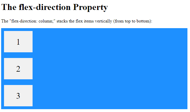
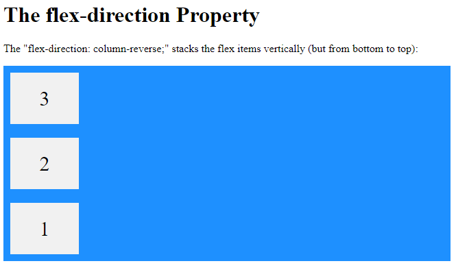
The flex-direction property defines in which direction the container wants to stack the flex items.
Example
The column value stacks the flex items vertically (from top to bottom):
<!DOCTYPE html>
<html>
<head>
<style>
.flex-container {
  display: flex;
  flex-direction: column;
  background-color: DodgerBlue;
}
.flex-container > div {
  background-color: #f1f1f1;
  width: 100px;
  margin: 10px;
  text-align: center;
  line-height: 75px;
  font-size: 30px;
}
</style>
</head>
<body>
<h1>The flex-direction Property</h1>
<p>The "flex-direction: column;" stacks the flex items vertically (from top to bottom):</p>
<div class="flex-container">
  <div>1</div>
  <div>2</div>
  <div>3</div>
</div>
</body>
</html>
Result:
Example
The column-reverse value stacks the flex items vertically (but from bottom to top):
<!DOCTYPE html>
<html>
<head>
<style>
.flex-container {
  display: flex;
  flex-direction: column-reverse;
  background-color: DodgerBlue;
}
.flex-container > div {
  background-color: #f1f1f1;
  width: 100px;
  margin: 10px;
  text-align: center;
  line-height: 75px;
  font-size: 30px;
}
</style>
</head>
<body>
<h1>The flex-direction Property</h1>
<p>The "flex-direction: column-reverse;" stacks the flex items vertically (but from bottom to top):</p>
<div class="flex-container">
  <div>1</div>
  <div>2</div>
  <div>3</div>
</div>
</body>
</html>
Result:
Example
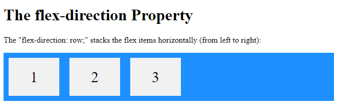
The row value stacks the flex items horizontally (from left to right):
<!DOCTYPE html>
<html>
<head>
<style>
.flex-container {
  display: flex;
  flex-direction: row;
  background-color: DodgerBlue;
}
.flex-container > div {
  background-color: #f1f1f1;
  width: 100px;
  margin: 10px;
  text-align: center;
  line-height: 75px;
  font-size: 30px;
}
</style>
</head>
<body>
<h1>The flex-direction Property</h1>
<p>The "flex-direction: row;" stacks the flex items horizontally (from left to right):</p>
<div class="flex-container">
  <div>1</div>
  <div>2</div>
  <div>3</div>
</div>
</body>
</html>
Result:
Example
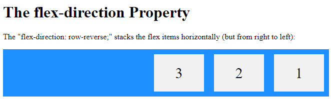
The row-reverse value stacks the flex items horizontally (but from right to left):
<!DOCTYPE html>
<html>
<head>
<style>
.flex-container {
  display: flex;
  flex-direction: row-reverse;
  background-color: DodgerBlue;
}
.flex-container > div {
  background-color: #f1f1f1;
  width: 100px;
  margin: 10px;
  text-align: center;
  line-height: 75px;
  font-size: 30px;
}
</style>
</head>
<body>
<h1>The flex-direction Property</h1>
<p>The "flex-direction: row-reverse;" stacks the flex items horizontally (but from right to left):</p>
<div class="flex-container">
  <div>1</div>
  <div>2</div>
  <div>3</div>
</div>
</body>
</html>
Result:
The flex-wrap Property
The flex-wrap property specifies whether the flex items should wrap or not.
The examples below have 12 flex items, to better demonstrate the flex-wrap property.
Example
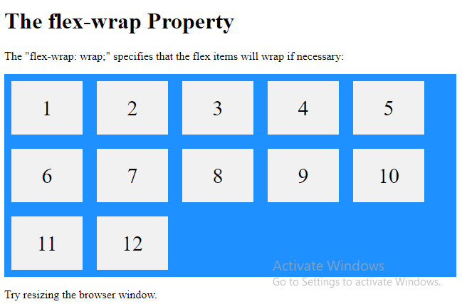
The wrap value specifies that the flex items will wrap if necessary:
<!DOCTYPE html>
<html>
<head>
<style>
.flex-container {
  display: flex;
  flex-wrap: wrap;
  background-color: DodgerBlue;
}
.flex-container > div {
  background-color: #f1f1f1;
  width: 100px;  margin: 10px;
  text-align: center;
  line-height: 75px;
  font-size: 30px;
}
</style>
</head>
<body>
<h1>The flex-wrap Property</h1>
<p>The "flex-wrap: wrap;" specifies that the flex items will wrap if necessary:</p>
<div class="flex-container">
  <div>1</div>
  <div>2</div>
  <div>3</div>
  <div>4</div>
  <div>5</div>
  <div>6</div>
  <div>7</div>
  <div>8</div>
  <div>9</div>
  <div>10</div>
  <div>11</div>
  <div>12</div>
</div>
<p>Try resizing the browser window.</p>
</body>
</html>
Result:
Example
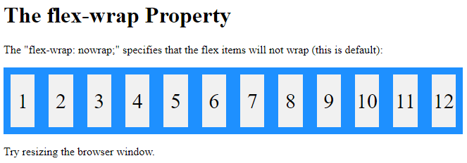
The nowrap value specifies that the flex items will not wrap (this is default):
<!DOCTYPE html>
<html>
<head>
<style>
.flex-container {
  display: flex;
  flex-wrap: nowrap;
  background-color: DodgerBlue;
}
.flex-container>div {
  background-color: #f1f1f1;
  width: 100px;
  margin: 10px;
  text-align: center;
  line-height: 75px;
  font-size: 30px;
}
</style>
</head>
<body>
<h1>The flex-wrap Property</h1>
<p>The "flex-wrap: nowrap;" specifies that the flex items will not wrap (this is default):</p><div class="flex-container">
  <div>1</div>
  <div>2</div>
  <div>3</div>
  <div>4</div>
  <div>5</div>
  <div>6</div>
  <div>7</div>
  <div>8</div>
  <div>9</div>
  <div>10</div>
  <div>11</div>
  <div>12</div>
</div>
<p>Try resizing the browser window.</p>
</body>
</html>
Result:
Example
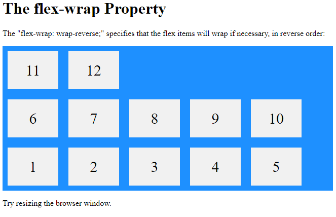
The wrap-reverse value specifies that the flexible items will wrap if necessary, in reverse order:
<!DOCTYPE html>
<html>
<head>
<style>
.flex-container {
  display: flex;
  flex-wrap: wrap-reverse;
  background-color: DodgerBlue;
}
.flex-container > div {
  background-color: #f1f1f1;
  width: 100px;
  margin: 10px;
  text-align: center;
  line-height: 75px;
  font-size: 30px;
}
</style>
</head>
<body>
<h1>The flex-wrap Property</h1>
<p>The "flex-wrap: wrap-reverse;" specifies that the flex items will wrap if necessary, in reverse order:</p>
<div class="flex-container">
  <div>1</div>
  <div>2</div>
  <div>3</div>
  <div>4</div>
  <div>5</div>
  <div>6</div>
  <div>7</div>
  <div>8</div>
  <div>9</div>
  <div>10</div>
  <div>11</div>
  <div>12</div>
</div>
<p>Try resizing the browser window.</p>
</body>
</html>
Result:
The flex-flow Property
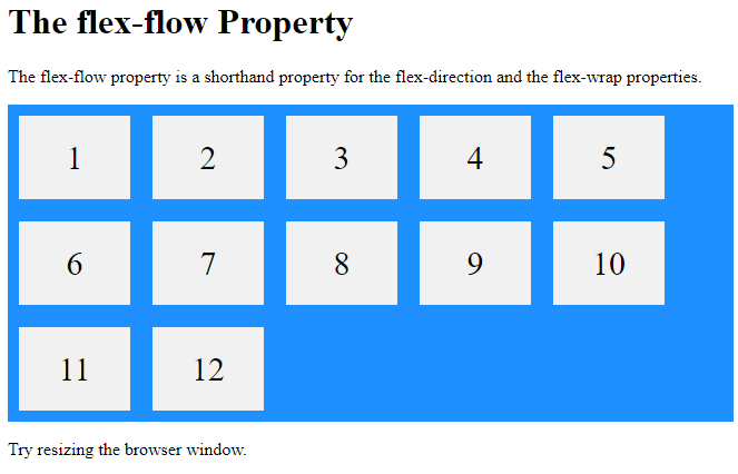
The flex-flow property is a shorthand property for setting both the flex-direction and flex-wrap properties.
Example
<!DOCTYPE html>
<html>
<head>
<style>
.flex-container {
  display: flex;
  flex-flow: row wrap;
  background-color: DodgerBlue;
}
.flex-container > div {
  background-color: #f1f1f1;
  width: 100px;
  margin: 10px;
  text-align: center;
  line-height: 75px;
  font-size: 30px;
}
</style>
</head>
<body>
<h1>The flex-flow Property</h1>
<p>The flex-flow property is a shorthand property for the flex-direction and the flex-wrap properties.</p>
<div class="flex-container">
  <div>1</div>
  <div>2</div>
  <div>3</div>
  <div>4</div>
  <div>5</div>
  <div>6</div>
  <div>7</div>
  <div>8</div>
  <div>9</div>
  <div>10</div>
  <div>11</div>
  <div>12</div>
</div>
<p>Try resizing the browser window.</p>
</body>
</html>
Result:
The justify-content Property
The justify-content property is used to align the flex items:
Example
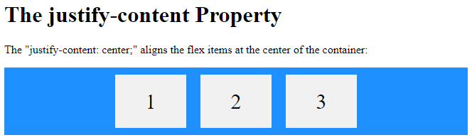
The center value aligns the flex items at the center of the container:
<!DOCTYPE html>
<html>
<head>
<style>
.flex-container {
  display: flex;
  justify-content: center;
  background-color: DodgerBlue;
}
.flex-container > div {
  background-color: #f1f1f1;
  width: 100px;
  margin: 10px;
  text-align: center;
  line-height: 75px;
  font-size: 30px;
}
</style>
</head>
<body>
<h1>The justify-content Property</h1>
<p>The "justify-content: center;" aligns the flex items at the center of the container:</p>
<div class="flex-container">
  <div>1</div>
  <div>2</div>
  <div>3</div>
</div>
</body>
</html>
Result:
Example
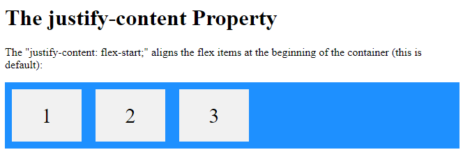
The flex-start value aligns the flex items at the beginning of the container (this is default):
<!DOCTYPE html>
<html>
<head>
<style>
.flex-container {
  display: flex;
  justify-content: flex-start;
  background-color: DodgerBlue;
}
.flex-container > div {
  background-color: #f1f1f1;
  width: 100px;
  margin: 10px;
  text-align: center;
  line-height: 75px;
  font-size: 30px;
}
</style>
</head>
<body>
<h1>The justify-content Property</h1>
<p>The "justify-content: flex-start;" aligns the flex items at the beginning of the container (this is default):</p>
<div class="flex-container">
  <div>1</div>
  <div>2</div>
  <div>3</div>
</div>
</body>
</html>
Result:
Example
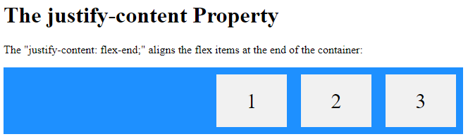
The flex-end value aligns the flex items at the end of the container:
<!DOCTYPE html>
<html>
<head>
<style>
.flex-container {
display: flex;
justify-content: flex-end;
background-color: DodgerBlue;
}
.flex-container > div {
background-color: #f1f1f1;
width: 100px;
margin: 10px;
text-align: center;
line-height: 75px;
font-size: 30px;
}
</style>
</head>
<body>
<h1>The justify-content Property</h1>
<p>The "justify-content: flex-end;" aligns the flex items at the end of the container:</p>
<div class="flex-container">
<div>1</div>
<div>2</div>
<div>3</div>
</div>
</body>
</html>
Result:
Example
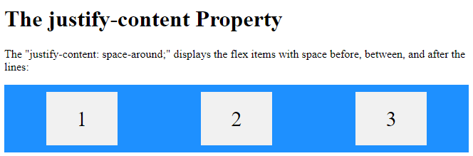
The space-around value displays the flex items with space before, between, and after the lines:
<!DOCTYPE html>
<html>
<head>
<style>
.flex-container {
  display: flex;
  justify-content: space-around;
  background-color: DodgerBlue;
}
.flex-container > div {
  background-color: #f1f1f1;
  width: 100px;
  margin: 10px;
  text-align: center;
  line-height: 75px;
  font-size: 30px;
}
</style>
</head>
<body>
<h1>The justify-content Property</h1>
<p>The "justify-content: space-around;" displays the flex items with space before, between, and after the lines:</p>
<div class="flex-container">
  <div>1</div>
  <div>2</div>
  <div>3</div>
</div>
</body>
</html>
Result:
Example
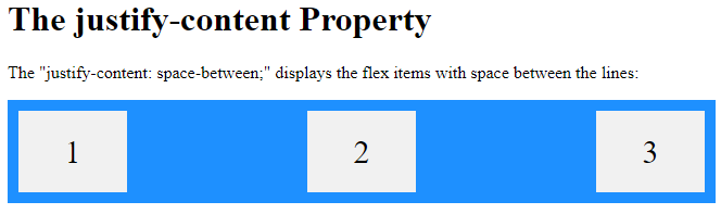
The space-between value displays the flex items with space between the lines:
<!DOCTYPE html>
<html>
<head>
<style>
.flex-container {
  display: flex;
  justify-content: space-between;
  background-color: DodgerBlue;
}
.flex-container > div {
  background-color: #f1f1f1;
  width: 100px;
  margin: 10px;
  text-align: center;
  line-height: 75px;
  font-size: 30px;
}
</style>
</head>
<body>
<h1>The justify-content Property</h1>
<p>The "justify-content: space-between;" displays the flex items with space between the lines:</p>
<div class="flex-container">
  <div>1</div>
  <div>2</div>
  <div>3</div>
</div>
</body>
</html>
Result:
The align-items Property
The align-items property is used to align the flex items.
In these examples we use a 200 pixels high container, to better demonstrate the align-items property.
Example
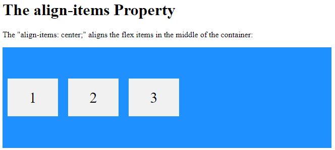
The center value aligns the flex items in the middle of the container:
<!DOCTYPE html>
<html>
<head>
<style>
.flex-container {
  display: flex;
  height: 200px;
  align-items: center;
  background-color: DodgerBlue;
}
.flex-container > div {
  background-color: #f1f1f1;
  width: 100px;
  margin: 10px;
  text-align: center;
  line-height: 75px;
  font-size: 30px;
}
</style>
</head>
<body>
<h1>The align-items Property</h1>
<p>The "align-items: center;" aligns the flex items in the middle of the container:</p>
<div class="flex-container">
  <div>1</div>
  <div>2</div>
  <div>3</div>
</div>
</body>
</html>
Result:
Example
The flex-start value aligns the flex items at the top of the container:
<!DOCTYPE html>
<html>
<head>
<style>
.flex-container {
display: flex;
height: 200px;
align-items: flex-start;
background-color: DodgerBlue;
}
.flex-container > div {
background-color: #f1f1f1;
width: 100px;
margin: 10px;
text-align: center;
line-height: 75px;
font-size: 30px;
}
</style>
</head>
<body>
<h1>The align-items Property</h1>
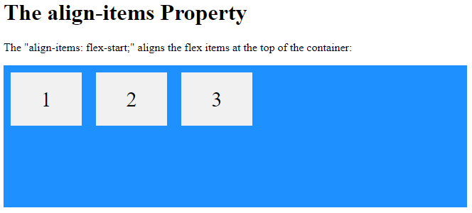
<p>The "align-items: flex-start;" aligns the flex items at the top of the container:</p>
<div class="flex-container">
<div>1</div>
<div>2</div>
<div>3</div>
</div>
</body>
</html>
Result:
Example
The flex-end value aligns the flex items at the bottom of the container:
<!DOCTYPE html>
<html>
<head>
<style>
.flex-container {
display: flex;
height: 200px;
align-items: flex-end;
background-color: DodgerBlue;
}
.flex-container > div {
background-color: #f1f1f1;
width: 100px;
margin: 10px;
text-align: center;
line-height: 75px;
font-size: 30px;
}
</style>
</head>
<body>
<h1>The align-items Property</h1>
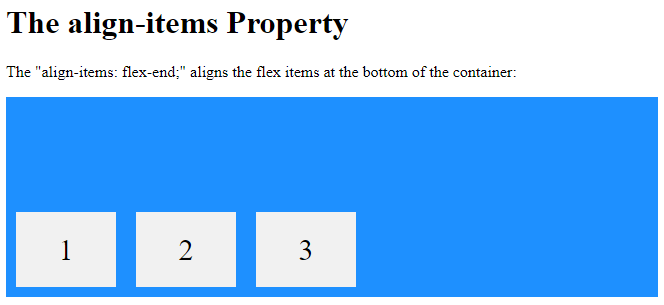
<p>The "align-items: flex-end;" aligns the flex items at the bottom of the container:</p>
<div class="flex-container">
<div>1</div>
<div>2</div>
<div>3</div>
</div>
</body>
</html>
Result:
Example
The stretch value stretches the flex items to fill the container (this is default):
<!DOCTYPE html>
<html>
<head>
<style>
.flex-container {
display: flex;
height: 200px;
align-items: stretch;
background-color: DodgerBlue;
}
.flex-container > div {
background-color: #f1f1f1;
width: 100px;
margin: 10px;
text-align: center;
line-height: 75px;
font-size: 30px;
}
</style>
</head>
<body>
<h1>The align-items Property</h1>
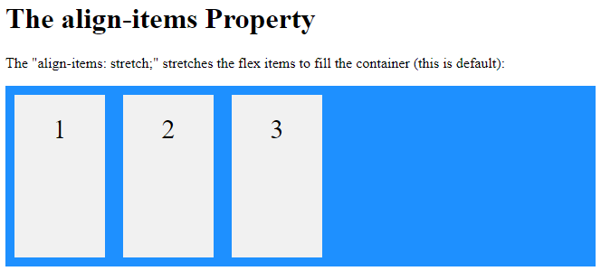
<p>The "align-items: stretch;" stretches the flex items to fill the container (this is default):</p>
<div class="flex-container">
<div>1</div>
<div>2</div>
<div>3</div>
</div>
</body>
</html>
Result:
Example
The baseline value aligns the flex items such as their baselines aligns:
<!DOCTYPE html>
<html>
<head>
<style>
.flex-container {
display: flex;
height: 200px;
align-items: baseline;
background-color: DodgerBlue;
}
flex-container > div {
background-color: #f1f1f1;
width: 100px;
margin: 10px;
text-align: center;
line-height: 75px;
font-size: 30px;
}
</style>
</head>
<body>
<h1>The align-items Property</h1>
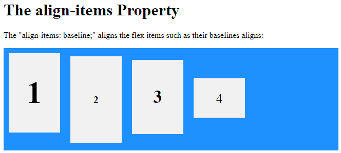
<p>The "align-items: baseline;" aligns the flex items such as their baselines aligns:</p>
<div class="flex-container">
<div><h1>1</h1></div>
<div><h6>2</h6></div>
<div><h3>3</h3></div>
<div><small>4</small></div>
</div>
</body>
</html>
Result:
The align-content Property
The align-content property is used to align the flex lines.
In these examples we use a 600 pixels high container, with the flex-wrap property set to wrap, to better demonstrate the align-content property.
Example
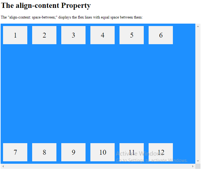
The space-between value displays the flex lines with equal space between them:
<!DOCTYPE html>
<html>
<head>
<style>
.flex-container {
  display: flex;
  height: 600px;
  flex-wrap: wrap;
  align-content: space-between;
  overflow: scroll;
  background-color: DodgerBlue;
}
.flex-container > div {
  background-color: #f1f1f1;
  width: 100px;
  margin: 10px;
  text-align: center;
  line-height: 75px;
  font-size: 30px;
}
</style>
</head>
<body>
<h1>The align-content Property</h1>
<p>The "align-content: space-between;" displays the flex lines with equal space between them:</p>
<div class="flex-container">
  <div>1</div>
  <div>2</div>
  <div>3</div>
  <div>4</div>
  <div>5</div>
  <div>6</div>
  <div>7</div>
  <div>8</div>
  <div>9</div>
  <div>10</div>
  <div>11</div>
  <div>12</div>
</div>
</body>
</html>
Result:
Example
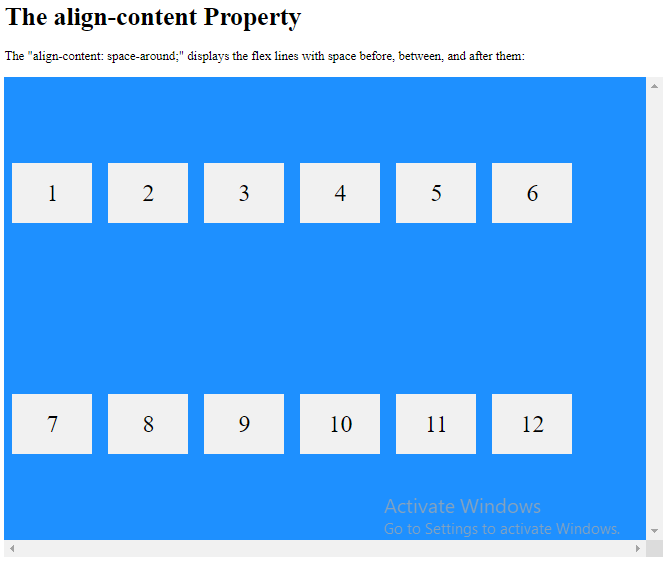
The space-around value displays the flex lines with space before, between, and after them:
<!DOCTYPE html>
<html>
<head>
<style>
.flex-container {
display: flex;
height: 600px;
flex-wrap: wrap;
align-content: space-around;
overflow: scroll;
background-color: DodgerBlue;
}
.flex-container > div {
background-color: #f1f1f1;
width: 100px;
margin: 10px;
text-align: center;
line-height: 75px;
font-size: 30px;
}
</style>
</head>
<body>
<h1>The align-content Property</h1>
<p>The "align-content: space-around;" displays the flex lines with space before, between, and after them:</p>
<div class="flex-container">
<div>1</div>
<div>2</div>
<div>3</div>
<div>4</div>
<div>5</div>
<div>6</div>
<div>7</div>
<div>8</div>
<div>9</div>
<div>10</div>
<div>11</div>
<div>12</div>
</div>
</body>
</html>
Result:
Example
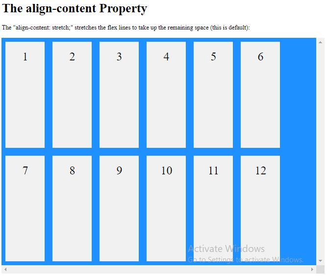
The stretch value stretches the flex lines to take up the remaining space (this is default):
<!DOCTYPE html>
<html>
<head>
<style>
.flex-container {
display: flex;
height: 600px;
flex-wrap: wrap;
align-content: stretch;
overflow: scroll;
background-color: DodgerBlue;
}
.flex-container > div {
background-color: #f1f1f1;
width: 100px;
margin: 10px;
text-align: center;
line-height: 75px;
font-size: 30px;
}
</style>
</head>
<body>
<h1>The align-content Property</h1>
<p>The "align-content: stretch;" stretches the flex lines to take up the remaining space (this is default):</p>
<div class="flex-container">
<div>1</div>
<div>2</div>
<div>3</div>
<div>4</div>
<div>5</div>
<div>6</div>
<div>7</div>
<div>8</div>
<div>9</div>
<div>10</div>
<div>11</div>
<div>12</div>
</div>
</body>
</html>
Result:
Example
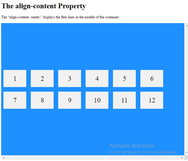
The center value displays display the flex lines in the middle of the container:
<!DOCTYPE html>
<html>
<head>
<style>
.flex-container {
display: flex;
height: 600px;
flex-wrap: wrap;
align-content: center;
overflow: scroll;
background-color: DodgerBlue;
}
.flex-container > div {
background-color: #f1f1f1;
width: 100px;
margin: 10px;
text-align: center;
line-height: 75px;
font-size: 30px;
}
</style>
</head>
<body>
<h1>The align-content Property</h1>
<p>The "align-content: center;" displays the flex lines in the middle of the container:</p>
<div class="flex-container">
<div>1</div>
<div>2</div>
<div>3</div>
<div>4</div>
<div>5</div>
<div>6</div>
<div>7</div>
<div>8</div>
<div>9</div>
<div>10</div>
<div>11</div>
<div>12</div>
</div>
</body>
</html>
Result:
Example
The flex-start value displays the flex lines at the start of the container:
<!DOCTYPE html>
<html>
<head>
<style>
.flex-container {
  display: flex;
  height: 600px;
  flex-wrap: wrap;
  align-content: flex-start;
  overflow: scroll;
  background-color: DodgerBlue;
}
.flex-container > div {
  background-color: #f1f1f1;
  width: 100px;
  margin: 10px;
  text-align: center;
  line-height: 75px;
  font-size: 30px;
}
</style>
</head>
<body>
<h1>The align-content Property</h1>
<p>The "align-content: flex-start;" displays the flex lines at the start of the container:</p><div class="flex-container">
  <div>1</div>
  <div>2</div>
  <div>3</div>
  <div>4</div>
  <div>5</div>
  <div>6</div>
  <div>7</div>
  <div>8</div>
  <div>9</div>
  <div>10</div>
  <div>11</div>
  <div>12</div>
</div>
</body>
</html>
Result:

Example
The flex-end value displays the flex lines at the end of the container:
<!DOCTYPE html>
<html>
<head>
<style>
.flex-container {
display: flex;
height: 600px;
flex-wrap: wrap;
align-content: flex-end;
overflow: scroll;
background-color: DodgerBlue;
}
.flex-container > div {
background-color: #f1f1f1;
width: 100px;
margin: 10px;
text-align: center;
line-height: 75px;
font-size: 30px;
}
</style>
</head>
<body>
<h1>The align-content Property</h1>
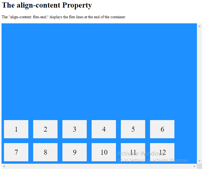
<p>The "align-content: flex-end;" displays the flex lines at the end of the container:</p>
<div class="flex-container">
<div>1</div>
<div>2</div>
<div>3</div>
<div>4</div>
<div>5</div>
<div>6</div>
<div>7</div>
<div>8</div>
<div>9</div>
<div>10</div>
<div>11</div>
<div>12</div>
</div>
</body>
</html>
Result:
Perfect Centering
In the following example we will solve a very common style problem: perfect centering.
SOLUTION: Set both the justify-content and align-items properties to center, and the flex item will be perfectly centered:
Example
<!DOCTYPE html>
<html>
<head>
<style>
.flex-container {
display: flex;
justify-content: center;
align-items: center;
height: 300px;
background-color: DodgerBlue;
}
.flex-container>div {
background-color: #f1f1f1;
color: white;
width: 100px;
height: 100px;
}
</style>
</head>
<body>
<h1>Perfect Centering</h1>
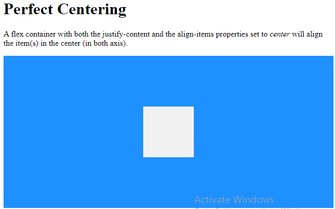
<p>A flex container with both the justify-content and the align-items properties set to <em>center</em> will align the item(s) in the center (in both axis).</p>
<div class="flex-container">
<div></div>
</div>
</body>
</html>
Result:
CSS Flex Items
Child Elements (Items)
The direct child elements of a flex container automatically becomes flexible (flex) items.
The element above represents four blue flex items inside a grey flex container.
Example
<!DOCTYPE html>
<html>
<head>
<style>
.flex-container {
display: flex;
background-color: #f1f1f1;
}
.flex-container > div {
background-color: DodgerBlue;
color: white;
width: 100px;
margin: 10px;
text-align: center;
line-height: 75px;
font-size: 30px;
}
</style>
</head>
<body>
<h1>Flexible Items</h1>
<div class="flex-container">
<div>1</div>
<div>2</div>
<div>3</div>
<div>4</div>
</div>
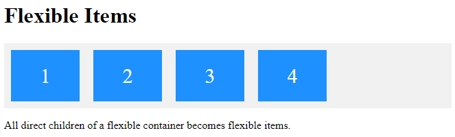
<p>All direct children of a flexible container becomes flexible items.</p>
</body>
</html>
Result:
The flex item properties are:
orderflex-growflex-shrinkflex-basisflexalign-self
The order Property
The order property specifies the order of the flex items.
The first flex item in the code does not have to appear as the first item in the layout.
The order value must be a number, default value is 0.
Example
The order property can change the order of the flex items:
<!DOCTYPE html>
<html>
<head>
<style>
.flex-container {
display: flex;
align-items: stretch;
background-color: #f1f1f1;
}
.flex-container>div {
background-color: DodgerBlue;
color: white;
width: 100px;
margin: 10px;
text-align: center;
line-height: 75px;
font-size: 30px;
}
</style>
</head>
<body>
<h1>The order Property</h1>
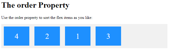
<p>Use the order property to sort the flex items as you like:</p>
<div class="flex-container">
<div style="order: 3">1</div>
<div style="order: 2">2</div>
<div style="order: 4">3</div>
<div style="order: 1">4</div>
</div>
</body>
</html>
Result:
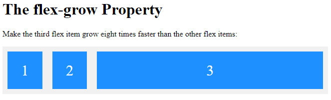
The flex-grow Property
The flex-grow property specifies how much a flex item will grow relative to the rest of the flex items.
The value must be a number, default value is 0.
Example
Make the third flex item grow eight times faster than the other flex items:
<!DOCTYPE html>
<html>
<head>
<style>
.flex-container {
  display: flex;
  align-items: stretch;
  background-color: #f1f1f1;
}
.flex-container > div {
  background-color: DodgerBlue;
  color: white;
  margin: 10px;
  text-align: center;
  line-height: 75px;
  font-size: 30px;
}
</style>
</head>
<body>
<h1>The flex-grow Property</h1>
<p>Make the third flex item grow eight times faster than the other flex items:</p>
<div class="flex-container">
  <div style="flex-grow: 1">1</div>
  <div style="flex-grow: 1">2</div>
  <div style="flex-grow: 8">3</div>
</div>
</body>
</html>
Result:
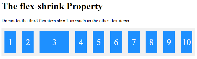
The flex-shrink Property
The flex-shrink property specifies how much a flex item will shrink relative to the rest of the flex items.
The value must be a number, default value is 1.
Example
Do not let the third flex item shrink as much as the other flex items:
<!DOCTYPE html>
<html>
<head>
<style>
.flex-container {
  display: flex;
  align-items: stretch;
  background-color: #f1f1f1;
}
.flex-container>div {
  background-color: DodgerBlue;
  color: white;
  width: 100px;
  margin: 10px;
  text-align: center;
  line-height: 75px;
  font-size: 30px;
}
</style>
</head>
<body>
<h1>The flex-shrink Property</h1>
<p>Do not let the third flex item shrink as much as the other flex items:</p>
<div class="flex-container">
  <div>1</div>
  <div>2</div>
  <div style="flex-shrink: 0">3</div>
  <div>4</div>
  <div>5</div>
  <div>6</div>
  <div>7</div>
  <div>8</div>
  <div>9</div>
  <div>10</div>
</div>
</body>
</html>
Result:
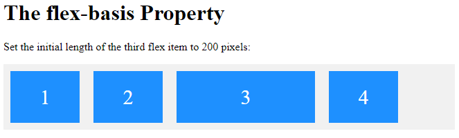
The flex-basis Property
The flex-basis property specifies the initial length of a flex item.
<!DOCTYPE html>
<html>
<head>
<style>
.flex-container {
  display: flex;
  align-items: stretch;
  background-color: #f1f1f1;
}
.flex-container > div {
  background-color: DodgerBlue;
  color: white;
  width: 100px;
  margin: 10px;
  text-align: center;
  line-height: 75px;
  font-size: 30px;
}
</style>
</head>
<body>
<h1>The flex-basis Property</h1>
<p>Set the initial length of the third flex item to 200 pixels:</p>
<div class="flex-container">
  <div>1</div>
  <div>2</div>
  <div style="flex-basis:200px">3</div>
  <div>4</div>
</div>
</body>
</html>
Result:
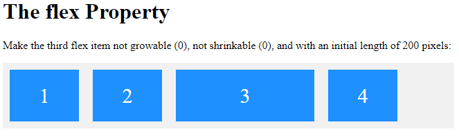
The flex Property
The flex property is a shorthand property for the flex-grow, flex-shrink, and flex-basis properties.
Example
Make the third flex item not growable (0), not shrinkable (0), and with an initial length of 200 pixels:
<!DOCTYPE html>
<html>
<head>
<style>
.flex-container {
  display: flex;
  align-items: stretch;
  background-color: #f1f1f1;
}
.flex-container>div {
  background-color: DodgerBlue;
  color: white;
  width: 100px;
  margin: 10px;
  text-align: center;
  line-height: 75px;
  font-size: 30px;
}
</style>
</head>
<body>
<h1>The flex Property</h1>
<p>Make the third flex item not growable (0), not shrinkable (0), and with an initial length of 200 pixels:</p>
<div class="flex-container">
  <div>1</div>
  <div>2</div>
  <div style="flex: 0 0 200px">3</div>
  <div>4</div>
</div>
</body>
</html>
Result:
The align-self Property
The align-self property specifies the alignment for the selected item inside the flexible container.
The align-self property overrides the default alignment set by the container’s align-items property.
In these examples we use a 200 pixels high container, to better demonstrate the align-self property:
Example
Align the third flex item in the middle of the container:
<!DOCTYPE html>
<html>
<head>
<style>
.flex-container {
display: flex;
height: 200px;
background-color: #f1f1f1;
}
.flex-container > div {
background-color: DodgerBlue;
color: white;
width: 100px;
margin: 10px;
text-align: center;
line-height: 75px;
font-size: 30px;
}
</style>
</head>
<body>
<h1>The align-self Property</h1>
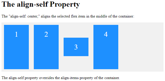
<p>The "align-self: center;" aligns the selected flex item in the middle of the container:</p>
<div class="flex-container">
<div>1</div>
<div>2</div>
<div style="align-self: center">3</div>
<div>4</div>
</div>
<p>The align-self property overrides the align-items property of the container.</p>
</body>
</html>
Result:
Example
Align the second flex item at the top of the container, and the third flex item at the bottom of the container:
<!DOCTYPE html>
<html>
<head>
<style>
.flex-container {
display: flex;
height: 200px;
background-color: #f1f1f1;
}
.flex-container > div {
background-color: DodgerBlue;
color: white;
width: 100px;
margin: 10px;
text-align: center;
line-height: 75px;
font-size: 30px;
}
</style>
</head>
<body>
<h1>The align-self Property</h1>
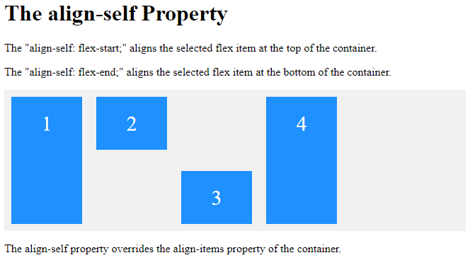
<p>The "align-self: flex-start;" aligns the selected flex item at the top of the container.</p><p>The "align-self: flex-end;" aligns the selected flex item at the bottom of the container.</p>
<div class="flex-container">
<div>1</div>
<div style="align-self: flex-start">2</div>
<div style="align-self: flex-end">3</div>
<div>4</div>
</div>
<p>The align-self property overrides the align-items property of the container.</p>
</body>
</html>
Result:
CSS Flex Responsive
Responsive Flexbox
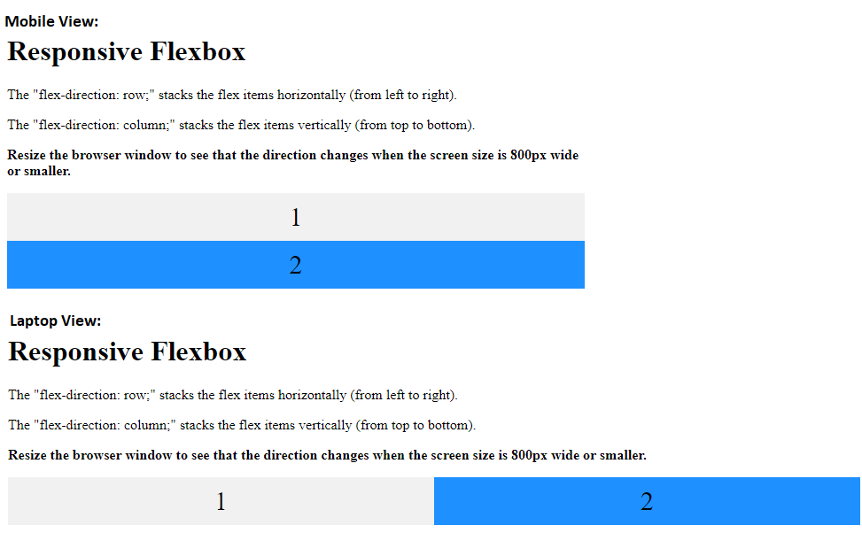
You learned from the CSS Media Queries chapter that you can use media queries to create different layouts for different screen sizes and devices.
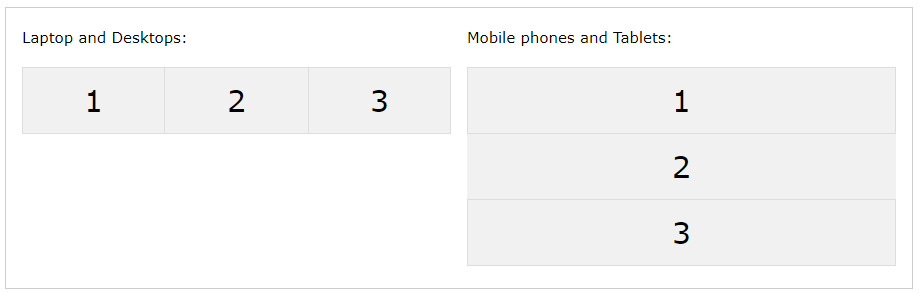
For example, if you want to create a two-column layout for most screen sizes, and a one-column layout for small screen sizes (such as phones and tablets), you can change the flex-direction from row to column at a specific breakpoint (800px in the example below):
Example
<!DOCTYPE html>
<html>
<head>
<style>
* {
  box-sizing: border-box;
}
.flex-container {
  display: flex;
  flex-direction: row;
  font-size: 30px;
  text-align: center;
}
.flex-item-left {
  background-color: #f1f1f1;
  padding: 10px;
  flex: 50%;
}
.flex-item-right {
  background-color: dodgerblue;
  padding: 10px;
  flex: 50%;
}
/* Responsive layout - makes a one column-layout instead of two-column layout */
@media (max-width: 800px) {
  .flex-container {
    flex-direction: column;
  }
}
</style>
</head>
<body>
<h1>Responsive Flexbox</h1>
<p>The "flex-direction: row;" stacks the flex items horizontally (from left to right).</p>
<p>The "flex-direction: column;" stacks the flex items vertically (from top to bottom).</p>
<p><b>Resize the browser window to see that the direction changes when the
screen size is 800px wide or smaller.</b></p>
<div class="flex-container">
  <div class="flex-item-left">1</div>
  <div class="flex-item-right">2</div>
</div>
</body>
</html>
Result:
Another way is to change the percentage of the flex property of the flex items to create different layouts for different screen sizes. Note that we also have to include flex-wrap: wrap; on the flex container for this example to work:
Example
<!DOCTYPE html>
<html>
<head>
<style>
* {
box-sizing: border-box;
}
.flex-container {
display: flex;
flex-wrap: wrap;
font-size: 30px;
text-align: center;
}
.flex-item-left {
background-color: #f1f1f1;
padding: 10px;
flex: 50%;
}
.flex-item-right {
background-color: dodgerblue;
padding: 10px;
flex: 50%;
}
/* Responsive layout - makes a one column-layout instead of a two-column layout */
@media (max-width: 800px) {
.flex-item-right, .flex-item-left {
flex: 100%;
}
}
</style>
</head>
<body>
<h1>Responsive Flexbox</h1>
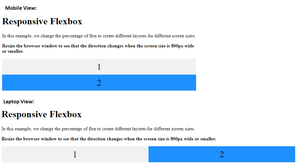
<p>In this example, we change the percentage of flex to create different layouts for different screen sizes.</p>
<p><b>Resize the browser window to see that the direction changes when the screen size is 800px wide or smaller.</b></p>
<div class="flex-container">
<div class="flex-item-left">1</div>
<div class="flex-item-right">2</div>
</div>
</body>
</html>
Result: