

CSS Text Overflow, Word Wrap, Line Breaking Rules, and Writing Modes
In this chapter you will learn about the following properties:
text-overflowword-wrapword-breakwriting-mode
CSS Text Overflow
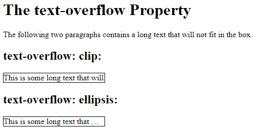
The CSS text-overflow property specifies how overflowed content that is not displayed should be signaled to the user.
It can be clipped:
This is some long text that will not fit in the box
or it can be rendered as an ellipsis (…):
The CSS code is as follows:
Example
<!DOCTYPE html>
<html>
<head>
<style>
p.test1 {
  white-space: nowrap;
  width: 200px;
  border: 1px solid #000000;
  overflow: hidden;
  text-overflow: clip;
}
p.test2 {
  white-space: nowrap;
  width: 200px;
  border: 1px solid #000000;
  overflow: hidden;
  text-overflow: ellipsis;
}
</style>
</head>
<body>
<h1>The text-overflow Property</h1>
<p>The following two paragraphs contains a long text that will not fit in the box.</p>
<h2>text-overflow: clip:</h2>
<p class="test1">This is some long text that will not fit in the box</p>
<h2>text-overflow: ellipsis:</h2>
<p class="test2">This is some long text that will not fit in the box</p>
</body>
</html>
Result:
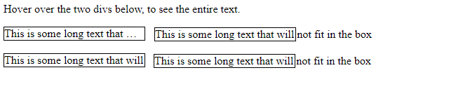
The following example shows how you can display the overflowed content when hovering over the element:
Example
<!DOCTYPE html>
<html>
<head>
<style>
div.test {
  white-space: nowrap;
  width: 200px;
  overflow: hidden;
  border: 1px solid #000000;
}
div.test:hover {
  overflow: visible;
}
</style>
</head>
<body>
<p>Hover over the two divs below, to see the entire text.</p>
<div class="test" style="text-overflow:ellipsis;">This is some long text that will not fit in the box</div>
<br>
<div class="test" style="text-overflow:clip;">This is some long text that will not fit in the box</div>
</body>
</html>
Result:
CSS Word Wrapping
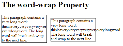
The CSS word-wrap property allows long words to be able to be broken and wrap onto the next line.
The word-wrap property allows you to force the text to wrap – even if it means splitting it in the middle of a word:
The CSS code is as follows:
Example
Allow long words to be able to be broken and wrap onto the next line:
<!DOCTYPE html>
<html>
<head>
<style>
p.test {
  width: 11em;
  border: 1px solid #000000;
  word-wrap: break-word;
}
</style>
</head>
<body>
<h1>The word-wrap Property</h1>
<p class="test">This paragraph contains a very long word: thisisaveryveryveryveryveryverylongword. The long word will break and wrap to the next line.</p>
</body>
</html>
Result:
CSS Word Breaking
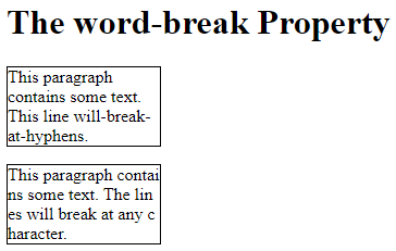
The CSS word-break property specifies line breaking rules.
The CSS code is as follows:
Example
<!DOCTYPE html>
<html>
<head>
<style>
p.test1 {
width: 140px;
border: 1px solid #000000;
word-break: keep-all;
}
p.test2 {
width: 140px;
border: 1px solid #000000;
word-break: break-all;
}
</style>
</head>
<body>
<h1>The word-break Property</h1>
<p class="test1">This paragraph contains some text. This line will-break-at-hyphens.</p>
<p class="test2">This paragraph contains some text. The lines will break at any character.</p>
</body>
</html>
Result:
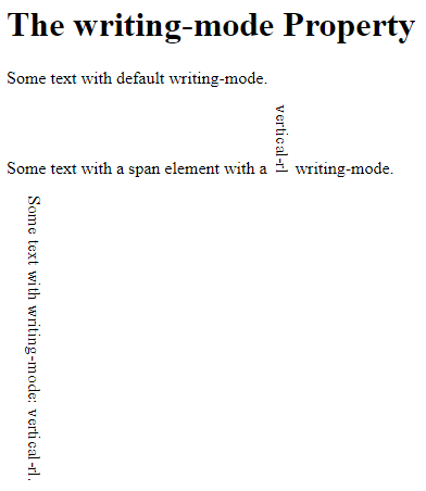
CSS Writing Mode
The CSS writing-mode property specifies whether lines of text are laid out horizontally or vertically.
The following example shows some different writing modes:
Example
<!DOCTYPE html>
<html>
<head>
<style>
p.test1 {
 writing-mode: horizontal-tb;
}
span.test2 {
  writing-mode: vertical-rl;
}
p.test2 {
  writing-mode: vertical-rl;
}
</style>
</head>
<body>
<h1>The writing-mode Property</h1>
<p class="test1">Some text with default writing-mode.</p>
<p>Some text with a span element with a <span class="test2">vertical-rl</span> writing-mode.</p>
<p class="test2">Some text with writing-mode: vertical-rl.</p>
</body>
</html>
Result: