

Table Borders
To specify table borders in CSS, use the border property.
The example below specifies a solid border for <table>, <th>, and <td> elements:
Example
<!DOCTYPE html>
<html>
<head>
<style>
table, th, td {
border: 1px solid;
}
</style>
</head>
<body>
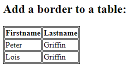
<h2>Add a border to a table:</h2>
<table>
<tr>
<th>Firstname</th>
<th>Lastname</th>
</tr>
<tr>
<td>Peter</td>
<td>Griffin</td>
</tr>
<tr>
<td>Lois</td>
<td>Griffin</td>
</tr>
</table>
</body>
</html>
Result:
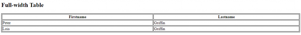
Full-Width Table
The table above might seem small in some cases. If you need a table that should span the entire screen (full-width), add width: 100% to the <table> element:
<!DOCTYPE html>
<html>
<head>
<style>
table, th, td {
  border: 1px solid;
}
table {
  width: 100%;
}
</style>
</head>
<body>
<h2>Full-width Table</h2>
<table>
  <tr>
    <th>Firstname</th>
    <th>Lastname</th>
  </tr>
  <tr>
    <td>Peter</td>
    <td>Griffin</td>
  </tr>
  <tr>
    <td>Lois</td>
    <td>Griffin</td>
  </tr>
</table>
</body>
</html>
Result:
Collapse Table Borders
The border-collapse property sets whether the table borders should be collapsed into a single border:
Example
<!DOCTYPE html>
<html>
<head>
<style>
table, td, th {
  border: 1px solid;
}
table {
  width: 100%;
  border-collapse: collapse;
}
</style>
</head>
<body>
<h2>Let the table borders collapse</h2>
<table>
  <tr>
    <th>Firstname</th>
    <th>Lastname</th>
  </tr>
  <tr>
    <td>Peter</td>
    <td>Griffin</td>
  </tr>
  <tr>
    <td>Lois</td>
    <td>Griffin</td>
  </tr>
</table>
</body>
</html>
Result:
Let the table borders collapse
| Firstname | Lastname |
|---|---|
| Peter | Griffin |
| Lois | Griffin |
If you only want a border around the table, only specify the border property for <table>:
Example
<!DOCTYPE html>
<html>
<head>
<style>
table {
  width: 100%;
  border: 1px solid;
}
</style>
</head>
<body>
<h2>Single Border Around The Table</h2>
<table>
  <tr>
    <th>Firstname</th>
    <th>Lastname</th>
  </tr>
  <tr>
    <td>Peter</td>
    <td>Griffin</td>
  </tr>
  <tr>
    <td>Lois</td>
    <td>Griffin</td>
  </tr>
</table>
</body>
</html>
Result:
Single Border Around The Table
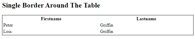
Table Width and Height
The width and height of a table are defined by the width and height properties.
The example below sets the width of the table to 100%, and the height of the <th> elements to 70px:
<!DOCTYPE html>
<html>
<head>
<style>
table, td, th {
  border: 1px solid black;
}
table {
  border-collapse: collapse;
  width: 100%;
}
th {
  height: 70px;
}
</style>
</head>
<body>
<h2>The width and height Properties</h2>
<p>Set the width of the table, and the height of the table header row:</p>
<table>
  <tr>
    <th>Firstname</th>
    <th>Lastname</th>
    <th>Savings</th>
  </tr>
  <tr>
    <td>Peter</td>
    <td>Griffin</td>
    <td>$100</td>
  </tr>
  <tr>
    <td>Lois</td>
    <td>Griffin</td>
    <td>$150</td>
</tr>
  <tr>
    <td>Joe</td>
    <td>Swanson</td>
    <td>$300</td>
  </tr>
  <tr>
    <td>Cleveland</td>
    <td>Brown</td>
    <td>$250</td>
  </tr>
</table>
</body>
</html>
Result:
The width and height Properties
Set the width of the table, and the height of the table header row:
Firstname | Lastname | Savings |
|---|---|---|
| Peter | Griffin | $100 |
| Lois | Griffin | $150 |
| Joe | Swanson | $300 |
| Cleveland | Brown | $250 |
To create a table that should only span half the page, use width: 50%:
Example
<!DOCTYPE html>
<html>
<head>
<style>
table, td, th {
  border: 1px solid black;
}
table {
  border-collapse: collapse;
  width: 50%;
}
</style>
</head>
<body>
<h2>A table that only span half the page</h2>
<p>Set the width of the table to 50%:</p>
<table>
  <tr>
    <th>Firstname</th>
    <th>Lastname</th>
    <th>Savings</th>
  </tr>
  <tr>
    <td>Peter</td>
    <td>Griffin</td>
    <td>$100</td>
  </tr>
  <tr>
    <td>Lois</td>
    <td>Griffin</td>
    <td>$150</td>
  </tr>
  <tr>
    <td>Joe</td>
    <td>Swanson</td>
    <td>$300</td>
  </tr>
  <tr>
    <td>Cleveland</td>
    <td>Brown</td>
    <td>$250</td>
  </tr>
</table>
</body>
</html>
Result:
A table that only span half the page
Set the width of the table to 50%:
| Firstname | Lastname | Savings |
|---|---|---|
| Peter | Griffin | $100 |
| Lois | Griffin | $150 |
| Joe | Swanson | $300 |
| Cleveland | Brown | $250 |
Horizontal Alignment
The text-align property sets the horizontal alignment (like left, right, or center) of the content in <th> or <td>.
By default, the content of <th> elements are center-aligned and the content of <td> elements are left-aligned.
To center-align the content of <td> elements as well, use text-align: center:
Example
<!DOCTYPE html>
<html>
<head>
<style>
table, td, th {
border: 1px solid black;
}
table {
border-collapse: collapse;
width: 100%;
}
td {
text-align: center;
}
</style>
</head>
<body>
<h2>The text-align Property</h2>
<p>This property sets the horizontal alignment (like left, right, or center) of the content in th or td.</p>
<table>
<tr>
<th>Firstname</th>
<th>Lastname</th>
<th>Savings</th>
</tr>
<tr>
<td>Peter</td>
<td>Griffin</td>
<td>$100</td>
</tr>
<tr>
<td>Lois</td>
<td>Griffin</td>
<td>$150</td>
</tr>
<tr>
<td>Joe</td>
<td>Swanson</td>
<td>$300</td>
</tr>
<tr>
<td>Cleveland</td>
<td>Brown</td>
<td>$250</td>
</tr>
</table>
</body>
</html>
Result:
The text-align Property
This property sets the horizontal alignment (like left, right, or center) of the content in th or td.
| Firstname | Lastname | Savings |
|---|---|---|
| Peter | Griffin | $100 |
| Lois | Griffin | $150 |
| Joe | Swanson | $300 |
| Cleveland | Brown | $250 |
To left-align the content, force the alignment of <th> elements to be left-aligned, with the text-align: left property:
Example
<!DOCTYPE html>
<html>
<head>
<style>
table, td, th {
border: 1px solid black;
}
table {
border-collapse: collapse;
width: 100%;
}
th {
text-align: left;
}
</style>
</head>
<body>
<h2>The text-align Property</h2>
<p>This property sets the horizontal alignment (like left, right, or center) of the content in th or td.</p>
<table>
<tr>
<th>Firstname</th>
<th>Lastname</th>
<th>Savings</th>
</tr>
<tr>
<td>Peter</td>
<td>Griffin</td>
<td>$100</td>
</tr>
<tr>
<td>Lois</td>
<td>Griffin</td>
<td>$150</td>
</tr>
<tr>
<td>Joe</td>
<td>Swanson</td>
<td>$300</td>
</tr>
<tr>
<td>Cleveland</td>
<td>Brown</td>
<td>$250</td>
</tr>
</table>
</body>
</html>
Result:
The text-align Property
This property sets the horizontal alignment (like left, right, or center) of the content in th or td.
| Firstname | Lastname | Savings |
|---|---|---|
| Peter | Griffin | $100 |
| Lois | Griffin | $150 |
| Joe | Swanson | $300 |
| Cleveland | Brown | $250 |
Vertical Alignment
The vertical-align property sets the vertical alignment (like top, bottom, or middle) of the content in <th> or <td>.
By default, the vertical alignment of the content in a table is middle (for both <th> and <td> elements).
The following example sets the vertical text alignment to bottom for <td> elements:
Example
<!DOCTYPE html>
<html>
<head>
<style>
table, td, th {
border: 1px solid black;
}
table {
border-collapse: collapse;
width: 100%;
}
td {
height: 50px;
vertical-align: bottom;
}
</style>
</head>
<body>
<h2>The vertical-align Property</h2>
<p>This property sets the vertical alignment (like top, bottom, or middle) of the content in th or td.</p>
<table>
<tr>
<th>Firstname</th>
<th>Lastname</th>
<th>Savings</th>
</tr>
<tr>
<td>Peter</td>
<td>Griffin</td>
<td>$100</td>
</tr>
<tr>
<td>Lois</td>
<td>Griffin</td>
<td>$150</td>
</tr>
<tr>
<td>Joe</td>
<td>Swanson</td>
<td>$300</td>
</tr>
<tr>
<td>Cleveland</td>
<td>Brown</td>
<td>$250</td>
</tr>
</table>
</body>
</html>
Result:
The vertical-align Property
This property sets the vertical alignment (like top, bottom, or middle) of the content in th or td.
| Firstname | Lastname | Savings |
|---|---|---|
Peter | Griffin | $100 |
Lois | Griffin | $150 |
Joe | Swanson | $300 |
Cleveland | Brown | $250 |
Table Padding
To control the space between the border and the content in a table, use the padding property on <td> and <th> elements:
Example
<!DOCTYPE html>
<html>
<head>
<style>
table, td, th {
border: 1px solid #ddd;
text-align: left;
}
table {
border-collapse: collapse;
width: 100%;
}
th, td {
padding: 15px;
}
</style>
</head>
<body>
<h2>The padding Property</h2>
<p>This property adds space between the border and the content in a table.</p>
<table>
<tr>
<th>Firstname</th>
<th>Lastname</th>
<th>Savings</th>
</tr>
<tr>
<td>Peter</td>
<td>Griffin</td>
<td>$100</td>
</tr>
<tr>
<td>Lois</td>
<td>Griffin</td>
<td>$150</td>
</tr>
<tr>
<td>Joe</td>
<td>Swanson</td>
<td>$300</td>
</tr>
<tr>
<td>Cleveland</td>
<td>Brown</td>
<td>$250</td>
</tr>
</table>
</body>
</html>
Result:
The padding Property
This property adds space between the border and the content in a table.
| Firstname | Lastname | Savings |
|---|---|---|
| Peter | Griffin | $100 |
| Lois | Griffin | $150 |
| Joe | Swanson | $300 |
| Cleveland | Brown | $250 |
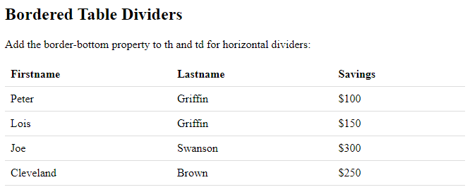
Horizontal Dividers
Add the border-bottom property to <th> and <td> for horizontal dividers:
Example
<!DOCTYPE html>
<html>
<head>
<style>
table {
border-collapse: collapse;
width: 100%;
}
th, td {
padding: 8px;
text-align: left;
border-bottom: 1px solid #ddd;
}
</style>
</head>
<body>
<h2>Bordered Table Dividers</h2>
<p>Add the border-bottom property to th and td for horizontal dividers:</p>
<table>
<tr>
<th>Firstname</th>
<th>Lastname</th>
<th>Savings</th>
</tr>
<tr>
<td>Peter</td>
<td>Griffin</td>
<td>$100</td>
</tr>
<tr>
<td>Lois</td>
<td>Griffin</td>
<td>$150</td>
</tr>
<tr>
<td>Joe</td>
<td>Swanson</td>
<td>$300</td>
</tr>
<tr>
<td>Cleveland</td>
<td>Brown</td>
<td>$250</td>
</tr>
</table>
</body>
</html>
Result:
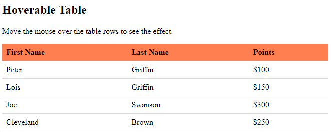
Hoverable Table
Use the :hover selector on <tr> to highlight table rows on mouse over:
Example
<!DOCTYPE html>
<html>
<head>
<style>
table {
  border-collapse: collapse;
  width: 100%;
}
th, td {
  padding: 8px;
  text-align: left;
  border-bottom: 1px solid #ddd;
}
tr:hover {background-color: coral;}
</style>
</head>
<body>
<h2>Hoverable Table</h2>
<p>Move the mouse over the table rows to see the effect.</p>
<table>
  <tr>
    <th>First Name</th>
    <th>Last Name</th>
    <th>Points</th>
  </tr>
  <tr>
    <td>Peter</td>
    <td>Griffin</td>
    <td>$100</td>
  </tr>
  <tr>
    <td>Lois</td>
    <td>Griffin</td>
    <td>$150</td>
  </tr>
  <tr>
    <td>Joe</td>
    <td>Swanson</td>
    <td>$300</td>
  </tr>
  <tr>
    <td>Cleveland</td>
    <td>Brown</td>
    <td>$250</td>
  </tr>
</table>
</body>
</html>
Result:
Striped Tables
For zebra-striped tables, use the nth-child() selector and add a background-color to all even (or odd) table rows:
Example
<!DOCTYPE html>
<html>
<head>
<style>
table {
  border-collapse: collapse;
  width: 100%;
}
th, td {
  text-align: left;
  padding: 8px;
}
tr:nth-child(even) {background-color: #f2f2f2;}
</style>
</head>
<body>
<h2>Striped Table</h2>
<p>For zebra-striped tables, use the nth-child() selector and add a background-color to all even (or odd) table rows:</p>
<table>
  <tr>
  <th>First Name</th>
  <th>Last Name</th>
  <th>Points</th>
  </tr>
  <tr>
  <td>Peter</td>
  <td>Griffin</td>
  <td>$100</td>
  </tr>
  <tr>
  <td>Lois</td>
  <td>Griffin</td>
  <td>$150</td>
  </tr>
  <tr>
  <td>Joe</td>
  <td>Swanson</td>
  <td>$300</td>
  </tr>
  <tr>
  <td>Cleveland</td>
  <td>Brown</td>
  <td>$250</td>
  </tr>
</table>
</body>
</html>
Result:
Striped Table
For zebra-striped tables, use the nth-child() selector and add a background-color to all even (or odd) table rows:
| First Name | Last Name | Points |
|---|---|---|
| Peter | Griffin | $100 |
| Lois | Griffin | $150 |
| Joe | Swanson | $300 |
| Cleveland | Brown | $250 |
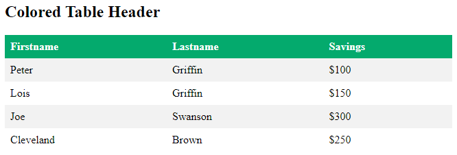
Table Color
The example below specifies the background color and text color of <th> elements:
Example
<!DOCTYPE html>
<html>
<head>
<style>
table {
  border-collapse: collapse;
  width: 100%;
}
th, td {
  text-align: left;
  padding: 8px;
}
tr:nth-child(even){background-color: #f2f2f2}
th {
  background-color: #04AA6D;
  color: white;
}
</style>
</head>
<body>
<h2>Colored Table Header</h2>
<table>
  <tr>
    <th>Firstname</th>
    <th>Lastname</th>
    <th>Savings</th>
  </tr>
  <tr>
    <td>Peter</td>
    <td>Griffin</td>
    <td>$100</td>
  </tr>
  <tr>
    <td>Lois</td>
    <td>Griffin</td>
    <td>$150</td>
  </tr>
  <tr>
    <td>Joe</td>
    <td>Swanson</td>
    <td>$300</td>
  </tr>
  <tr>
    <td>Cleveland</td>
    <td>Brown</td>
    <td>$250</td>
</tr>
</table>
</body>
</html>
Result:
Responsive Table
A responsive table will display a horizontal scroll bar if the screen is too small to display the full content:
Add a container element (like <div>) with overflow-x:auto around the <table> element to make it responsive:
Example
<!DOCTYPE html>
<html>
<head>
<style>
table {
  border-collapse: collapse;
  width: 100%;
}
th, td {
  text-align: left;
  padding: 8px;
}
tr:nth-child(even) {background-color: #f2f2f2;}
</style>
</head>
<body>
<h2>Responsive Table</h2>
<p>A responsive table will display a horizontal scroll bar if the screen is too
small to display the full content. Resize the browser window to see the effect:</p>
<p>To create a responsive table, add a container element (like div) with <strong>overflow-x:auto</strong> around the table element:</p>
<div style="overflow-x: auto;">
  <table>
    <tr>
      <th>First Name</th>
      <th>Last Name</th>
      <th>Points</th>
      <th>Points</th>
      <th>Points</th>
      <th>Points</th>
      <th>Points</th>
      <th>Points</th>
      <th>Points</th>
      <th>Points</th>
      <th>Points</th>
      <th>Points</th>
    </tr>
    <tr>
      <td>Jill</td>
      <td>Smith</td>
      <td>50</td>
      <td>50</td>
      <td>50</td>
      <td>50</td>
      <td>50</td>
      <td>50</td>
      <td>50</td>
      <td>50</td>
      <td>50</td>
      <td>50</td>
 </tr>
      <td>Eve</td>
      <td>Jackson</td>
      <td>94</td>
      <td>94</td>
      <td>94</td>
      <td>94</td>
      <td>94</td>
      <td>94</td>
      <td>94</td>
      <td>94</td>
      <td>94</td>
      <td>94</td>
    </tr>
    <tr>
      <td>Adam</td>
      <td>Johnson</td>
      <td>67</td>
      <td>67</td>
      <td>67</td>
      <td>67</td>
      <td>67</td>
      <td>67</td>
      <td>67</td>
      <td>67</td>
      <td>67</td>
      <td>67</td>
    </tr>
  </table>
</div>
</body>
</html>
Result:
Responsive Table
A responsive table will display a horizontal scroll bar if the screen is too small to display the full content. Resize the browser window to see the effect:
To create a responsive table, add a container element (like div) with overflow-x:auto around the table element:
| First Name | Last Name | Points | Points | Points | Points | Points | Points | Points | Points | Points | Points | Points | Points |
|---|---|---|---|---|---|---|---|---|---|---|---|---|---|
| Jill | Smith | 50 | 50 | 50 | 50 | 50 | 50 | 50 | 50 | 50 | 50 | 50 | 50 |
| Eve | Jackson | 94 | 94 | 94 | 94 | 94 | 94 | 94 | 94 | 94 | 94 | 94 | 94 |
| Adam | Johnson | 67 | 67 | 67 | 67 | 67 | 67 | 67 | 67 | 67 | 67 | 67 | 67 |