

Learn how to create a responsive pagination using CSS.
Simple Pagination
If you have a website with lots of pages, you may wish to add some sort of pagination to each page:
Example
<!DOCTYPE html>
<html>
<head>
<style>
.pagination {
display: inline-block;
}
.pagination a {
color: black;
float: left;
padding: 8px 16px;
text-decoration: none;
}
</style>
</head>
<body>
<h2>Simple Pagination</h2>
<div class="pagination">
<a href="#">«</a>
<a href="#">1</a>
<a href="#">2</a>
<a href="#">3</a>
<a href="#">4</a>
<a href="#">5</a>
<a href="#">6</a>
<a href="#">»</a>
</div>
</body>
</html>
Result:
Simple Pagination
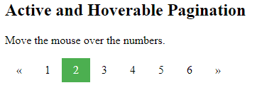
Active and Hoverable Pagination
Highlight the current page with an .active class, and use the :hover selector to change the color of each page link when moving the mouse over them:
Example
<!DOCTYPE html>
<html>
<head>
<style>
.pagination {
display: inline-block;
}
.pagination a {
color: black;
float: left;
padding: 8px 16px;
text-decoration: none;
}
.pagination a.active {
background-color: #4CAF50;
color: white;
}
.pagination a:hover:not(.active) {background-color: #ddd;}
</style>
</head>
<body>
<h2>Active and Hoverable Pagination</h2>
<p>Move the mouse over the numbers.</p>
<div class="pagination">
<a href="#">«</a>
<a href="#">1</a>
<a class="active" href="#">2</a>
<a href="#">3</a>
<a href="#">4</a>
<a href="#">5</a>
<a href="#">6</a>
<a href="#">»</a>
</div>
</body>
</html>
Result:
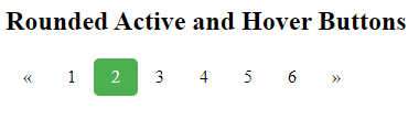
Rounded Active and Hoverable Buttons
Add the border-radius property if you want a rounded “active” and “hover” button:
Example
<!DOCTYPE html>
<html>
<head>
<style>
.pagination {
display: inline-block;
}
.pagination a {
color: black;
float: left;
padding: 8px 16px;
text-decoration: none;
}
.pagination a.active {
background-color: #4CAF50;
color: white;
border-radius: 5px;
}
.pagination a:hover:not(.active) {
background-color: #ddd;
border-radius: 5px;
}
</style>
</head>
<body>
<h2>Rounded Active and Hover Buttons</h2>
<div class="pagination">
<a href="#">«</a>
<a href="#">1</a>
<a href="#" class="active">2</a>
<a href="#">3</a>
<a href="#">4</a>
<a href="#">5</a>
<a href="#">6</a>
<a href="#">»</a>
</div>
</body>
</html>
Result:
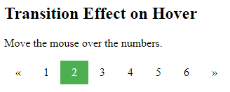
Hoverable Transition Effect
Add the transition property to the page links to create a transition effect on hover:
Example
<!DOCTYPE html>
<html>
<head>
<style>
.pagination {
display: inline-block;
}
.pagination a {
color: black;
float: left;
padding: 8px 16px;
text-decoration: none;
transition: background-color .3s;
}
.pagination a.active {
background-color: #4CAF50;
color: white;
}
.pagination a:hover:not(.active) {background-color: #ddd;}
</style>
</head>
<body>
<h2>Transition Effect on Hover</h2>
<p>Move the mouse over the numbers.</p>
<div class="pagination">
<a href="#">«</a>
<a href="#">1</a>
<a href="#" class="active">2</a>
<a href="#">3</a>
<a href="#">4</a>
<a href="#">5</a>
<a href="#">6</a>
<a href="#">»</a>
</div>
</body>
</html>
Result:
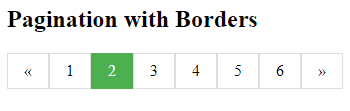
Bordered Pagination
Use the border property to add borders to the pagination:
Example
<!DOCTYPE html>
<html>
<head>
<style>
.pagination {
display: inline-block;
}
.pagination a {
color: black;
float: left;
padding: 8px 16px;
text-decoration: none;
transition: background-color .3s;
border: 1px solid #ddd;
}
.pagination a.active {
background-color: #4CAF50;
color: white;
border: 1px solid #4CAF50;
}
.pagination a:hover:not(.active) {background-color: #ddd;}
</style>
</head>
<body>
<h2>Pagination with Borders</h2>
<div class="pagination">
<a href="#">«</a>
<a href="#">1</a>
<a href="#" class="active">2</a>
<a href="#">3</a>
<a href="#">4</a>
<a href="#">5</a>
<a href="#">6</a>
<a href="#">»</a>
</div>
</body>
</html>
Result:
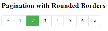
Rounded Borders
Tip: Add rounded borders to your first and last link in the pagination:
Example
<!DOCTYPE html>
<html>
<head>
<style>
.pagination {
display: inline-block;
}
.pagination a {
color: black;
float: left;
padding: 8px 16px;
text-decoration: none;
border: 1px solid #ddd;
}
.pagination a.active {
background-color: #4CAF50;
color: white;
border: 1px solid #4CAF50;
}
.pagination a:hover:not(.active) {background-color: #ddd;}
.pagination a:first-child {
border-top-left-radius: 5px;
border-bottom-left-radius: 5px;
}
.pagination a:last-child {
border-top-right-radius: 5px;
border-bottom-right-radius: 5px;
}
</style>
</head>
<body>
<h2>Pagination with Rounded Borders</h2>
<div class="pagination">
<a href="#">«</a>
<a href="#">1</a>
<a class="active" href="#">2</a>
<a href="#">3</a>
<a href="#">4</a>
<a href="#">5</a>
<a href="#">6</a>
<a href="#">»</a>
</div>
</body>
</html>
Result:
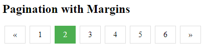
Space Between Links
Tip: Add the margin property if you do not want to group the page links:
Example
<!DOCTYPE html>
<html>
<head>
<style>
.pagination {
display: inline-block;
}
.pagination a {
color: black;
float: left;
padding: 8px 16px;
text-decoration: none;
transition: background-color .3s;
border: 1px solid #ddd;
margin: 0 4px;
}
.pagination a.active {
background-color: #4CAF50;
color: white;
border: 1px solid #4CAF50;
}
.pagination a:hover:not(.active) {background-color: #ddd;}
</style>
</head>
<body>
<h2>Pagination with Margins</h2>
<div class="pagination">
<a href="#">«</a>
<a href="#">1</a>
<a href="#" class="active">2</a>
<a href="#">3</a>
<a href="#">4</a>
<a href="#">5</a>
<a href="#">6</a>
<a href="#">»</a>
</div>
</body>
</html>
Result:
Centered Pagination
To center the pagination, wrap a container element (like <div>) around it with text-align:center
Example
<!DOCTYPE html>
<html>
<head>
<style>
.center {
text-align: center;
}
.pagination {
display: inline-block;
}
.pagination a {
color: black;
float: left;
padding: 8px 16px;
text-decoration: none;
transition: background-color .3s;
border: 1px solid #ddd;
margin: 0 4px;
}
.pagination a.active {
background-color: #4CAF50;
color: white;
border: 1px solid #4CAF50;
}
.pagination a:hover:not(.active) {background-color: #ddd;}
</style>
</head>
<body>
<h2>Centered Pagination</h2>
<div class="center">
<div class="pagination">
<a href="#">«</a>
<a href="#">1</a>
<a href="#" class="active">2</a>
<a href="#">3</a>
<a href="#">4</a>
<a href="#">5</a>
<a href="#">6</a>
<a href="#">»</a>
</div>
</div>
</body>
</html>
Result:

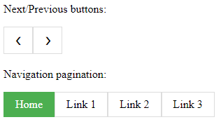
More Examples
Example
<!DOCTYPE html>
<html>
<head>
<style>
body {
background-color:white;
}
.pagination {
display: inline-block;
}
.pagination a {
color: black;
float: left;
padding: 8px 16px;
text-decoration: none;
transition: background-color .3s;
border: 1px solid #ddd;
}
.pagination a.active {
background-color: #4CAF50;
color: white;
border: 1px solid #4CAF50;
}
.pagination a:hover:not(.active) {background-color: #ddd;}
</style>
</head>
<body>
<p>Next/Previous buttons:</p>
<div class="pagination">
<a href="#">❮</a>
<a href="#">❯</a>
</div>
<p>Navigation pagination:</p>
<div class="pagination">
<a href="#" class="active">Home</a>
<a href="#">Link 1</a>
<a href="#">Link 2</a>
<a href="#">Link 3</a>
</div>
</body>
</html>
Result:
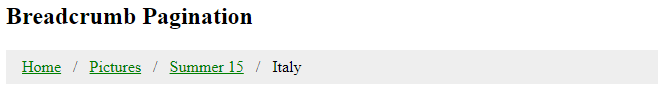
Breadcrumbs
Another variation of pagination is so-called “breadcrumbs”:
Example
<!DOCTYPE html>
<html>
<head>
<style>
ul.breadcrumb {
  padding: 8px 16px;
  list-style: none;
  background-color: #eee;
}
ul.breadcrumb li {display: inline;}
ul.breadcrumb li+li:before {
  padding: 8px;
  color: black;
  content: "/\00a0";
}
ul.breadcrumb li a {color: green;}
</style>
</head>
<body>
<h2>Breadcrumb Pagination</h2>
<ul class="breadcrumb">
  <li><a href="#">Home</a></li>
  <li><a href="#">Pictures</a></li>
  <li><a href="#">Summer 15</a></li>
  <li>Italy</li>
</ul>
</body>
</html>
Result: