

CSS Shadow Effects
With CSS you can add shadow to text and to elements.
In these chapters you will learn about the following properties:
text-shadowbox-shadow
CSS Text Shadow
The CSS text-shadow property applies shadow to text.
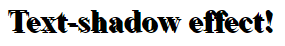
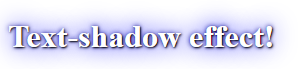
In its simplest use, you only specify the horizontal shadow (2px) and the vertical shadow (2px):
Text shadow effect!
Example
<!DOCTYPE html>
<html>
<head>
<style>
h1 {
  text-shadow: 2px 2px;
}
</style>
</head>
<body>
<h1>Text-shadow effect!</h1>
</body>
</html>
Result:
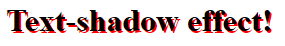
Next, add a color to the shadow:
Text shadow effect!
Example
<!DOCTYPE html>
<html>
<head>
<style>
h1 {
text-shadow: 2px 2px red;
}
</style>
</head>
<body>
<h1>Text-shadow effect!</h1>
</body>
</html>
Result:
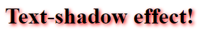
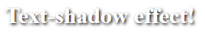
Then, add a blur effect to the shadow:
Example
<!DOCTYPE html>
<html>
<head>
<style>
h1 {
  text-shadow: 2px 2px 5px red;
}
</style>
</head>
<body>
<h1>Text-shadow effect!</h1>
</body>
</html>
Result:
The following example shows a white text with black shadow:
Example
<!DOCTYPE html>
<html>
<head>
<style>
h1 {
  color: white;
  text-shadow: 2px 2px 4px #000000;
}
</style>
</head>
<body>
<h1>Text-shadow effect!</h1>
</body>
</html>
Result:
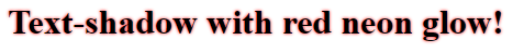
The following example shows a red neon glow shadow:
Example
<!DOCTYPE html>
<html>
<head>
<style>
h1 {
  text-shadow: 0 0 3px #FF0000;
}
</style>
</head>
<body>
<h1>Text-shadow with red neon glow!</h1>
</body>
</html>
Result:
Multiple Shadows
To add more than one shadow to the text, you can add a comma-separated list of shadows.
The following example shows a red and blue neon glow shadow:
Example
<!DOCTYPE html>
<html>
<head>
<style>
h1 {
  text-shadow: 0 0 3px #FF0000, 0 0 5px #0000FF;
}
</style>
</head>
<body>
<h1>Text-shadow with red and blue neon glow!</h1>
</body>
</html>
Result:

The following example shows a white text with black, blue, and darkblue shadow:
Example
<!DOCTYPE html>
<html>
<head>
<style>
h1 {
  color: white;
  text-shadow: 1px 1px 2px black, 0 0 25px blue, 0 0 5px darkblue;
}
</style>
</head>
<body>
<h1>Text-shadow effect!</h1>
</body>
</html>
Result:
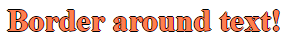
You can also use the text-shadow property to create a plain border around some text (without shadows):
Example
<!DOCTYPE html>
<html>
<head>
<style>
h1 {
  color: coral;
  text-shadow: -1px 0 black, 0 1px black, 1px 0 black, 0 -1px black;
}
</style>
</head>
<body>
<h1>Border around text!</h1>
</body>
</html>
Result:
CSS box-shadow Property
The CSS box-shadow property is used to apply one or more shadows to an element.
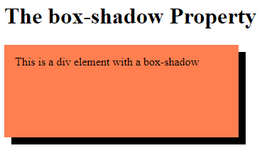
Specify a Horizontal and a Vertical Shadow
In its simplest use, you only specify a horizontal and a vertical shadow. The default color of the shadow is the current text-color.
Example
Specify a horizontal and a vertical shadow:
<!DOCTYPE html>
<html>
<head>
<style>
div {
  width: 300px;
  height: 100px;
  padding: 15px;
  background-color: coral;
  box-shadow: 10px 10px;
}
</style>
</head>
<body>
<h1>The box-shadow Property</h1>
<div>This is a div element with a box-shadow</div>
</body>
</html>
Result:
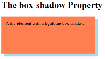
Specify a Color for the Shadow
The color parameter defines the color of the shadow.
Example
Specify a color for the shadow:
<!DOCTYPE html>
<html>
<head>
<style>
div {
  width: 300px;
  height: 100px;
  padding: 15px;
  background-color: coral;
  box-shadow: 10px 10px lightblue;
}
</style>
</head>
<body>
<h1>The box-shadow Property</h1>
<div>This is a div element with a box-shadow</div>
</body>
</html>
Result:
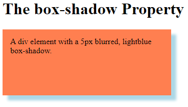
Add a Blur Effect to the Shadow
The blur parameter defines the blur radius. The higher the number, the more blurred the shadow will be.
Example
Add a blur effect to the shadow:
<!DOCTYPE html>
<html>
<head>
<style>
div {
  width: 300px;
  height: 100px;
  padding: 15px;
  background-color: coral;
  box-shadow: 10px 10px 5px lightblue;
}
</style>
</head>
<body>
<h1>The box-shadow Property</h1>
<div>A div element with a 5px blurred, lightblue box-shadow.</div>
</body>
</html>
Result:
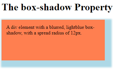
Set the Spread Radius of the Shadow
The spread parameter defines the spread radius. A positive value increases the size of the shadow, a negative value decreases the size of the shadow.
Example
Set the spread radius of the shadow:
<!DOCTYPE html>
<html>
<head>
<style>
div {
  width: 300px;
  height: 100px;
  padding: 15px;
  background-color: coral;
  box-shadow: 10px 10px 5px 12px lightblue;
}
</style>
</head>
<body>
<h1>The box-shadow Property</h1>
<div>A div element with a blurred, lightblue box-shadow, with a spread radius of 12px.</div></body>
</html>
Result:
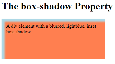
Set the inset Parameter
The inset parameter changes the shadow from an outer shadow (outset) to an inner shadow.
Example
Add the inset parameter:
<!DOCTYPE html>
<html>
<head>
<style>
div {
  width: 300px;
  height: 100px;
  padding: 15px;
  background-color: coral;
  box-shadow: 10px 10px 5px lightblue inset;
}
</style>
</head>
<body>
<h1>The box-shadow Property</h1>
<div>A div element with a blurred, lightblue, inset box-shadow.</div>
</body>
</html>
Result:
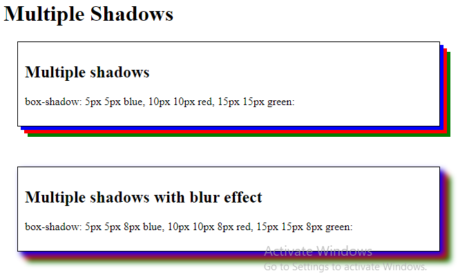
Add Multiple Shadows
An element can also have multiple shadows:
Example
<!DOCTYPE html>
<html>
<head>
<style>
#example1 {
  border: 1px solid;
  padding: 10px;
  box-shadow: 5px 5px blue, 10px 10px red, 15px 15px green;
  margin: 20px;
}
#example2 {
  border: 1px solid;
  padding: 10px;
  box-shadow: 5px 5px 8px blue, 10px 10px 8px red, 15px 15px 8px green;
  margin: 20px;
}
</style>
</head>
<body>
<h1>Multiple Shadows</h1>
<div id="example1">
  <h2>Multiple shadows</h2>
  <p>box-shadow: 5px 5px blue, 10px 10px red, 15px 15px green:</p>
</div>
<br>
<div id="example2">
  <h2>Multiple shadows with blur effect</h2>
  <p>box-shadow: 5px 5px 8px blue, 10px 10px 8px red, 15px 15px 8px green:</p>
</div>
</body>
</html>
Result:
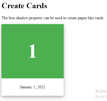
Cards
You can also use the box-shadow property to create paper-like cards:
Example
<!DOCTYPE html>
<html>
<head>
<style>
div.card {
  width: 250px;
  box-shadow: 0 4px 8px 0 rgba(0, 0, 0, 0.2), 0 6px 20px 0 rgba(0, 0, 0, 0.19);
  text-align: center;
}
div.header {
  background-color: #4CAF50;
  color: white;
  padding: 10px;
  font-size: 40px;
}
div.container {
  padding: 10px;
}
</style>
</head>
<body>
<h1>Create Cards</h1>
<p>The box-shadow property can be used to create paper-like cards:</p>
<div class="card">
  <div class="header">
    <h1>1</h1>
  </div>
  <div class="container">
    <p>January 1, 2021</p>
  </div>
</div>
</body>
</html>
Result:
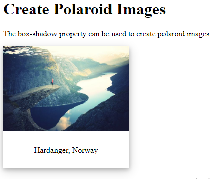
Example:
- Tryit: Using box-shadow to create polaroid images
<!DOCTYPE html>
<html>
<head>
<style>
div.polaroid {
  width: 250px;
  box-shadow: 0 4px 8px 0 rgba(0, 0, 0, 0.2), 0 6px 20px 0 rgba(0, 0, 0, 0.19);
  text-align: center;
}
div.container {
  padding: 10px;
}
</style>
</head>
<body>
<h1>Create Polaroid Images</h1>
<p>The box-shadow property can be used to create polaroid images:</p>
<div class="polaroid">
  <img src="rock600x400.jpg" alt="Norway" style="width:100%">
  <div class="container">
    <p>Hardanger, Norway</p>
  </div>
</div>
</body>
</html>
Result: