

CSS border-radius Property
The CSS border-radius property defines the radius of an element’s corners.
Tip: This property allows you to add rounded corners to elements!
Here are three examples:
Here is the code:
Example
<!DOCTYPE html>
<html>
<head>
<style>
#rcorners1 {
border-radius: 25px;
background: #73AD21;
padding: 20px;
width: 200px;
height: 150px;
}
#rcorners2 {
border-radius: 25px;
border: 2px solid #73AD21;
padding: 20px;
width: 200px;
height: 150px;
}
#rcorners3 {
border-radius: 25px;
background: url(paper.gif);
background-position: left top;
background-repeat: repeat;
padding: 20px;
width: 200px;
height: 150px;
}
</style>
</head>
<body>
<h1>The border-radius Property</h1>
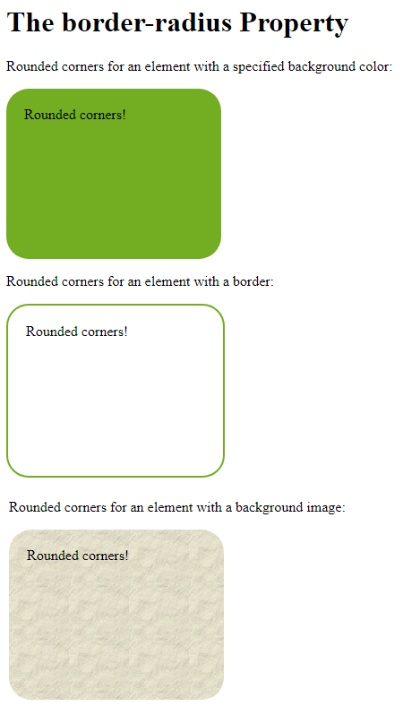
<p>Rounded corners for an element with a specified background color:</p>
<p id="rcorners1">Rounded corners!</p>
<p>Rounded corners for an element with a border:</p>
<p id="rcorners2">Rounded corners!</p>
<p>Rounded corners for an element with a background image:</p>
<p id="rcorners3">Rounded corners!</p>
</body>
</html>
Result:
CSS border-radius – Specify Each Corner
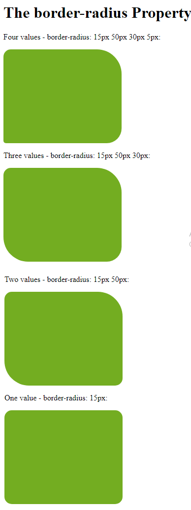
The border-radius property can have from one to four values. Here are the rules:
Four values – border-radius: 15px 50px 30px 5px; (first value applies to top-left corner, second value applies to top-right corner, third value applies to bottom-right corner, and fourth value applies to bottom-left corner):
Three values – border-radius: 15px 50px 30px; (first value applies to top-left corner, second value applies to top-right and bottom-left corners, and third value applies to bottom-right corner):
Two values – border-radius: 15px 50px; (first value applies to top-left and bottom-right corners, and the second value applies to top-right and bottom-left corners):
One value – border-radius: 15px; (the value applies to all four corners, which are rounded equally:
Here is the code:
Example
<!DOCTYPE html>
<html>
<head>
<style>
rcorners1 {
 border-radius: 15px 50px 30px 5px;
   background: #73AD21;
   padding: 20px;
   width: 200px;
   height: 150px;
 }
 rcorners2 {
 border-radius: 15px 50px 30px;
   background: #73AD21;
   padding: 20px;
   width: 200px;
   height: 150px;
 }
 rcorners3 {
 border-radius: 15px 50px;
   background: #73AD21;
   padding: 20px;
   width: 200px;
   height: 150px;
 }
 rcorners4 {
 border-radius: 15px;
   background: #73AD21;
   padding: 20px;
   width: 200px;
   height: 150px;
 }
</style>
</head>
<body>
<h1>The border-radius Property</h1>
<p>Four values - border-radius: 15px 50px 30px 5px:</p>
<p id="rcorners1"></p>
<p>Three values - border-radius: 15px 50px 30px:</p>
<p id="rcorners2"></p>
<p>Two values - border-radius: 15px 50px:</p>
<p id="rcorners3"></p>
<p>One value - border-radius: 15px:</p>
<p id="rcorners4"></p>
</body>
</html>
Result:
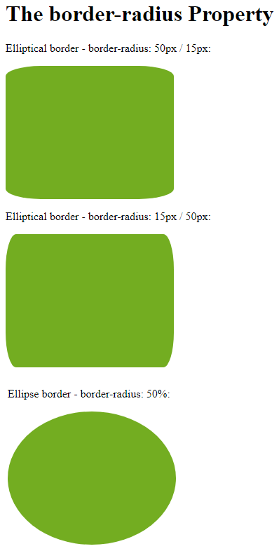
You could also create elliptical corners:
Example
<!DOCTYPE html>
<html>
<head>
<style>
#rcorners1 {
border-radius: 50px / 15px;
background: #73AD21;
padding: 20px;
width: 200px;
height: 150px;
}
#rcorners2 {
border-radius: 15px / 50px;
background: #73AD21;
padding: 20px;
width: 200px;
height: 150px;
}
#rcorners3 {
border-radius: 50%;
background: #73AD21;
padding: 20px;
width: 200px;
height: 150px;
}
</style>
</head>
<body>
<h1>The border-radius Property</h1>
<p>Elliptical border - border-radius: 50px / 15px:</p>
<p id="rcorners1"></p>
<p>Elliptical border - border-radius: 15px / 50px:</p>
<p id="rcorners2"></p>
<p>Ellipse border - border-radius: 50%:</p>
<p id="rcorners3"></p>
</body>
</html>
Result: