

Child Elements (Items)
A grid container contains grid items.
By default, a container has one grid item for each column, in each row, but you can style the grid items so that they will span multiple columns and/or rows.
The grid-column Property:
The grid-column property defines on which column(s) to place an item.
You define where the item will start, and where the item will end.
To place an item, you can refer to line numbers, or use the keyword “span” to define how many columns the item will span.
Example
Make “item1” start on column 1 and end before column 5:
<!DOCTYPE html>
<html>
<head>
<style>
.grid-container {
display: grid;
grid-template-columns: auto auto auto auto auto auto;
gap: 10px;
background-color: #2196F3;
padding: 10px;
}
.grid-container > div {
background-color: rgba(255, 255, 255, 0.8);
text-align: center;
padding: 20px 0;
font-size: 30px;
}
.item1 {
grid-column: 1 / 5;
}
</style>
</head>
<body>
<h1>The grid-column Property</h1>
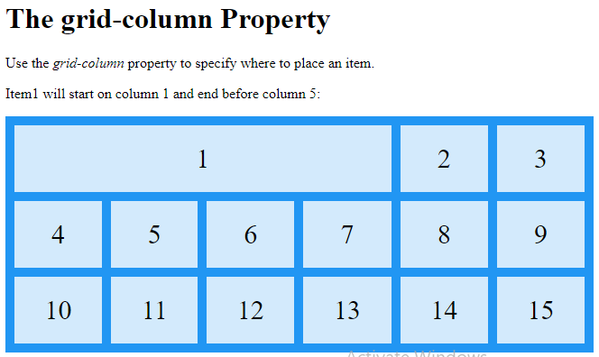
<p>Use the <em>grid-column</em> property to specify where to place an item.</p>
<p>Item1 will start on column 1 and end before column 5:</p>
<div class="grid-container">
<div class="item1">1</div>
<div class="item2">2</div>
<div class="item3">3</div>
<div class="item4">4</div>
<div class="item5">5</div>
<div class="item6">6</div>
<div class="item7">7</div>
<div class="item8">8</div>
<div class="item9">9</div>
<div class="item10">10</div>
<div class="item11">11</div>
<div class="item12">12</div>
<div class="item13">13</div>
<div class="item14">14</div>
<div class="item15">15</div>
</div>
</body>
</html>
Result:
Example
Make “item1” start on column 1 and span 3 columns:
<!DOCTYPE html>
<html>
<head>
<style>
.grid-container {
display: grid;
grid-template-columns: auto auto auto auto auto auto;
gap: 10px;
background-color: #2196F3;
padding: 10px;
}
.grid-container > div {
background-color: rgba(255, 255, 255, 0.8);
text-align: center;
padding: 20px 0;
font-size: 30px;
}
.item1 {
grid-column: 1 / span 3;
}
</style>
</head>
<body>
<h1>The grid-column Property</h1>
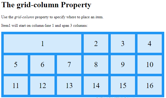
<p>Use the <em>grid-column</em> property to specify where to place an item.</p>
<p>Item1 will start on column-line 1 and span 3 columns:</p>
<div class="grid-container">
<div class="item1">1</div>
<div class="item2">2</div>
<div class="item3">3</div>
<div class="item4">4</div>
<div class="item5">5</div>
<div class="item6">6</div>
<div class="item7">7</div>
<div class="item8">8</div>
<div class="item9">9</div>
<div class="item10">10</div>
<div class="item11">11</div>
<div class="item12">12</div>
<div class="item13">13</div>
<div class="item14">14</div>
<div class="item15">15</div>
<div class="item16">16</div>
</div>
</body>
</html>
Result:
Example
Make “item2” start on column 2 and span 3 columns:
<!DOCTYPE html>
<html>
<head>
<style>
.grid-container {
display: grid;
grid-template-columns: auto auto auto auto auto auto;
gap: 10px;
background-color: #2196F3;
padding: 10px;
}
.grid-container > div {
background-color: rgba(255, 255, 255, 0.8);
text-align: center;
padding: 20px 0;
font-size: 30px;
}
.item2 {
grid-column: 2 / span 3;
}
</style>
</head>
<body>
<h1>The grid-column Property</h1>
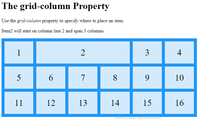
<p>Use the <em>grid-column</em> property to specify where to place an item.</p>
<p>Item2 will start on column line 2 and span 3 columns:</p>
<div class="grid-container">
<div class="item1">1</div>
<div class="item2">2</div>
<div class="item3">3</div>
<div class="item4">4</div>
<div class="item5">5</div>
<div class="item6">6</div>
<div class="item7">7</div>
<div class="item8">8</div>
<div class="item9">9</div>
<div class="item10">10</div>
<div class="item11">11</div>
<div class="item12">12</div>
<div class="item13">13</div>
<div class="item14">14</div>
<div class="item15">15</div>
<div class="item16">16</div>
</div>
</body>
</html>
Result:
The grid-row Property:
The grid-row property defines on which row to place an item.
You define where the item will start, and where the item will end.
To place an item, you can refer to line numbers, or use the keyword “span” to define how many rows the item will span:
Example
Make “item1” start on row-line 1 and end on row-line 4:
<!DOCTYPE html>
<html>
<head>
<style>
.grid-container {
display: grid;
grid-template-columns: auto auto auto auto auto auto;
gap: 10px;
background-color: #2196F3;
padding: 10px;
}
.grid-container > div {
background-color: rgba(255, 255, 255, 0.8);
text-align: center;
padding: 20px 0;
font-size: 30px;
}
.item1 {
grid-row: 1 / 4;
}
</style>
</head>
<body>
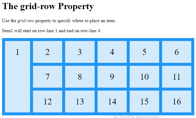
<h1>The grid-row Property</h1>
<p>Use the <em>grid-row</em> property to specify where to place an item.</p>
<p>Item1 will start on row-line 1 and end on row-line 4:</p>
<div class="grid-container">
<div class="item1">1</div>
<div class="item2">2</div>
<div class="item3">3</div>
<div class="item4">4</div>
<div class="item5">5</div>
<div class="item6">6</div>
<div class="item7">7</div>
<div class="item8">8</div>
<div class="item9">9</div>
<div class="item10">10</div>
<div class="item11">11</div>
<div class="item12">12</div>
<div class="item13">13</div>
<div class="item14">14</div>
<div class="item15">15</div>
<div class="item16">16</div>
</div>
</body>
</html>
Result:
Example
Make “item1” start on row 1 and span 2 rows:
<!DOCTYPE html>
<html>
<head>
<style>
.grid-container {
display: grid;
grid-template-columns: auto auto auto auto auto auto;
gap: 10px;
background-color: #2196F3;
padding: 10px;
}
.grid-container > div {
background-color: rgba(255, 255, 255, 0.8);
text-align: center;
padding: 20px 0;
font-size: 30px;
}
.item1 {
grid-row: 1 / span 2;
}
</style>
</head>
<body>
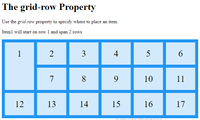
<h1>The grid-row Property</h1>
<p>Use the <em>grid-row</em> property to specify where to place an item.</p>
<p>Item1 will start on row 1 and span 2 rows:</p>
<div class="grid-container">
<div class="item1">1</div>
<div class="item2">2</div>
<div class="item3">3</div>
<div class="item4">4</div>
<div class="item5">5</div>
<div class="item6">6</div>
<div class="item7">7</div>
<div class="item8">8</div>
<div class="item9">9</div>
<div class="item10">10</div>
<div class="item11">11</div>
<div class="item12">12</div>
<div class="item13">13</div>
<div class="item14">14</div>
<div class="item15">15</div>
<div class="item16">16</div>
<div class="item17">17</div>
</div>
</body>
</html>
Result:
The grid-area Property
The grid-area property can be used as a shorthand property for the grid-row-start, grid-column-start, grid-row-end and the grid-column-end properties.
Example
Make “item8” start on row-line 1 and column-line 2, and end on row-line 5 and column line 6:
<!DOCTYPE html>
<html>
<head>
<style>
.grid-container {
display: grid;
grid-template-columns: auto auto auto auto auto auto;
gap: 10px;
background-color: #2196F3;
padding: 10px;
}
.grid-container > div {
background-color: rgba(255, 255, 255, 0.8);
text-align: center;
padding: 20px 0;
font-size: 30px;
}
.item8 {
grid-area: 1 / 2 / 5 / 6;
}
</style>
</head>
<body>
<h1>The grid-area Property</h1>
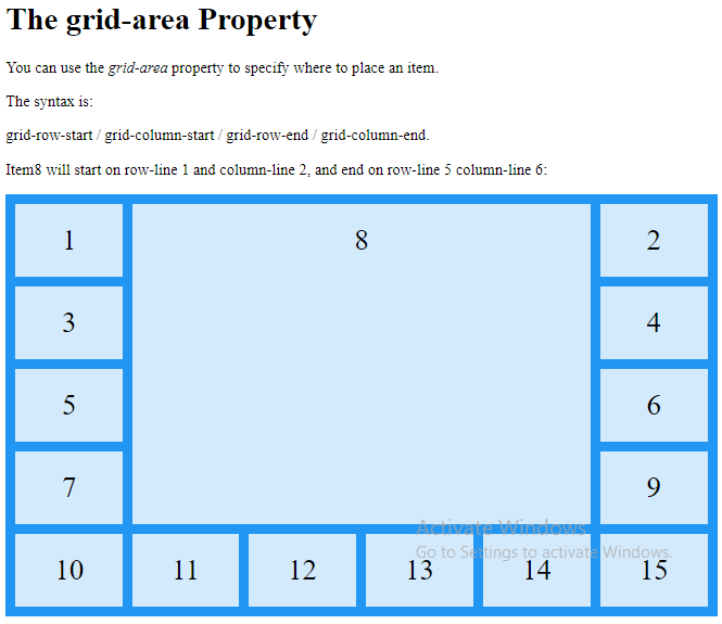
<p>You can use the <em>grid-area</em> property to specify where to place an item.</p>
<p>The syntax is:</p>
<p>grid-row-start / grid-column-start / grid-row-end / grid-column-end.</p>
<p>Item8 will start on row-line 1 and column-line 2, and end on row-line 5 column-line 6:</p>
<div class="grid-container">
<div class="item1">1</div>
<div class="item2">2</div>
<div class="item3">3</div>
<div class="item4">4</div>
<div class="item5">5</div>
<div class="item6">6</div>
<div class="item7">7</div>
<div class="item8">8</div>
<div class="item9">9</div>
<div class="item10">10</div>
<div class="item11">11</div>
<div class="item12">12</div>
<div class="item13">13</div>
<div class="item14">14</div>
<div class="item15">15</div>
</div>
</body>
</html>
Result:
Example
Make “item8” start on row-line 2 and column-line 1, and span 2 rows and 3 columns:
<!DOCTYPE html>
<html>
<head>
<style>
.grid-container {
display: grid;
grid-template-columns: auto auto auto auto auto auto;
gap: 10px;
background-color: #2196F3;
padding: 10px;
}
.grid-container > div {
background-color: rgba(255, 255, 255, 0.8);
text-align: center;
padding: 20px 0;
font-size: 30px;
}
.item8 {
grid-area: 2 / 1 / span 2 / span 3;
}
</style>
</head>
<body>
<h1>The grid-area Property</h1>
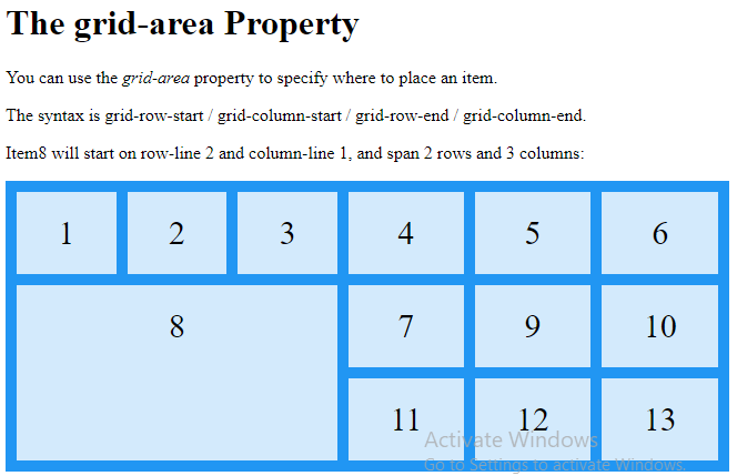
<p>You can use the <em>grid-area</em> property to specify where to place an item.</p>
<p>The syntax is grid-row-start / grid-column-start / grid-row-end / grid-column-end.</p><p>Item8 will start on row-line 2 and column-line 1, and span 2 rows and 3 columns:</p>
<div class="grid-container">
<div class="item1">1</div>
<div class="item2">2</div>
<div class="item3">3</div>
<div class="item4">4</div>
<div class="item5">5</div>
<div class="item6">6</div>
<div class="item7">7</div>
<div class="item8">8</div>
<div class="item9">9</div>
<div class="item10">10</div>
<div class="item11">11</div>
<div class="item12">12</div>
<div class="item13">13</div>
</div>
</body>
</html>
Result:
Naming Grid Items
The grid-area property can also be used to assign names to grid items.
Named grid items can be referred to by the grid-template-areas property of the grid container.
Example
Item1 gets the name “myArea” and spans all five columns in a five columns grid layout:
<!DOCTYPE html>
<html>
<head>
<style>
.item1 {
grid-area: myArea;
}
.grid-container {
display: grid;
grid-template-areas: 'myArea myArea myArea myArea myArea';
gap: 10px;
background-color: #2196F3;
padding: 10px;
}
.grid-container > div {
background-color: rgba(255, 255, 255, 0.8);
text-align: center;
padding: 20px 0;
font-size: 30px;
}
</style>
</head>
<body>
<h1>The grid-area Property</h1>
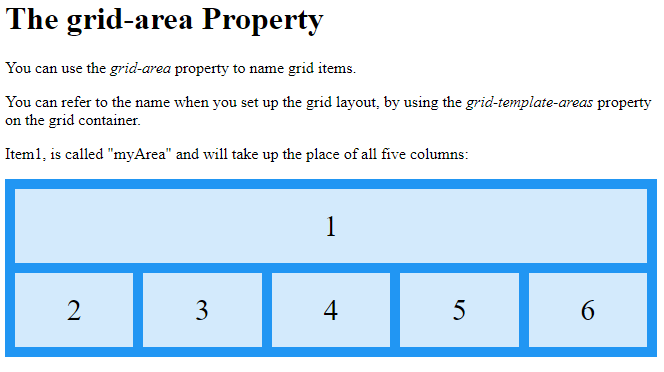
<p>You can use the <em>grid-area</em> property to name grid items.</p>
<p>You can refer to the name when you set up the grid layout, by using the <em>grid-template-areas</em> property on the grid container.</p>
<p>Item1, is called "myArea" and will take up the place of all five columns:</p>
<div class="grid-container">
<div class="item1">1</div>
<div class="item2">2</div>
<div class="item3">3</div>
<div class="item4">4</div>
<div class="item5">5</div>
<div class="item6">6</div>
</div>
</body>
</html>
Result:
Each row is defined by apostrophes (‘ ‘)
The columns in each row is defined inside the apostrophes, separated by a space.
Example
Let “myArea” span two columns in a five columns grid layout (period signs represent items with no name):
<!DOCTYPE html>
<html>
<head>
<style>
.item1 {
grid-area: myArea;
}
.grid-container {
display: grid;
grid-template-areas: 'myArea myArea . . .';
gap: 10px;
background-color: #2196F3;
padding: 10px;
}
.grid-container > div {
background-color: rgba(255, 255, 255, 0.8);
text-align: center;
padding: 20px 0;
font-size: 30px;
}
</style>
</head>
<body>
<h1>The grid-area Property</h1>
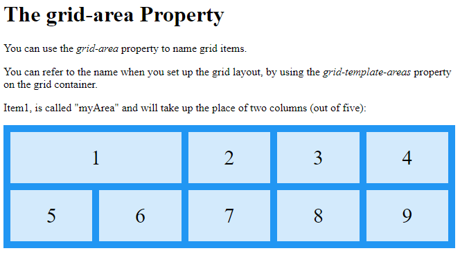
<p>You can use the <em>grid-area</em> property to name grid items.</p>
<p>You can refer to the name when you set up the grid layout, by using the <em>grid-template-areas</em> property on the grid container.</p>
<p>Item1, is called "myArea" and will take up the place of two columns (out of five):</p>
<div class="grid-container">
<div class="item1">1</div>
<div class="item2">2</div>
<div class="item3">3</div>
<div class="item4">4</div>
<div class="item5">5</div>
<div class="item6">6</div>
<div class="item7">7</div>
<div class="item8">8</div>
<div class="item9">9</div>
</div>
</body>
</html>
Result:
To define two rows, define the column of the second row inside another set of apostrophes:
Example
Make “item1” span two columns and two rows:
<!DOCTYPE html>
<html>
<head>
<style>
.item1 {
grid-area: myArea;
}
.grid-container {
display: grid;
grid-template-areas: 'myArea myArea . . .' 'myArea myArea . . .';
gap: 10px;
background-color: #2196F3;
padding: 10px;
}
.grid-container > div {
background-color: rgba(255, 255, 255, 0.8);
text-align: center;
padding: 20px 0;
font-size: 30px;
}
</style>
</head>
<body>
<h1>The grid-area Property</h1>
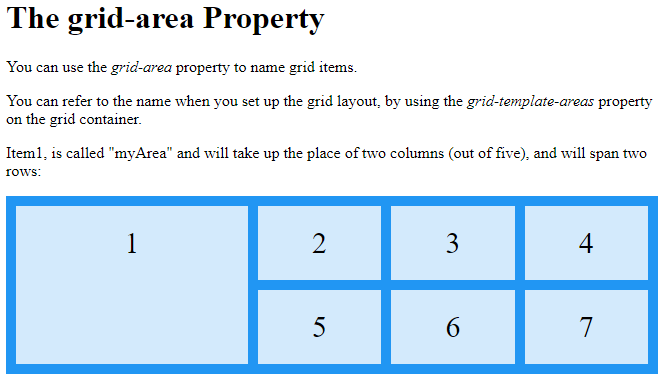
<p>You can use the <em>grid-area</em> property to name grid items.</p>
<p>You can refer to the name when you set up the grid layout, by using the <em>grid-template-areas</em> property on the grid container.</p>
<p>Item1, is called "myArea" and will take up the place of two columns (out of five), and will span two rows:</p>
<div class="grid-container">
<div class="item1">1</div>
<div class="item2">2</div>
<div class="item3">3</div>
<div class="item4">4</div>
<div class="item5">5</div>
<div class="item6">6</div>
<div class="item7">7</div>
</div>
</body>
</html>
Result:
Example
Name all items, and make a ready-to-use webpage template:
<!DOCTYPE html>
<html>
<head>
<style>
.item1 { grid-area: header; }
.item2 { grid-area: menu; }
.item3 { grid-area: main; }
.item4 { grid-area: right; }
.item5 { grid-area: footer; }
.grid-container {
display: grid;
grid-template-areas:
'header header header header header header'
'menu main main main right right'
'menu footer footer footer footer footer';
gap: 10px;
background-color: #2196F3;
padding: 10px;
}
.grid-container > div {
background-color: rgba(255, 255, 255, 0.8);
text-align: center;
padding: 20px 0;
font-size: 30px;
}
</style>
</head>
<body>
<h1>The grid-area Property</h1>
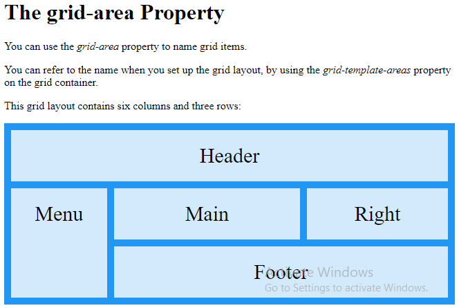
<p>You can use the <em>grid-area</em> property to name grid items.</p>
<p>You can refer to the name when you set up the grid layout, by using the <em>grid-template-areas</em> property on the grid container.</p>
<p>This grid layout contains six columns and three rows:</p>
<div class="grid-container">
<div class="item1">Header</div>
<div class="item2">Menu</div>
<div class="item3">Main</div>
<div class="item4">Right</div>
<div class="item5">Footer</div>
</div>
</body>
</html>
Result:
The Order of the Items
The Grid Layout allows us to position the items anywhere we like.
Example
<!DOCTYPE html>
<html>
<head>
<style>
.grid-container {
display: grid;
grid-template-columns: auto auto auto;
gap: 10px;
background-color: #2196F3;
padding: 10px;
}
.grid-container > div {
background-color: rgba(255, 255, 255, 0.8);
text-align: center;
padding: 20px 0;
font-size: 30px;
}
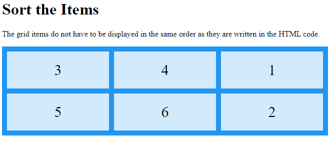
.item1 { grid-area: 1 / 3 / 2 / 4; }
.item2 { grid-area: 2 / 3 / 3 / 4; }
.item3 { grid-area: 1 / 1 / 2 / 2; }
.item4 { grid-area: 1 / 2 / 2 / 3; }
.item5 { grid-area: 2 / 1 / 3 / 2; }
.item6 { grid-area: 2 / 2 / 3 / 3; }
</style>
</head>
<body>
<h1>Sort the Items</h1>
<p>The grid items do not have to be displayed in the same order as they are written in the HTML code.</p>
<div class="grid-container">
<div class="item1">1</div>
<div class="item2">2</div>
<div class="item3">3</div>
<div class="item4">4</div>
<div class="item5">5</div>
<div class="item6">6</div>
</div>
</body>
</html>
Result:
You can re-arrange the order for certain screen sizes, by using media queries:
Example
<!DOCTYPE html>
<html>
<head>
<style>
.grid-container {
display: grid;
grid-template-columns: auto auto auto;
gap: 10px;
background-color: #2196F3;
padding: 10px;
}
.grid-container > div {
background-color: rgba(255, 255, 255, 0.8);
text-align: center;
padding: 20px 0;
font-size: 30px;
}
@media only screen and (max-width: 500px) {
.item1 { grid-area: 1 / span 3 / 2 / 4; }
.item2 { grid-area: 3 / 3 / 4 / 4; }
.item3 { grid-area: 2 / 1 / 3 / 2; }
.item4 { grid-area: 2 / 2 / span 2 / 3; }
.item5 { grid-area: 3 / 1 / 4 / 2; }
.item6 { grid-area: 2 / 3 / 3 / 4; }
}
</style>
</head>
<body>
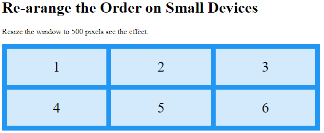
<h1>Re-arange the Order on Small Devices</h1>
<p>Resize the window to 500 pixels see the effect.</p>
<div class="grid-container">
<div class="item1">1</div>
<div class="item2">2</div>
<div class="item3">3</div>
<div class="item4">4</div>
<div class="item5">5</div>
<div class="item6">6</div>
</div>
</body>
</html>
Result: