

CSS gradients let you display smooth transitions between two or more specified colors.
CSS defines three types of gradients:
- Linear Gradients (goes down/up/left/right/diagonally)
- Radial Gradients (defined by their center)
- Conic Gradients (rotated around a center point)
CSS Linear Gradients
To create a linear gradient you must define at least two color stops. Color stops are the colors you want to render smooth transitions among. You can also set a starting point and a direction (or an angle) along with the gradient effect.
Syntax
background-image: linear-gradient(direction, color-stop1, color-stop2, …);
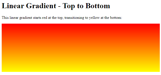
Direction – Top to Bottom (this is default)
The following example shows a linear gradient that starts at the top. It starts red, transitioning to yellow:
Example
<!DOCTYPE html>
<html>
<head>
<style>
#grad1 {
height: 200px;
background-color: red; /* For browsers that do not support gradients */
background-image: linear-gradient(red, yellow);
}
</style>
</head>
<body>
<h1>Linear Gradient - Top to Bottom</h1>
<p>This linear gradient starts red at the top, transitioning to yellow at the bottom:</p>
<div id="grad1"></div>
</body>
</html>
Result:
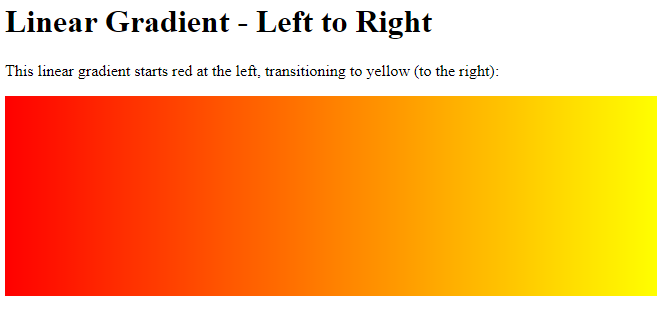
Direction – Left to Right
The following example shows a linear gradient that starts from the left. It starts red, transitioning to yellow:
Example
<!DOCTYPE html>
<html>
<head>
<style>
#grad1 {
  height: 200px;
  background-color: red; /* For browsers that do not support gradients */
  background-image: linear-gradient(to right, red , yellow);
}
</style>
</head>
<body>
<h1>Linear Gradient - Left to Right</h1>
<p>This linear gradient starts red at the left, transitioning to yellow (to the right):</p>
<div id="grad1"></div>
</body>
</html>
Result:
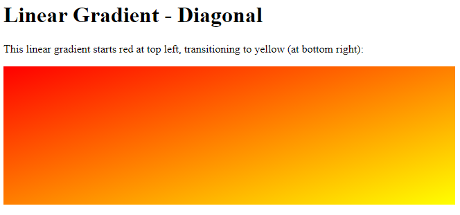
Direction – Diagonal
You can make a gradient diagonally by specifying both the horizontal and vertical starting positions.
The following example shows a linear gradient that starts at top left (and goes to bottom right). It starts red, transitioning to yellow:
Example
<!DOCTYPE html>
<html>
<head>
<style>
#grad1 {
  height: 200px;
  background-color: red; /* For browsers that do not support gradients */
  background-image: linear-gradient(to bottom right, red, yellow);
}
</style>
</head>
<body>
<h1>Linear Gradient - Diagonal</h1>
<p>This linear gradient starts red at top left, transitioning to yellow (at bottom right):</p><div id="grad1"></div>
</body>
</html>
Result:
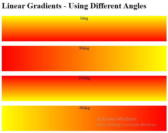
Using Angles
If you want more control over the direction of the gradient, you can define an angle, instead of the predefined directions (to bottom, to top, to right, to left, to bottom right, etc.). A value of 0deg is equivalent to “to top”. A value of 90deg is equivalent to “to right”. A value of 180deg is equivalent to “to bottom”.
Syntax
background-image: linear-gradient(angle, color-stop1, color-stop2);
The following example shows how to use angles on linear gradients:
Example
<!DOCTYPE html>
<html>
<head>
<style>
#grad1 {
  height: 100px;
  background-color: red; /* For browsers that do not support gradients */
  background-image: linear-gradient(0deg, red, yellow);
}
#grad2 {
  height: 100px;
  background-color: red; /* For browsers that do not support gradients */
  background-image: linear-gradient(90deg, red, yellow);
}
#grad3 {
  height: 100px;
  background-color: red; /* For browsers that do not support gradients */
  background-image: linear-gradient(180deg, red, yellow);
}
#grad4 {
  height: 100px;
  background-color: red; /* For browsers that do not support gradients */
  background-image: linear-gradient(-90deg, red, yellow);
}
</style>
</head>
<body>
<h1>Linear Gradients - Using Different Angles</h1>
<div id="grad1" style="text-align:center;">0deg</div><br>
<div id="grad2" style="text-align:center;">90deg</div><br>
<div id="grad3" style="text-align:center;">180deg</div><br>
<div id="grad4" style="text-align:center;">-90deg</div>
</body>
</html>
Result:
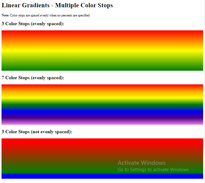
Using Multiple Color Stops
The following example shows a linear gradient (from top to bottom) with multiple color stops:
Example
<!DOCTYPE html>
<html>
<head>
<style>
#grad1 {
  height: 200px;
  background-color: red; /* For browsers that do not support gradients */
  background-image: linear-gradient(red, yellow, green);
}
#grad2 {
  height: 200px;
  background-color: red; /* For browsers that do not support gradients */
  background-image: linear-gradient(red, orange, yellow, green, blue, indigo, violet);
}
#grad3 {
  height: 200px;
  background-color: red; /* For browsers that do not support gradients */
  background-image: linear-gradient(red 10%, green 85%, blue 90%);
}
</style>
</head>
<body>
<h1>Linear Gradients - Multiple Color Stops</h1>
<p><strong>Note:</strong> Color stops are spaced evenly when no percents are specified.</p>
<h2>3 Color Stops (evenly spaced):</h2>
<div id="grad1"></div>
<h2>7 Color Stops (evenly spaced):</h2>
<div id="grad2"></div>
<h2>3 Color Stops (not evenly spaced):</h2>
<div id="grad3"></div>
</body>
</html>
Result:
The following example shows how to create a linear gradient (from left to right) with the color of the rainbow and some text:
Example
<!DOCTYPE html>
<html>
<head>
<style>
#grad1 {
  height: 55px;
  background-color: red; /* For browsers that do not support gradients */
  background-image: linear-gradient(to right, red, orange, yellow, green, blue, indigo, violet);
}
</style>
</head>
<body>
<div id="grad1" style="text-align:center;margin:auto;color:#888888;font-size:40px;font-weight:bold">
Rainbow Background
</div>
</body>
</html>
Result:

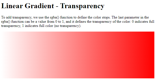
Using Transparency
CSS gradients also support transparency, which can be used to create fading effects.
To add transparency, we use the rgba() function to define the color stops. The last parameter in the rgba() function can be a value from 0 to 1, and it defines the transparency of the color: 0 indicates full transparency, 1 indicates full color (no transparency).
The following example shows a linear gradient that starts from the left. It starts fully transparent, transitioning to full color red:
Example
<!DOCTYPE html>
<html>
<head>
<style>
#grad1 {
  height: 200px;
  background-image: linear-gradient(to right, rgba(255,0,0,0), rgba(255,0,0,1));
}
</style>
</head>
<body>
<h1>Linear Gradient - Transparency</h1>
<p>To add transparency, we use the rgba() function to define the color stops. The last parameter in the rgba() function can be a value from 0 to 1, and it defines the transparency of the color: 0 indicates full transparency, 1 indicates full color (no transparency).</p>
<div id="grad1"></div>
</body>
</html>
Result:
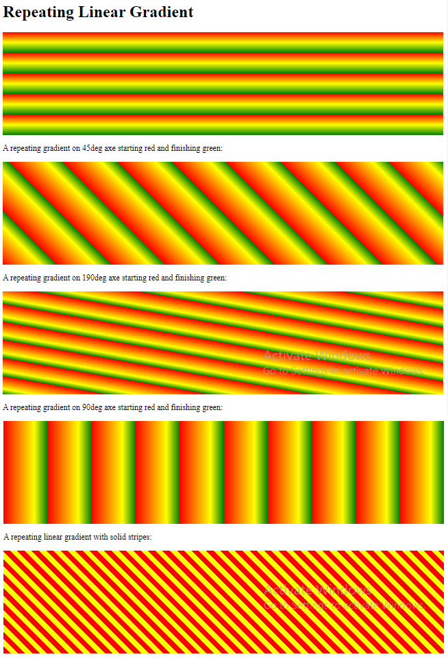
Repeating a linear-gradient
The repeating-linear-gradient() function is used to repeat linear gradients:
Example
A repeating linear gradient:
<!DOCTYPE html>
<html>
<head>
<style>
#grad1 {
  height: 200px;
  background-color: red; /* For browsers that do not support gradients */
  background-image: repeating-linear-gradient(red, yellow 10%, green 20%);
}
#grad2 {
  height: 200px;
  background-color: red; /* For browsers that do not support gradients */
  background-image: repeating-linear-gradient(45deg,red,yellow 7%,green 10%);
}
#grad3 {
  height: 200px;
  background-color: red; /* For browsers that do not support gradients */
  background-image: repeating-linear-gradient(190deg,red,yellow 7%,green 10%);
}
#grad4 {
  height: 200px;
  background-color: red; /* For browsers that do not support gradients */
  background-image: repeating-linear-gradient(90deg,red,yellow 7%,green 10%);
}
#grad5 {
  height: 200px;
  background-color: red; /* For browsers that do not support gradients */
  background-image: repeating-linear-gradient(45deg, red 0px, red 10px, red 10px, yellow 10px, yellow 20px);
}
</style>
</head>
<body>
<h1>Repeating Linear Gradient</h1>
<div id="grad1"></div>
<p>A repeating gradient on 45deg axe starting red and finishing green:</p>
<div id="grad2"></div>
<p>A repeating gradient on 190deg axe starting red and finishing green:</p>
<div id="grad3"></div>
<p>A repeating gradient on 90deg axe starting red and finishing green:</p>
<div id="grad4"></div>
<p>A repeating linear gradient with solid stripes:</p>
<div id="grad5"></div>
</body>
</html>
Result:
CSS Radial Gradients
A radial gradient is defined by its center.
To create a radial gradient you must also define at least two color stops.
Syntax
background-image: radial-gradient(shape size at position, start-color, …, last-color);
By default, shape is ellipse, size is farthest-corner, and position is center.
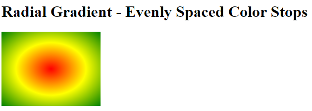
Radial Gradient – Evenly Spaced Color Stops (this is default)
The following example shows a radial gradient with evenly spaced color stops:
Example
<!DOCTYPE html>
<html>
<head>
<style>
#grad1 {
  height: 150px;
  width: 200px;
  background-color: red; /* For browsers that do not support gradients */
  background-image: radial-gradient(red, yellow, green);
}
</style>
</head>
<body>
<h1>Radial Gradient - Evenly Spaced Color Stops</h1>
<div id="grad1"></div>
</body>
</html>
Result:
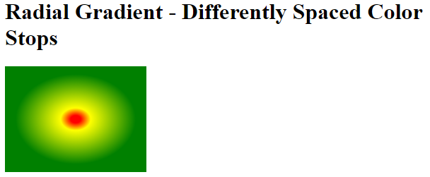
Radial Gradient – Differently Spaced Color Stops
The following example shows a radial gradient with differently spaced color stops:
Example
<!DOCTYPE html>
<html>
<head>
<style>
#grad1 {
  height: 150px;
  width: 200px;
  background-color: red; /* For browsers that do not support gradients */
  background-image: radial-gradient(red 5%, yellow 15%, green 60%);
}
</style>
</head>
<body>
<h1>Radial Gradient - Differently Spaced Color Stops</h1>
<div id="grad1"></div>
</body>
</html>
Result:
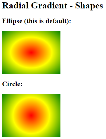
Set Shape
The shape parameter defines the shape. It can take the value circle or ellipse. The default value is ellipse.
The following example shows a radial gradient with the shape of a circle:
Example
<!DOCTYPE html>
<html>
<head>
<style>
#grad1 {
  height: 150px;
  width: 200px;
  background-color: red; /* For browsers that do not support gradients */
  background-image: radial-gradient(red, yellow, green);
}
#grad2 {
  height: 150px;
  width: 200px;
  background-color: red; /* For browsers that do not support gradients */
  background-image: radial-gradient(circle, red, yellow, green);
}
</style>
</head>
<body>
<h1>Radial Gradient - Shapes</h1>
<h2>Ellipse (this is default):</h2>
<div id="grad1"></div>
<h2><strong>Circle:</strong></h2>
<div id="grad2"></div>
</body>
</html>
Result:
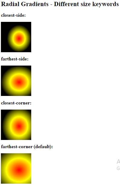
Use of Different Size Keywords
The size parameter defines the size of the gradient. It can take four values:
- closest-side
- farthest-side
- closest-corner
- farthest-corner
Example
A radial gradient with different size keywords:
<!DOCTYPE html>
<html>
<head>
<style>
#grad1 {
  height: 150px;
  width: 150px;
  background-color: red; /* For browsers that do not support gradients */
  background-image: radial-gradient(closest-side at 60% 55%, red, yellow, black);
}
#grad2 {
  height: 150px;
  width: 150px;
  background-color: red; /* For browsers that do not support gradients */
  background-image: radial-gradient(farthest-side at 60% 55%, red, yellow, black);
}
#grad3 {
  height: 150px;
  width: 150px;
  background-color: red; /* For browsers that do not support gradients */
  background-image: radial-gradient(closest-corner at 60% 55%, red, yellow, black);
}
#grad4 {
  height: 150px;
  width: 150px;
  background-color: red; /* For browsers that do not support gradients */
  background-image: radial-gradient(farthest-corner at 60% 55%, red, yellow, black);
}
</style>
</head>
<body>
<h1>Radial Gradients - Different size keywords</h1>
<h2>closest-side:</h2>
<div id="grad1"></div>
<h2>farthest-side:</h2>
<div id="grad2"></div>
<h2>closest-corner:</h2>
<div id="grad3"></div>
<h2>farthest-corner (default):</h2>
<div id="grad4"></div>
</body>
</html>
Result:
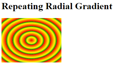
Repeating a radial-gradient
The repeating-radial-gradient() function is used to repeat radial gradients:
Example
A repeating radial gradient:
<!DOCTYPE html>
<html>
<head>
<style>
#grad1 {
  height: 150px;
  width: 200px;
  background-color: red; /* For browsers that do not support gradients */
  background-image: repeating-radial-gradient(red, yellow 10%, green 15%);
}
</style>
</head>
<body>
<h1>Repeating Radial Gradient</h1>
<div id="grad1"></div>
</body>
</html>
Result:
CSS Conic Gradients
A conic gradient is a gradient with color transitions rotated around a center point.
To create a conic gradient you must define at least two colors.
Syntax
background-image: conic-gradient([from angle] [at position,] color [degree], color [degree], …);
By default, angle is 0deg and position is center.
If no degree is specified, the colors will be spread equally around the center point.
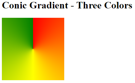
Conic Gradient: Three Colors
The following example shows a conic gradient with three colors:
Example
A conic gradient with three colors:
<!DOCTYPE html>
<html>
<head>
<style>
#grad1 {
height: 200px;
width: 200px;
background-color: red; /* For browsers that do not support gradients */
background-image: conic-gradient(red, yellow, green);
}
</style>
</head>
<body>
<h1>Conic Gradient - Three Colors</h1>
<div id="grad1"></div>
</body>
</html>
Result:
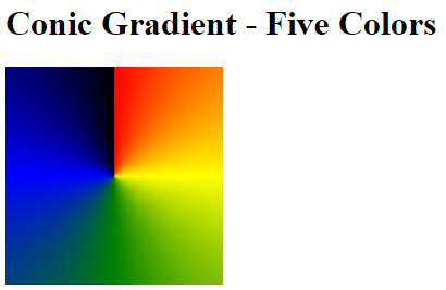
Conic Gradient: Five Colors
The following example shows a conic gradient with five colors:
Example
A conic gradient with five colors:
<!DOCTYPE html>
<html>
<head>
<style>
#grad1 {
  height: 200px;
  width: 200px;
  background-color: red; /* For browsers that do not support gradients */
  background-image: conic-gradient(red, yellow, green, blue, black);
}
</style>
</head>
<body>
<h1>Conic Gradient - Five Colors</h1>
<div id="grad1"></div>
</body>
</html>
Result:
Conic Gradient: Three Colors and Degrees
The following example shows a conic gradient with three colors and a degree for each color:
Example
A conic gradient with three colors and a degree for each color:
<!DOCTYPE html>
<html>
<head>
<style>
#grad1 {
  height: 200px;
  width: 200px;
  background-color: red; /* For browsers that do not support gradients */
  background-image: conic-gradient(red 45deg, yellow 90deg, green 210deg);
}
</style>
</head>
<body>
<h1>Conic Gradient - Defined degree for each color</h1>
<div id="grad1"></div>
</body>
</html>
Result:
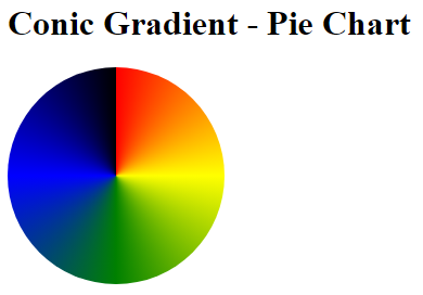
Create Pie Charts
Just add border-radius: 50% to make the conic gradient look like a pie:
Example
<!DOCTYPE html>
<html>
<head>
<style>
#grad1 {
  height: 200px;
  width: 200px;
  background-color: red; /* For browsers that do not support gradients */
  background-image: conic-gradient(red, yellow, green, blue, black);
  border-radius: 50%;
}
</style>
</head>
<body>
<h1>Conic Gradient - Pie Chart</h1>
<div id="grad1"></div>
</body>
</html>
Result:
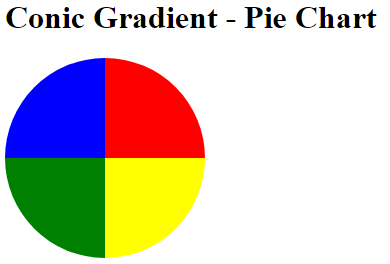
Here is another pie chart with defined degrees for all the colors:
Example
<!DOCTYPE html>
<html>
<head>
<style>
#grad1 {
  height: 200px;
  width: 200px;
  background-color: red; /* For browsers that do not support gradients */
  background-image: conic-gradient(red 0deg, red 90deg, yellow 90deg, yellow 180deg, green 180deg, green 270deg, blue 270deg);
  border-radius: 50%;
}
</style>
</head>
<body>
<h1>Conic Gradient - Pie Chart</h1>
<div id="grad1"></div>
</body>
</html>
Result:
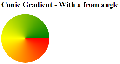
Conic Gradient With Specified From Angle
The [from angle] specifies an angle that the entire conic gradient is rotated by.
The following example shows a conic gradient with a from angle of 90deg:
Example
A conic gradient with a from angle:
<!DOCTYPE html>
<html>
<head>
<style>
#grad1 {
  height: 200px;
  width: 200px;
  background-color: red; /* For browsers that do not support gradients */
  background-image: conic-gradient(from 90deg, red, yellow, green);
  border-radius: 50%;
}
</style>
</head>
<body>
<h1>Conic Gradient - With a from angle</h1>
<div id="grad1"></div>
</body>
</html>
Result:
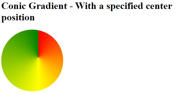
Conic Gradient With Specified Center Position
The [at position] specifies the center of the conic gradient.
The following example shows a conic gradient with a center position of 60% 45%:
Example
A conic gradient with a specified center position:
<!DOCTYPE html>
<html>
<head>
<style>
#grad1 {
  height: 200px;
  width: 200px;
  background-color: red; /* For browsers that do not support gradients */
  background-image: conic-gradient(at 60% 45%, red, yellow, green);
  border-radius: 50%;
}
</style>
</head>
<body>
<h1>Conic Gradient - With a specified center position</h1>
<div id="grad1"></div>
</body>
</html>
Result:
Repeating a Conic Gradient
The repeating-conic-gradient() function is used to repeat conic gradients:
Example
A repeating conic gradient:
<!DOCTYPE html>
<html>
<head>
<style>
#grad1 {
  height: 200px;
  width: 200px;
  background-color: red; /* For browsers that do not support gradients */
  background-image: repeating-conic-gradient(red 10%, yellow 20%);
  border-radius: 50%;
}
</style>
</head>
<body>
<h1>Repeating a Conic Gradient</h1>
<div id="grad1"></div>
</body>
</html>
Result:
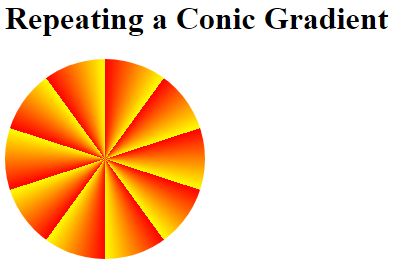
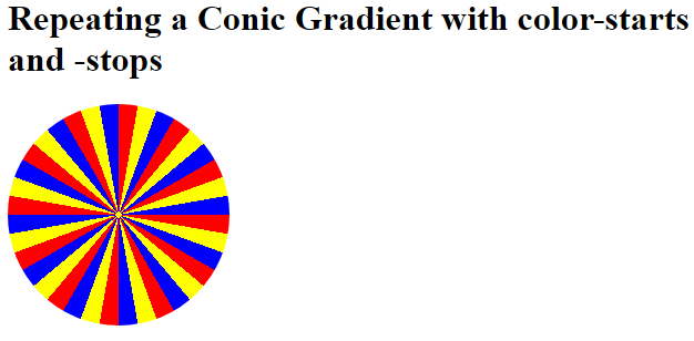
Here is a repeating conic gradient with defined color-starts and color-stops:
Example
A repeating conic gradient with defined color-starts and color-stops:
<!DOCTYPE html>
<html>
<head>
<style>
#grad1 {
height: 200px;
width: 200px;
background-color: red; /* For browsers that do not support gradients */
background-image: repeating-conic-gradient(red 0deg 10deg, yellow 10deg 20deg, blue 20deg 30deg);
border-radius: 50%;
}
</style>
</head>
<body>
<h1>Repeating a Conic Gradient with color-starts and -stops</h1>
<div id="grad1"></div>
</body>
</html>
Result: