

CSS Border Images
With the CSS border-image property, you can set an image to be used as the border around an element.
CSS border-image Property
The CSS border-image property allows you to specify an image to be used instead of the normal border around an element.
The property has three parts:
- The image to use as the border
- Where to slice the image
- Define whether the middle sections should be repeated or stretched
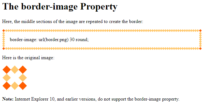
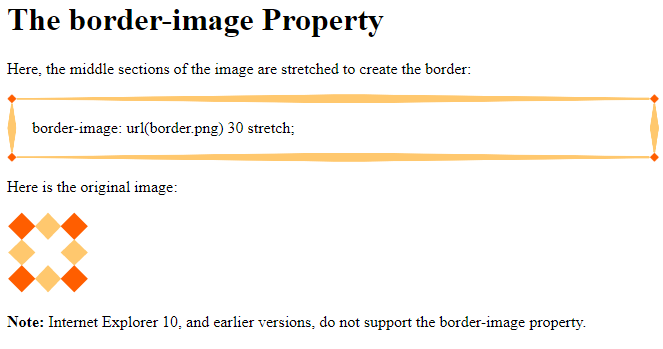
We will use the following image (called “border.png”):

The border-image property takes the image and slices it into nine sections, like a tic-tac-toe board. It then places the corners at the corners, and the middle sections are repeated or stretched as you specify.
Note: For border-image to work, the element also needs the border property set!
Here, the middle sections of the image are repeated to create the border:
Here is the code:
Example
<!DOCTYPE html>
<html>
<head>
<style>
#borderimg {
  border: 10px solid transparent;
  padding: 15px;
  border-image: url(border.png) 30 round;
}
</style>
</head>
<body>
<h1>The border-image Property</h1>
<p>Here, the middle sections of the image are repeated to create the border:</p>
<p id="borderimg">border-image: url(border.png) 30 round;</p>
<p>Here is the original image:</p><img src="border.png">
<p><strong>Note:</strong> Internet Explorer 10, and earlier versions, do not support the border-image property.</p>
</body>
</html>
Result:
Here, the middle sections of the image are stretched to create the border:
Here is the code:
Example
<!DOCTYPE html>
<html>
<head>
<style>
#borderimg {
  border: 10px solid transparent;
  padding: 15px;
  border-image: url(border.png) 30 stretch;
}
</style>
</head>
<body>
<h1>The border-image Property</h1>
<p>Here, the middle sections of the image are stretched to create the border:</p>
<p id="borderimg">border-image: url(border.png) 30 stretch;</p>
<p>Here is the original image:</p><img src="border.png">
<p><strong>Note:</strong> Internet Explorer 10, and earlier versions, do not support the border-image property.</p>
</body>
</html>
Result:
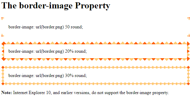
CSS border-image – Different Slice Values
Different slice values completely changes the look of the border:
Example 1:
border-image: url(border.png) 50 round;
Example 2:
border-image: url(border.png) 20% round;
Example 3:
border-image: url(border.png) 30% round;
Here is the code:
Example
<!DOCTYPE html>
<html>
<head>
<style>
#borderimg1 {
  border: 10px solid transparent;
  padding: 15px;
  border-image: url(border.png) 50 round;
}
#borderimg2 {
  border: 10px solid transparent;
  padding: 15px;
  border-image: url(border.png) 20% round;
}
#borderimg3 {
  border: 10px solid transparent;
  padding: 15px;
  border-image: url(border.png) 30% round;
}
</style>
</head>
<body>
<h1>The border-image Property</h1>
<p id="borderimg1">border-image: url(border.png) 50 round;</p>
<p id="borderimg2">border-image: url(border.png) 20% round;</p>
<p id="borderimg3">border-image: url(border.png) 30% round;</p>
<p><strong>Note:</strong> Internet Explorer 10, and earlier versions, do not support the border-image property.</p>
</body>
</html>
Result: