

CSS also supports 3D transformations.
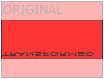
Mouse over the elements below to see the difference between a 2D and a 3D transformation:
In this chapter you will learn about the following CSS property:
transform
Browser Support
The numbers in the table specify the first browser version that fully supports the property.
| Property | Google Chrome | Internet Explorer | Mozilla Firefox | Safari | Opera |
|---|---|---|---|---|---|
| transform | 36.0 | 10.0 | 16.0 | 9.0 | 23.0 |
CSS 3D Transforms Methods
With the CSS transform property you can use the following 3D transformation methods:
rotateX()rotateY()rotateZ()
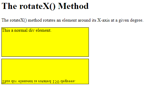
The rotateX() Method
The rotateX() method rotates an element around its X-axis at a given degree:
Example
<!DOCTYPE html>
<html>
<head>
<style>
div {
  width: 300px;
  height: 100px;
  background-color: yellow;
  border: 1px solid black;
}
#myDiv {
  transform: rotateX(150deg);
}
</style>
</head>
<body>
<h1>The rotateX() Method</h1>
<p>The rotateX() method rotates an element around its X-axis at a given degree.</p>
<div>
This a normal div element.
</div>
<div id="myDiv">
This div element is rotated 150 degrees.
</div>
</body>
</html>
Result:
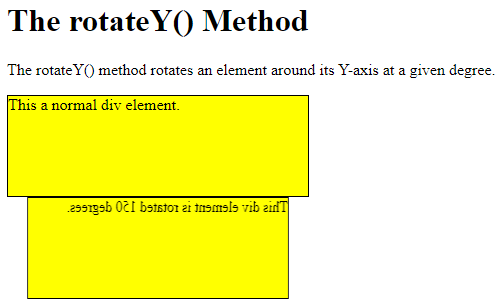
The rotateY() Method
The rotateY() method rotates an element around its Y-axis at a given degree:
Example
<!DOCTYPE html>
<html>
<head>
<style>
div {
  width: 300px;
  height: 100px;
  background-color: yellow;
  border: 1px solid black;
}
#myDiv {
  transform: rotateY(150deg);
}
</style>
</head>
<body>
<h1>The rotateY() Method</h1>
<p>The rotateY() method rotates an element around its Y-axis at a given degree.</p>
<div>
This a normal div element.
</div>
<div id="myDiv">
This div element is rotated 150 degrees.
</div>
</body>
</html>
Result:
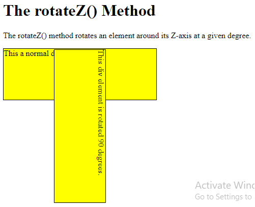
The rotateZ() Method
The rotateZ() method rotates an element around its Z-axis at a given degree:
Example
<!DOCTYPE html>
<html>
<head>
<style>
div {
  width: 300px;
  height: 100px;
  background-color: yellow;
  border: 1px solid black;
}
#myDiv {
  transform: rotateZ(90deg);
}
</style>
</head>
<body>
<h1>The rotateZ() Method</h1>
<p>The rotateZ() method rotates an element around its Z-axis at a given degree.</p>
<div>
This a normal div element.
</div>
<div id="myDiv">
This div element is rotated 90 degrees.
</div>
</body>
</html>
Result: