

Responsive web design is about creating web pages that look good on all devices!
A responsive web design will automatically adjust for different screen sizes and viewports.
What is Responsive Web Design?
Responsive Web Design is about using HTML and CSS to automatically resize, hide, shrink, or enlarge, a website, to make it look good on all devices (desktops, tablets, and phones):
<!DOCTYPE html>
<html>
<head>
<meta name="viewport" content="width=device-width, initial-scale=1.0">
<style>
* {
box-sizing: border-box;
}
.menu {
float: left;
width: 20%;
}
.menuitem {
padding: 8px;
margin-top: 7px;
border-bottom: 1px solid #f1f1f1;
}
.main {
float: left;
width: 60%;
padding: 0 20px;
overflow: hidden;
}
.right {
background-color: lightblue;
float: left;
width: 20%;
padding: 10px 15px;
margin-top: 7px;
}
@media only screen and (max-width:800px) {
/* For tablets: */
.main {
width: 80%;
padding: 0;
}
.right {
width: 100%;
}
}
@media only screen and (max-width:500px) {
/* For mobile phones: */
.menu, .main, .right {
width: 100%;
}
}
</style>
</head>
<body style="font-family:Verdana;">
<div style="background-color:#f1f1f1;padding:15px;">
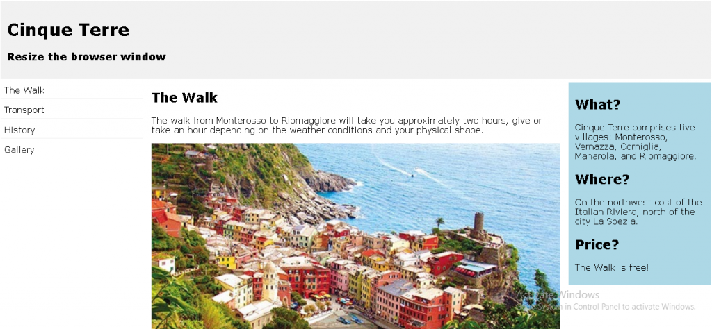
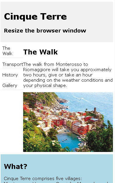
<h1>Cinque Terre</h1>
<h3>Resize the browser window</h3>
</div>
<div style="overflow:auto">
<div class="menu">
<div class="menuitem">The Walk</div>
<div class="menuitem">Transport</div>
<div class="menuitem">History</div>
<div class="menuitem">Gallery</div>
</div>
<div class="main">
<h2>The Walk</h2>
<p>The walk from Monterosso to Riomaggiore will take you approximately two hours, give or take an hour depending on the weather conditions and your physical shape.</p>
<img src="img_5terre.jpg" style="width:100%">
</div>
<div class="right">
<h2>What?</h2>
<p>Cinque Terre comprises five villages: Monterosso, Vernazza, Corniglia, Manarola, and Riomaggiore.</p>
<h2>Where?</h2>
<p>On the northwest cost of the Italian Riviera, north of the city La Spezia.</p>
<h2>Price?</h2>
<p>The Walk is free!</p>
</div>
</div>
<div style="background-color:#f1f1f1;text-align:center;padding:10px;margin-top:7px;font-size:12px;"> This web page is a part of a demonstration of fluid web design made by w3schools.com. Resize the browser window to see the content respond to the resizing.</div>
</body>
</html>
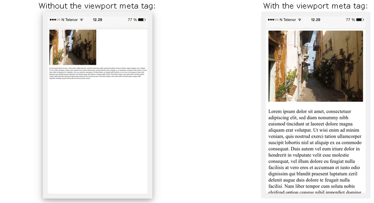
Setting The Viewport
To create a responsive website, add the following <meta> tag to all your web pages:
This will set the viewport of your page, which will give the browser instructions on how to control the page’s dimensions and scaling.
Here is an example of a web page without the viewport meta tag, and the same web page with the viewport meta tag:
Responsive Images
Responsive images are images that scale nicely to fit any browser size.
Using the width Property
If the CSS width property is set to 100%, the image will be responsive and scale up and down:
<!DOCTYPE html>
<html>
<head>
<meta name="viewport" content="width=device-width, initial-scale=1.0">
</head>
<body>
<h2>Responsive Image</h2>
<p>When the CSS width property is set in a percentage value, the image will scale up and down when resizing the browser window. Resize the browser window to see the effect.</p>
<img src="img_girl.jpg" style="width:100%;">
</body>
</htm>
Responsive Image
When the CSS width property is set in a percentage value, the image will scale up and down when resizing the browser window. Resize the browser window to see the effect.
Notice that in the example above, the image can be scaled up to be larger than its original size. A better solution, in many cases, will be to use the max-width property instead.
Using the max-width Property
If the max-width property is set to 100%, the image will scale down if it has to, but never scale up to be larger than its original size:
<!DOCTYPE html> <html> <head> <meta name="viewport" content="width=device-width, initial-scale=1.0"> </head> <body> <h2>Responsive Image</h2> <p>"max-width:100%" prevents the image from getting bigger than its original size. However, if you make the browser window smaller, the image will still scale down.</p> <p>Resize the browser window to see the effect.</p> <img src="img_girl.jpg" style="max-width:100%;height:auto;"> </body> </html>
Responsive Image
“max-width:100%” prevents the image from getting bigger than its original size. However, if you make the browser window smaller, the image will still scale down.
Resize the browser window to see the effect.
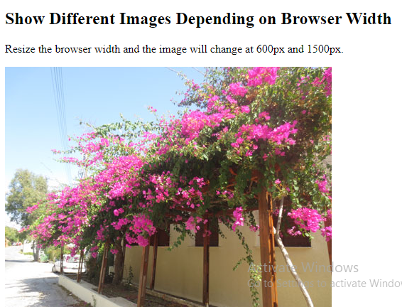
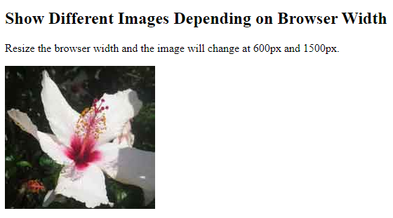
Show Different Images Depending on Browser Width
The HTML <picture> element allows you to define different images for different browser window sizes.
Resize the browser window to see how the image below change depending on the width:
<!DOCTYPE html>
<html>
<head>
<meta name="viewport" content="width=device-width, initial-scale=1.0">
</head>
<body>
<h2>Show Different Images Depending on Browser Width</h2>
<p>Resize the browser width and the image will change at 600px and 1500px.</p>
<picture>
  <source srcset="img_smallflower.jpg" media="(max-width: 600px)">
  <source srcset="img_flowers.jpg" media="(max-width: 1500px)">
  <source srcset="flowers.jpg">
  <img src="img_flowers.jpg" alt="Flowers" style="width:auto;">
</picture>
</body>
</html>
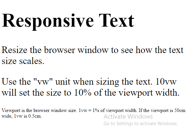
Responsive Text Size
The text size can be set with a “vw” unit, which means the “viewport width”.
That way the text size will follow the size of the browser window:
<!DOCTYPE html>
<html>
<head>
<meta name="viewport" content="width=device-width, initial-scale=1.0">
</head>
<body>
<h1 style="font-size:10vw;">Responsive Text</h1>
<p style="font-size:5vw;">Resize the browser window to see how the text size scales.</p>
<p style="font-size:5vw;">Use the "vw" unit when sizing the text. 10vw will set the size to 10% of the viewport width.</p>
<p>Viewport is the browser window size. 1vw = 1% of viewport width. If the viewport is 50cm wide, 1vw is 0.5cm.</p>
</body>
</html>
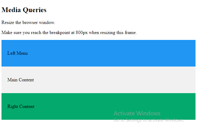
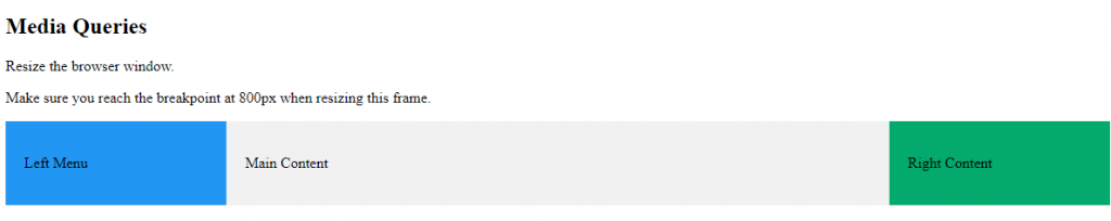
Media Queries
In addition to resize text and images, it is also common to use media queries in responsive web pages.
With media queries you can define completely different styles for different browser sizes.
Example: resize the browser window to see that the three div elements below will display horizontally on large screens and stacked vertically on small screens:
<!DOCTYPE html>
<html>
<head>
<meta name="viewport" content="width=device-width, initial-scale=1.0">
<style>
* {
box-sizing: border-box;
}
.left {
background-color: #2196F3;
padding: 20px;
float: left;
width: 20%; /* The width is 20%, by default */
}
.main {
background-color: #f1f1f1;
padding: 20px;
float: left;
width: 60%; /* The width is 60%, by default */
}
.right {
background-color: #04AA6D;
padding: 20px;
float: left;
width: 20%; /* The width is 20%, by default */
}
/* Use a media query to add a break point at 800px: */
@media screen and (max-width: 800px) {
.left, .main, .right {
width: 100%; /* The width is 100%, when the viewport is 800px or smaller */
}
}
</style>
</head>
<body>
<h2>Media Queries</h2>
<p>Resize the browser window.</p>
<p>Make sure you reach the breakpoint at 800px when resizing this frame.</p>
<div class="left">
<p>Left Menu</p>
</div>
<div class="main">
<p>Main Content</p>
</div>
<div class="right">
<p>Right Content</p>
</div>
</body>
</html>